P
@dar-ju
What challenges did you encounter, and how did you overcome them?
Perfect Pixel on 375px is hard here.
I would like an evaluation of the design's responsiveness across multiple screen sizes. Additionally, I seek feedback on how well the layout performs and renders across different browsers.
I need to know if there is an alternative responsive layout approach that could be used?
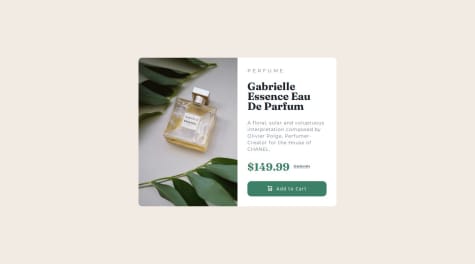
I need to evaluate the styles I used to scale the image to fit the box height in the desktop design. .product-box .product-image { flex: 1; display: flex; }
.product-box .product-image img { width: 18.8125rem; /* 301px */ display: block; object-fit: cover; }
I noticed that the image dimensions are very large, so I need to know if it would be better to create a new copy of the image file for the webpage and resize the image dimensions to be smaller to reduce the image file size
I just need some review on the link states styles to ensure this approach is correct: CSS .profile .profile-info ul li a:link, .profile .profile-info ul li a:visited, .profile .profile-info ul li a:focus { background-color: var(--grey); }
.profile .profile-info ul li a:hover { background-color: var(--light-grey); }
.profile .profile-info ul li a:active { background-color: var(--green); color: var(--off-black); }
I would value a thorough code review to ensure my HTML, CSS, and overall code structure follow best practices. Feedback on improving code readability and maintainability would be beneficial.
Perfect Pixel on 375px is hard here.
Congratulations on your perfect solution! 👍 I really liked how you separated the CSS into multiple files—this makes the codebase more maintainable and easier to organize.
I noticed that the 'testimonials' div is nested inside two container elements instead of being placed directly inside the <main> element. Could you share your reasoning behind this approach? Simplifying the structure might make the HTML more concise, but I'd love to hear your perspective on this decision.
Hello there,
Great work on your solution! I particularly appreciated your use of the <hgroup> element to group the subheading and heading (<h1>). This is a thoughtful choice that enhances the structure and semantics of the HTML in this context.
Here are a few suggestions to further improve your code:
Accessibility Enhancements:
I noticed that the alt attributes for the icon images are currently left empty. Providing a brief description for each icon would improve accessibility, allowing screen readers to convey meaningful information to visually impaired users. For example, you could use descriptions like "Supervisor Icon," "Team Builder Icon," etc.
Refactoring Repeated Styles:
There are some repeated CSS styles for card headings and paragraphs, such as color and font size. To simplify your code and make it more maintainable, consider consolidating these styles into shared classes. For instance, instead of defining individual classes like .firstcard__h--color, .secondcard__h--color, etc., you could use a single class, .card__h--color, and apply it to all cards. This would look something like:
.card__h--color { color: var(--very-dark-blue); }
.card__h--size { font-size: 1.1rem; }
.card__p--color { color: var(--grayish-blue); }
.card__p--size { font-size: 0.8rem; }
This approach keeps your code cleaner and easier to modify in the future.
Overall, your solution demonstrates clear attention to detail and effective use of semantic HTML elements. Well done! I hope you find these suggestions helpful.
Implementing a responsive layout that works seamlessly across different devices and screen sizes is an accomplishment. Ensuring the card adapts well on mobile, tablet, and desktop adds significant value to the project. While the component might look great in one browser, ensuring it's flawless across all major browsers is crucial. Next time, you could invest more in automated testing or manual checks to avoid any compatibility issues.
What challenges did you encounter, and how did you overcome them?Ensuring that the product preview card looked perfect on various screen sizes (mobile, tablet, desktop) was a challenge. Getting the layout to adapt properly, especially when dealing with text overflow, image resizing, or grid/flexbox properties, required careful attention. To overcome responsive design challenges, I used CSS Grid and Flexbox strategically. Media queries were applied at specific breakpoints to ensure content was displayed appropriately on all devices. Tools like Chrome DevTools helped simulate different screen sizes during development.
What specific areas of your project would you like help with?Implementing smooth transitions or micro-interactions to enhance user experience. Optimizing the use of JavaScript or CSS animations to ensure they don’t affect performance negatively. Gathering and integrating feedback to better understand how real users interact with the component and identify areas for improvement. If the product card involves dynamic data (like updating price, rating, or availability), handling state management or adding interactive elements (e.g., hover, click events) efficiently can be a challenge. React, Vue.js, or even plain JavaScript. Help with optimizing event listeners, DOM manipulation, or improving performance for animations/interactions would be beneficial.
Congratulations, Great solution 👍. I also agree with the previous comment about transition.
made the required adjustments!.. this was one difficult task for me, but im glad it pulled through.. pls do leave your thoughts concerning this
Hello there, You made a good solution 👍 Your code is well-structured and easy to read.
Suggestions for Improvement:
The use of HTML5 semantic elements (<section>, <h1>, <h2>, <h3>, <ul>, <ol>, <table>) is good. However, wrapping the content inside multiple <div> elements instead of using more semantic tags (like <main>, <article>) can be improved for better readability and SEO. For example: You could replace the element <div class="container"> with <main class="container"> and also the element <div class="innerCont"> could be <article class="innerCont">
The width of the <div class="container"> should be larger to match the design.
The font size of the headings and body text should be adjusted to match the design.
The image dimensions are explicitly set with width="320px" and height="130px", which might distort the image. It's better to use CSS to set a width of 100% for responsive designs.
Overall, your project is well-structured and follows a clear layout. I hope you find these suggestions helpful.
Hello there, You made a good solution 👍 Your code is well-structured and easy to read.
Suggestions for Improvement:
CSS Variables:
    Consider using CSS variables for colors and other repetitive values. This will make your code more maintainable and easier to update in the future. For example:

    css

:root {
  --green: hsl(75, 94%, 57%);
  --white: hsl(0, 0%, 100%);
  --grey: hsl(0, 0%, 20%);
  --dark-grey: hsl(0, 0%, 12%);
  --off-black: hsl(0, 0%, 8%);
}

body {
  background-color: var(--off-black);
  color: var(--white);
}

.card-container {
  background-color: var(--dark-grey);
}

.location {
  color: var(--green);
}

a {
  color: var(--white);
  background-color: var(--grey);
}

a:hover {
  background-color: var(--green);
  color: var(--grey);
}
Again, great job on your project! I hope you find this suggestion helpful.
I think I have sorted out the challenge and divided it part by part, that makes solving the problem much easier. I'll try the responsiveness differently next time.
What challenges did you encounter, and how did you overcome them?I had some challenge with readme file in github repo. searched youtube, watched a video tutorial and the problem was solved, as simple as that!
What specific areas of your project would you like help with?N/A
Hello there, You made a good solution 👍
Your HTML structure is clear and well-organized. However, I noticed that the img elements do not have alternative text. Including descriptive alt text is important for accessibility, as it helps users who rely on screen readers understand the content and purpose of the images.
in my solution I have provided an alternative text as follows:
HTML:
<img decoding="async" src="images/illustration-article.svg" alt="Illustration Article">
Your CSS is well-structured and easy to read. I noticed that you applied the border-radius directly to the image element rather than its wrapper. While this works fine, applying the border-radius to the wrapper can sometimes offer more control, especially if you need to manage overflow or apply additional styling to the container. Here's an example of how you could adjust your CSS:
CSS: .blog-img { overflow: hidden; border-radius: 10px; }
.blog-img img { width: 100%; }
This approach ensures that any overflow from the image is hidden and that the border-radius is consistently applied, which can be particularly useful for maintaining design integrity across different browsers.
Again, great job on your project! I hope you find this suggestion helpful.