Not Found
Not Found
Not Found
Not Found
Not Found
Not Found
Not Found
Not Found
Not Found
Not Found
Not Found
Not Found
Not Found
Not Found
Not Found
Not Found
Not Found
Not Found
Not Found
Not Found

All comments

  • @catherineisonline

    Submitted

    Hello, Frontend Mentor community! This is my solution to the News homepage.

    I appreciate all the feedback you left that helped me to improve this project. Due to the fact that I published this project very long ago, I am no longer updating it and changing its status to Public Archive on my Github.

    You are free to download or use the code for reference in your projects, but I no longer update it or accept any feedback.

    Thank you

    POTB 330

    @Peteonthebeat

    Posted

    Great work as usual!

    0
  • Adriano 34,000

    @AdrianoEscarabote

    Submitted

    👨‍💻 Hello everyone.

    This was a really fun project to do, I really liked the colors in both dark mode and light mode, and I'm very satisfied with the layout structure, it was a great way to practice grid manipulation with Bootstrap!

    I have a question for you, how do I make it so that when the burger menu is open, the background is dark?

    I added:

    • 👨‍💻 Burguer Menu in the mobile version!
    • 🎨 Dark/Light Mode!

    Feel free to leave comments on how I can improve my code.

    Thanks! 😊

    POTB 330

    @Peteonthebeat

    Posted

    Better than the original. What more can I say, I envy your skills! Keep up the great work!

    1
  • @catherineisonline

    Submitted

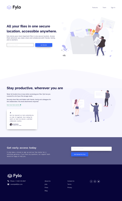
    Hello, Frontend Mentor community! This is my solution to the Fylo landing page with two column layout.

    I appreciate all the feedback you left that helped me to improve this project. Due to the fact that I published this project very long ago, I am no longer updating it and changing its status to Public Archive on my Github.

    You are free to download or use the code for reference in your projects, but I no longer update it or accept any feedback.

    Thank you

    POTB 330

    @Peteonthebeat

    Posted

    Тhis looks flawless, virtually no difference with the design!

    0
  • POTB 330

    @Peteonthebeat

    Posted

    Congratulations on completing this challenge. As long as I can see, there's pretty much no difference between your solution and the original design!

    Keep up the excellent work!

    0
  • POTB 330

    @Peteonthebeat

    Posted

    Hey, congratulations on completing this challenge! I think you might want to increase the padding of the body; this will get it to look even more identical to the design.

    Marked as helpful

    1
  • POTB 330

    @Peteonthebeat

    Submitted

    This is my solution for the 'Social Proo Section' challenge. I am open to suggestions and constructive criticism. I'd also be happy to know whether I should actually write the read.me files for these challenges or should I upload them with the plain instructions.

    Regards!

    Social Proof Section Solution

    #styled-components

    2

    POTB 330

    @Peteonthebeat

    Posted

    Hey @kxnzx, Thank you for this comment.

    I feel the same way about the README.MD. It's just that I saw many others merely uploading the template without changing anything, so I asked, and now I have no doubts.

    Regards, POTB

    0
  • POTB 330

    @Peteonthebeat

    Submitted

    My solution for the 3 Column Preview Card Component challenge.

    I am unsure of the slight expansion the button border causes on larger screens, I'd be happy to learn about a practice that avoids that.

    Regards!

    3 Column Preview Card Component Solution

    #sass/scss#styled-components

    4

    POTB 330

    @Peteonthebeat

    Posted

    Hey @correlucas, Thanks for commenting and taking the time to check this solution. I agree with what you say, but I thought that would make the container look odd at 700-800px width. I added the media queries to prevent that, but I'll definitely consider what you say to get things done with fewer lines of code.

    Regards!

    0
  • @NationsAnarchy

    Submitted

    I feel quite satisfied with this challenge, after completing this one I will utilize what I've been able to do and modify the previous challenges that I've done before here. Please let me know if there is any room for improvement for this one as always!

    POTB 330

    @Peteonthebeat

    Posted

    Congratulations for completing this challenge. It looks pretty identical! Great job!

    A simple thing you can change to get it even closer to the actual example is employing <span> tags to wrap the actual numbers and use the 'Lexend Deca' font for that and you h1...

    Regards!

    Marked as helpful

    0
  • POTB 330

    @Peteonthebeat

    Submitted

    I wouldn't say I found anything particularly difficult. Probably, the most challenging was to figure out how to get the <hr> tag to look as close to the provided designs. I never really did any work with this one prior to this challenge. It also took me a bit longer to figure out that the <div> holding 'Etherium' and 'Clock' icons and their text must use: display: flex; justify-content: space-between

    I'd be happy to hear some opinions on the transitions of the media queries.

    I hope everything displays as expected. Other than that, I am open to suggestions about doing things more efficiently with fewer lines of code.

    Regards! POTB

    NFT Preview Card Component

    #styled-components

    4

    POTB 330

    @Peteonthebeat

    Posted

    Hello, @PhoenixDev22 Thank you for this thorough review of my submission. I really appreciate the constructive criticism. Hands down, this is the most extensive feedback I ever got on anything I did with code.

    I searched the provided instructions and readme file, but I never found a requirement for a hover state on the image or any of the text, but maybe I'm wrong, so I wrapped both 'Jules Wyvern' and 'Equilibrium #3429' into <a> tags. Now they have the hover effect going.

    I also applied your advice about using <ul> and <li> instead of plain <div> and that <span> which I learned recently and apparently decide to use on whatever came to my mind.

    I deleted the <hr> tag, adding border: 0.1rem solid white; to the creation <div>. This was very helpful as it reminded me how to add opacity to the property —  border-top: 0.2px solid rgba(255, 255, 255, 0.1)

    Other than that, I'm not sure wrapping my images inside <figure> or <figcaption> tags would actually improve things... Maybe it will but I left those as they are.

    Nonetheless, I updated the files, making corrections based on your feedback.

    Regards, POTB

    0
  • POTB 330

    @Peteonthebeat

    Submitted

    What did you find difficult while building the project? — I am in the process of figuring out 'Flex' and 'Grid.' So I'll refer to them as the most difficult. I

    Which areas of your code are you unsure of? — I am quite satisfied with the results I get from using 'em' and 'rem' instead of pixels. On the contrary, I'm not 100% sure I use those values most optimally...

    Do you have any questions about best practices? — Yes, I actually have one. What should I do if the following doesn't center a div inside my main?

    main { display: flex; justify-content: center; align-items: center; }

    Regards!

    POTB 330

    @Peteonthebeat

    Posted

    @Snehamoy Bag, Thanks!

    I'll definitely consider your advice and maybe resubmit this solution with the folders properly organized...

    Sincere, Pete

    0