Skip to content
  • Unlock Pro
  • Log in with GitHub
Profile
OverviewSolutions
9
Comments
10
Raptor0x1
@Raptor0x1

All comments

  • Luis Aviles•330
    @lavil014
    Submitted 12 months ago
    What are you most proud of, and what would you do differently next time?

    I am proud of finding the solution on my own with little guidance, I have to push my self to find the best lay out and functions in JS to handle event listeners.

    What challenges did you encounter, and how did you overcome them?

    Oveflowing, responsive design, I had to try several times to match the design as close as possible.

    What specific areas of your project would you like help with?

    I would like help with JS since this is my first project using JS. I am new to this language.

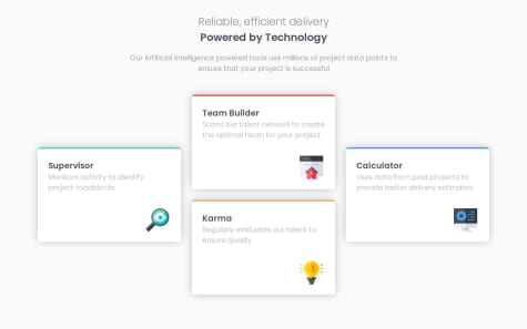
    Responsive landing page using display grid and flex, DOM manipulation.

    1
    Raptor0x1•210
    @Raptor0x1
    Posted 12 months ago
    • Your HTML looks semantic but your solution is somewhat different from the design mainly in terms of size. My guess, It's due to the image. Decrease the size of image and it should do the trick.
    • I can't help you with the JS part as this is first JS project for me too.
  • Stephen Raj M•220
    @stephen3425
    Submitted about 1 year ago
    What are you most proud of, and what would you do differently next time?

    I used flexbox next time will use CSS grid

    What challenges did you encounter, and how did you overcome them?

    The background image on the first card. First I used it in HTML, which either disappeared once the background color was applied or the text was overwritten. Later I switched to the style sheet and applied the image there that's how I resolved it.

    Testimonial-grid-flexbox

    1
    Raptor0x1•210
    @Raptor0x1
    Posted about 1 year ago

    It's not a good practice to build different projects on different branches. You could make different repos for each projects.

    Now coming to the code

    • I know you have said you will use grid next time but the project's name itself is saying to use grid. It would have been better if you had learned to use grid first and then started this project.

    • Don't use the id selector so casually. Id's have high specificity so they can easily override other tags and classes. So better don't use them unless it's very necessary.

    • In your CSS reset use box-sizing: border-box;. It's difficult to know what is happening as I am used to border-box. It makes much easier for other people for reviewing your code and time efficient too.

    • Use relative units (em, rem) instead of absolute units (px).

    Marked as helpful
  • xinfeng•50
    @xiaojinlove
    Submitted about 1 year ago

    css

    2
    Raptor0x1•210
    @Raptor0x1
    Posted about 1 year ago

    Here are some things you should work on.

    • Your font isn't working. Remove the quotation marks on the sans-serif. Fallbacks fonts types such as serif, sans-serif, roboto etc don't require quotation marks. Font property cannot be used with single value it should have at least two values of font-size and font-family. So better to use font-family. Reference

    • If you open it in the dev tools and bring your cursor over the content class you can see there is some space below image. This is the default space set by the browser for the inline element. To get rid of that space use display: block;.

    • There was no need to use .card::before instead you can use box-shadow to gain this effect.

    • Use 'rem' or 'em' instead of 'px'.

  • Mel•120
    @Mel-Ja
    Submitted about 1 year ago

    Four card feature section

    3
    Raptor0x1•210
    @Raptor0x1
    Posted about 1 year ago

    You did a great job. But you could have used grid instead of flexbox. It would have taken less time and energy.

  • Abdulrahman Fathy•20
    @AbdulrahmanFa2hy
    Submitted about 1 year ago

    HTML, CSS, Display Flex

    2
    Raptor0x1•210
    @Raptor0x1
    Posted about 1 year ago
    • First of all, don't keep your focus on just the component think of the bigger picture here, when this component is going to be used in blog websites there's going to be multiple components similar to this one.
    • Keeping the first point in mind, you can use min-height instead of height in the body. In a website there's going to be more content after this component min-height: 100vh makes the screen scroll if there's more content than the viewport height without overflowing. So it's better to use min-height.
    • Instead of absolute units (px) use relative units such as rem.
    • You can use margin to create some space between the screen and card in mobile view.
    • There is no need to use button element. In most of the websites cards are sorted using these tags in this case it is learning. They use javascript to do this. What I'm trying to say is learning is not a button just text, so use <p> , <span> or simply write this in a new div.
    • Instead of using Next-Sibling Combinator h2 + p you could have given a class to each element. Moving forward you will have to create larger projects and using these combinators will make things messy. Use classes instead.
    • Lastly, You haven't done the active states of the card.
    Marked as helpful
  • Juned Shaikh•80
    @JUNEDSK
    Submitted about 1 year ago
    What are you most proud of, and what would you do differently next time?

    Have used some unwanted color names will try something similar

    What challenges did you encounter, and how did you overcome them?

    Nothing much easy pesy

    What specific areas of your project would you like help with?

    none

    product-preview-card-component-main

    1
    Raptor0x1•210
    @Raptor0x1
    Posted about 1 year ago

    You could use relative units instead of absolute units.

  • Juliane Cardoso•70
    @julianesilvac75
    Submitted about 1 year ago
    What are you most proud of, and what would you do differently next time?

    I'm proud of my semantic HTML, even though I'm sure there's still room for improvement

    What challenges did you encounter, and how did you overcome them?

    Styling the list markers was especially hard since I've never had to style it with different colors and weights before. I'm not sure if I like the way I solve this, but it seemed like the best solution for this project.

    What specific areas of your project would you like help with?

    If anyone has documentation or tips on how to style lists and tables in a better way, it would be very appreciated.

    Recipe page solution using Semantic HTML and CSS

    2
    Raptor0x1•210
    @Raptor0x1
    Posted about 1 year ago

    Forgot to close the tr tag in the table. Rest looks good.

    Marked as helpful
  • P
    Fadya•510
    @MaxCoder-mc
    Submitted about 1 year ago
    What are you most proud of, and what would you do differently next time?

    Kept learning to make the solution as close as the challenge

    What challenges did you encounter, and how did you overcome them?

    No challenges

    What specific areas of your project would you like help with?

    Nothing, but if someone has any notes on how to improve my solution i would like to know that very much

    Social links profile using HTML and CSS

    1
    Raptor0x1•210
    @Raptor0x1
    Posted about 1 year ago
    • Your attribution class has been commented out.

    • There is no need to use flexbox everywhere. Usage in class main and profile was not needed.

    • You should use anchor tags instead of button tag. Button is used when the user has to do some activity on the same page but on this links profile when user will click on the button, he would have to go to another website. So Button is not appropriate here, Instead make use of anchor tags and maybe wrap them in the list tag of unordered list tag.

    • Lastly, Use em or rem instead of px for things like font-size , margin, padding, border-radius etc.

    Marked as helpful
  • Faye•80
    @FayeVinyl
    Submitted about 1 year ago
    What are you most proud of, and what would you do differently next time?

    I learned how to use clamp() to make text responsive without using media queries

    What challenges did you encounter, and how did you overcome them?

    I am comfortable with media queries so it was an exciting challenge to learn a new skill and apply it

    What specific areas of your project would you like help with?

    Any advice is always welcome

    Blog Preview Card Main

    1
    Raptor0x1•210
    @Raptor0x1
    Posted about 1 year ago
    • You could write better alt attribute in image. Imagine there are going to many number of cards in a website. A keyboard user can't understand what the image is all about when "bold, abstract illustration in yellow, white, and black" is spoken by the text-reader. Try to write a meaningful alt text.
    • According to the figma file provided you could have increased the size of box shadow when hovered on the card. Here is a reference article.
    • Else everything looks good.
    Marked as helpful
  • André•30
    @AndreCode2093
    Submitted about 1 year ago
    What are you most proud of, and what would you do differently next time?

    Using some preprocessor or maybe tailwindcss

    What challenges did you encounter, and how did you overcome them?

    The use of media queries, im just starting with these concepts

    What specific areas of your project would you like help with?

    Maybe how to setup sass

    Qr Code Component using Flex and Grid

    2
    Raptor0x1•210
    @Raptor0x1
    Posted about 1 year ago
    • Code is well structured (though put the closing curly braces of .card at the wrong place) and tried the layout on the screen sizes , it looks good.
    • The card description is a bit off the place as compared to the design. You can give a width to the card description smaller to card title.

Stay up to datewith new challenges, featured solutions, selected articles, and our latest news

Frontend Mentor

  • Unlock Pro
  • Contact us
  • FAQs
  • Become a partner

Explore

  • Learning paths
  • Challenges
  • Solutions
  • Articles

Community

  • Discord
  • Guidelines

For companies

  • Hire developers
  • Train developers
© Frontend Mentor 2019 - 2025
  • Terms
  • Cookie Policy
  • Privacy Policy
  • License

Oops! 😬

You need to be logged in before you can do that.

Log in with GitHub

Oops! 😬

You need to be logged in before you can do that.

Log in with GitHub

Oops! 😬

You need to be logged in before you can do that.

Log in with GitHub

Oops! 😬

You need to be logged in before you can do that.

Log in with GitHub

Oops! 😬

You need to be logged in before you can do that.

Log in with GitHub

Oops! 😬

You need to be logged in before you can do that.

Log in with GitHub

Oops! 😬

You need to be logged in before you can do that.

Log in with GitHub

Oops! 😬

You need to be logged in before you can do that.

Log in with GitHub

Oops! 😬

You need to be logged in before you can do that.

Log in with GitHub

Oops! 😬

You need to be logged in before you can do that.

Log in with GitHub

Oops! 😬

You need to be logged in before you can do that.

Log in with GitHub

Oops! 😬

You need to be logged in before you can do that.

Log in with GitHub

Oops! 😬

You need to be logged in before you can do that.

Log in with GitHub

Oops! 😬

You need to be logged in before you can do that.

Log in with GitHub

Oops! 😬

You need to be logged in before you can do that.

Log in with GitHub

Oops! 😬

You need to be logged in before you can do that.

Log in with GitHub

Oops! 😬

You need to be logged in before you can do that.

Log in with GitHub

Oops! 😬

You need to be logged in before you can do that.

Log in with GitHub

Oops! 😬

You need to be logged in before you can do that.

Log in with GitHub

Oops! 😬

You need to be logged in before you can do that.

Log in with GitHub

Oops! 😬

You need to be logged in before you can do that.

Log in with GitHub

Oops! 😬

You need to be logged in before you can do that.

Log in with GitHub

Oops! 😬

You need to be logged in before you can do that.

Log in with GitHub

Oops! 😬

You need to be logged in before you can do that.

Log in with GitHub

Oops! 😬

You need to be logged in before you can do that.

Log in with GitHub

Oops! 😬

You need to be logged in before you can do that.

Log in with GitHub

Oops! 😬

You need to be logged in before you can do that.

Log in with GitHub

Oops! 😬

You need to be logged in before you can do that.

Log in with GitHub

Oops! 😬

You need to be logged in before you can do that.

Log in with GitHub

Oops! 😬

You need to be logged in before you can do that.

Log in with GitHub

Oops! 😬

You need to be logged in before you can do that.

Log in with GitHub