


@jonathanlemus
Hi, I'm Santiago, a frontend and backend web developer who is making his way in this world of programming and software development. I love what I do, and that involves helping others with the knowledge I have acquired, developing and creating apps that people can use.
Latest solutions
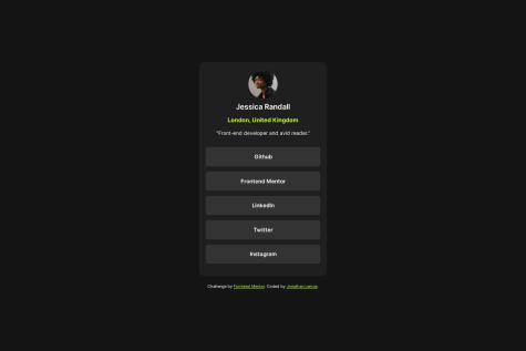
Social Links Profile - ReactJS + TS - TailwindCSS + ViteJS
#react#tailwind-css#vite#vitest#typescriptSubmitted over 1 year agoFylo dark theme landing page - Astro - Tailwind CSS - ReactJS - TS
#astro#react#typescript#tailwind-cssSubmitted over 1 year agoRest countries api with color theme switcher - React | TailwindCS
#react#tailwind-css#typescriptSubmitted over 1 year agoCoding bootcamp testimonials slider - ReactJS - TailwindCSS
#tailwind-css#reactSubmitted over 2 years agoPricing component with toggle - ReactJS - SCSS - Mobile First
#react#sass/scssSubmitted over 2 years agoLaunch countdown timer - ReactJS - SCSS - Flexbox - Mobile First
#react#sass/scssSubmitted over 2 years ago
Latest comments
- @Remy349
Hola @jonathanlemus, excelente resultado. Me gusto mucho como quedo todo el diseño. Bien ahí.
Solo una recomendación de mi parte:
- Para mostrar todos los enlaces de GitHub, Frontend Mentor, etc... Te recomiendo que lo hagas usando una lista <ul> con elementos <li> y dentro de esos elementos <li> los elementos <a href=""> para mostrar los enlaces. Algo así:
<ul>
    <li><a href="#">GitHub</a></li>
    <li><a href="#">Frontend Mentor</a></li>
    <li><a href="#">LinkedIn</a></li>
</ul>
Esto sera de mucha ayuda para una buena semántica y estructura html y al SEO.
Marked as helpful - @aazs-edu@Remy349
Hi @aazs-edu, congratulations for completing the challenge, the final result is amazing. I would just like to give you a couple of tips to improve your skills.
-
In the body, instead of using height: 100vh; it is preferable to use min-height: 100vh; to center elements.
-
With height you are giving a definitive height to the element, if the content needs more space it will overflow.
-
With min-height you are giving an element a minimum height, if you specify a lower height, the height that the element will have will be the value you assigned to min-height, min-height is not applied when the height is greater than min-height.
-
-
In mobile responsive design there comes a point where the design wants to break, this is because of the width: 340px; you use in your <div class="container"> tag, instead you can use a max-width: 340px; and in the <section> tag add a margin: 0 1rem; and remove the margin: 0 auto; you have in your <div class="container"> tag. This way you will have a better responsive design for mobiles.
CONGRATULATIONS for completing the challenge, keep it up :)
Marked as helpful -
- @Jonndev25@Remy349
Hi @Jonndev25, first of all, congratulations for completing the challenge, the final result is really amazing, you did very well. Honestly there is not much to comment you used the tags in a good way.
If I had to say something it would be just a few tips:
-
If you want the card to be center aligned you can use place-content: center; instead of place-items: center; but this is just a matter of aesthetics. Your result is already good.
-
My other observation would be not to leave the alt in the img tag empty, mostly for SEO purposes.
I hope this is helpful :)
Marked as helpful -
- @amrmabdelazeem@Remy349
Hi @amrmabdelazeem, many congratulations on completing the challenge, it is really amazing and the final design is great.
I reviewed your React code and I want to give you a tip to refactor the code found in the App.jsx component. I cloned your repository and edited the code to change the logic you have when rendering the Activity.jsx component. Instead of doing those component renderings using the if else you have nested, I recommend this way:
import React, { useState } from "react";
import Heading from "./Heading";
import Activity from "./Activity";
import data from "../data.json";

export default function App() {
  const [time, setTime] = useState("weekly");

  function handleTime(childTime) {
    setTime(childTime);
  }

  const getTimeframeData = (item, timeframe) => ({
    key: timeframe,
    current: item.timeframes[timeframe].current,
    previous: item.timeframes[timeframe].previous,
  });

  return (
    <div className="container">
      <Heading onHandle={handleTime} />
      {data.map((item, index) => {
        const timeframeData = getTimeframeData(item, time);

        return (
          <Activity
            key={index}
            id={index}
            title={item.title}
            current={timeframeData.current}
            previous={timeframeData.previous}
          />
        );
      })}
    </div>
  );
}
A little explanation:
Function getTimeframeData:
const getTimeframeData = (item, timeframe) => ({ key: timeframe, current: item.timeframes[timeframe].current, previous: item.timeframes[timeframe].previous, });- This function takes two arguments: item (representing an element of the array data.json) and timeframe (representing the current time period).
- Returns an object with the keys key, current and previous, which correspond to the specific properties of the time period within the item.
Component Rendering:
return ( <div className="container"> <Heading onHandle={handleTime} /> {data.map((item, index) => { const timeframeData = getTimeframeData(item, time); return ( <Activity key={index} id={index} title={item.title} current={timeframeData.current} previous={timeframeData.previous} /> ); })} </div> );- Then, a mapping is performed on the array data using the map method.
- For each item element, getTimeframeData is called to obtain the data specific to the current time period (time) and an <Activity /> component is rendered with that data.
In short, the code uses the time state to track the current time period and a getTimeframeData function to get the time period specific data for each activity in the data array. Then, the interface is rendered based on this data.
CONGRATULATIONS ON COMPLETING THE CHALLENGE. I hope my advice will be of great help to you :)
Marked as helpful - @azwick@Remy349
Congratulations, it is an incredible result. Just a couple of recommendations for you to consider:
-
Modify a couple of styles in the css, in the responsive design for phones comes a point where it does not adapt very well, this is because of the min-width: 420px you have in the body, remove it :)
-
There are many ways to center an element, one of them is the following and consider using in your <main class="page"> tag:
/* USING FLEX */

.page {
  display: flex;
  justify-content: center;
  align-items: center;
  min-height: 100vh;
}

/* USING GRID */
.page {
  display: grid;
  place-content: center;
  min-height: 100vh;
}
I recommend that you use min-height instead of just height.
- In your react code I reviewed it and it is very well done, although there are many things you can improve, such as creating a component for the thank you card, separate from the component you have in the card component.
I hope this will help you to continue improving your learning.
Keep it up :)
Marked as helpful -
- @GUARE-01@Remy349
The result of your project is amazing, very well done. I will only make some recommendations with the use of HTML tags.
I saw your html and you use a lot of <div> tags, in the end they helped you to complete the project and it looks very good, but there are more you could use. An example would be the <article> tags for the testimonial cards, but in this case it would be much better to use the <figure> tag and inside it use <figcaption> and <blockquote>.
I leave this link for you to investigate a little more the use of these tags:
Well done, keep it up :)