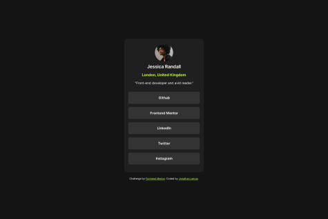
@jonathanlemus

Santiago Moraga Caldera
@Remy349All comments
- @Remy349
Hola @jonathanlemus, excelente resultado. Me gusto mucho como quedo todo el diseño. Bien ahí.
Solo una recomendación de mi parte:
- Para mostrar todos los enlaces de GitHub, Frontend Mentor, etc... Te recomiendo que lo hagas usando una lista <ul> con elementos <li> y dentro de esos elementos <li> los elementos <a href=""> para mostrar los enlaces. Algo así:
<ul>
    <li><a href="#">GitHub</a></li>
    <li><a href="#">Frontend Mentor</a></li>
    <li><a href="#">LinkedIn</a></li>
</ul>
Esto sera de mucha ayuda para una buena semántica y estructura html y al SEO.
Marked as helpful - @aazs-edu@Remy349
Hi @aazs-edu, congratulations for completing the challenge, the final result is amazing. I would just like to give you a couple of tips to improve your skills.
-
In the body, instead of using height: 100vh; it is preferable to use min-height: 100vh; to center elements.
-
With height you are giving a definitive height to the element, if the content needs more space it will overflow.
-
With min-height you are giving an element a minimum height, if you specify a lower height, the height that the element will have will be the value you assigned to min-height, min-height is not applied when the height is greater than min-height.
-
-
In mobile responsive design there comes a point where the design wants to break, this is because of the width: 340px; you use in your <div class="container"> tag, instead you can use a max-width: 340px; and in the <section> tag add a margin: 0 1rem; and remove the margin: 0 auto; you have in your <div class="container"> tag. This way you will have a better responsive design for mobiles.
CONGRATULATIONS for completing the challenge, keep it up :)
Marked as helpful -
- @Jonndev25@Remy349
Hi @Jonndev25, first of all, congratulations for completing the challenge, the final result is really amazing, you did very well. Honestly there is not much to comment you used the tags in a good way.
If I had to say something it would be just a few tips:
-
If you want the card to be center aligned you can use place-content: center; instead of place-items: center; but this is just a matter of aesthetics. Your result is already good.
-
My other observation would be not to leave the alt in the img tag empty, mostly for SEO purposes.
I hope this is helpful :)
Marked as helpful -
- @amrmabdelazeem@Remy349
Hi @amrmabdelazeem, many congratulations on completing the challenge, it is really amazing and the final design is great.
I reviewed your React code and I want to give you a tip to refactor the code found in the App.jsx component. I cloned your repository and edited the code to change the logic you have when rendering the Activity.jsx component. Instead of doing those component renderings using the if else you have nested, I recommend this way:
import React, { useState } from "react";
import Heading from "./Heading";
import Activity from "./Activity";
import data from "../data.json";

export default function App() {
  const [time, setTime] = useState("weekly");

  function handleTime(childTime) {
    setTime(childTime);
  }

  const getTimeframeData = (item, timeframe) => ({
    key: timeframe,
    current: item.timeframes[timeframe].current,
    previous: item.timeframes[timeframe].previous,
  });

  return (
    <div className="container">
      <Heading onHandle={handleTime} />
      {data.map((item, index) => {
        const timeframeData = getTimeframeData(item, time);

        return (
          <Activity
            key={index}
            id={index}
            title={item.title}
            current={timeframeData.current}
            previous={timeframeData.previous}
          />
        );
      })}
    </div>
  );
}
A little explanation:
Function getTimeframeData:
const getTimeframeData = (item, timeframe) => ({ key: timeframe, current: item.timeframes[timeframe].current, previous: item.timeframes[timeframe].previous, });- This function takes two arguments: item (representing an element of the array data.json) and timeframe (representing the current time period).
- Returns an object with the keys key, current and previous, which correspond to the specific properties of the time period within the item.
Component Rendering:
return ( <div className="container"> <Heading onHandle={handleTime} /> {data.map((item, index) => { const timeframeData = getTimeframeData(item, time); return ( <Activity key={index} id={index} title={item.title} current={timeframeData.current} previous={timeframeData.previous} /> ); })} </div> );- Then, a mapping is performed on the array data using the map method.
- For each item element, getTimeframeData is called to obtain the data specific to the current time period (time) and an <Activity /> component is rendered with that data.
In short, the code uses the time state to track the current time period and a getTimeframeData function to get the time period specific data for each activity in the data array. Then, the interface is rendered based on this data.
CONGRATULATIONS ON COMPLETING THE CHALLENGE. I hope my advice will be of great help to you :)
Marked as helpful - @azwick@Remy349
Congratulations, it is an incredible result. Just a couple of recommendations for you to consider:
-
Modify a couple of styles in the css, in the responsive design for phones comes a point where it does not adapt very well, this is because of the min-width: 420px you have in the body, remove it :)
-
There are many ways to center an element, one of them is the following and consider using in your <main class="page"> tag:
/* USING FLEX */

.page {
  display: flex;
  justify-content: center;
  align-items: center;
  min-height: 100vh;
}

/* USING GRID */
.page {
  display: grid;
  place-content: center;
  min-height: 100vh;
}
I recommend that you use min-height instead of just height.
- In your react code I reviewed it and it is very well done, although there are many things you can improve, such as creating a component for the thank you card, separate from the component you have in the card component.
I hope this will help you to continue improving your learning.
Keep it up :)
Marked as helpful -
- @GUARE-01@Remy349
The result of your project is amazing, very well done. I will only make some recommendations with the use of HTML tags.
I saw your html and you use a lot of <div> tags, in the end they helped you to complete the project and it looks very good, but there are more you could use. An example would be the <article> tags for the testimonial cards, but in this case it would be much better to use the <figure> tag and inside it use <figcaption> and <blockquote>.
I leave this link for you to investigate a little more the use of these tags:
Well done, keep it up :)
- @Karrar-Hussein@Remy349
Hi @Karrar-Hussein, the result you achieved in the challenge is excellent, very well done.
Just a little tip to improve your structure when writing HTML and get a semantic improvement for your future projects and challenges:
- Note that you used many <div> tags, which in the end led you to the desired result but my recommendation is that you try using other tags such as the <main> tag for all the main content of the page and the <article> tag for the cards, specifically the ones with the
<div class="card banner">classes.
This will improve the way you write HTML and the semantics of the pages, I leave these links for you to learn more about its use.
Keep learning :)
Marked as helpful - Note that you used many <div> tags, which in the end led you to the desired result but my recommendation is that you try using other tags such as the <main> tag for all the main content of the page and the <article> tag for the cards, specifically the ones with the
- @Xjanus12x@Remy349
Hi @Xjanus12x, congratulations for completing the challenge, the truth is that it is a very good result you achieved. I would just like to give you some tips for you to consider for your future projects:
-
Looking at the HTML you wrote I noticed that you used a lot of <figure> tags, for this project I recommend you to use the <article> tag, I leave you this link to learn more about it. You will have a better structure when writing HTML: HTML: <article>
-
This one is for the cards, there is a point where the cards don't fit well in the height, do the test trying to reduce the width of the window and you will see what I am talking about, you can solve this by adding a height to your .card__hours element:
.card__hours {
  min-height: 100%;
}
That should be enough to solve that little problem.
- This tip is for your styles.scss file, use @forward instead of the @import. I leave you this link: SASS @forward
I hope my advice will be helpful. Again congratulations for completing the challenge, excellent result. Keep learning :)
Marked as helpful -
- @aisyelo@Remy349
Hi @aisyelo, great job completing the challenge, a very good result!!!!!
Just a few tips for you to take into consideration for future projects:
To solve your problem you can center all the elements using "display: flex" in the "body", remove all the padding and margin you added, you can also remove the "position: relative" and "position: absolute" so it doesn't interfere in the styles. Now just add these styles to the "body"....
body {
  display: flex;
  flex-direction: column;
  align-items: center;
  justify-content: center;
  min-height: 100vh;
}
This should be enough to fix your problem.
Again, congratulations on completing the challenge, keep learning :)
Marked as helpful - @Mouradis@Remy349
Hi @Mouradis, I like the final result of your project, it is very well done, just some tips for you to take into consideration for future projects:
1.If you want to center an element you can do it very easily using Flex, what you did is fine, in the end we are different and we have different thoughts and ideas, but I want to show you this way to do it if you didn't know it yet:
body {
  min-height: 100vh;
  display: flex;
  justify-content: center;
  align-items: center;
}
With these simple lines you can center an HTML element, I applied it in the body as it is very practical and there is only one HTML element that you want to center, but in general it will depend on what you want to center and also the amount of elements to center.
2.Note that you did not put the background image that the project should have, in order to do this there are different ways to do it, I will show you one that will be related to the portion of code that I left you in the first tip:
body {
  min-height: 100vh;
  display: flex;
  justify-content: center;
  align-items: center;
  position: relative;
}

body::before {
  content: '';
  position: absolute;
  background-image: url(Your image here!);
  width: 100%;
  // This value may vary, it will depend on you
  height: 100%;
  // You can use this for the image position,
  // these values will depend on you
  top: 0;
  left: 0;
  // This is another way, these values will depend on you
  background-position: top 0 left 0;
  z-index: -10;
  // From time to time you will find it necessary to use the following values,
  // so that the image is not distorted
  background-size: Here you can use cover or contain, there are more;
  background-repeat: Here you can use no-repeat, there are more;
}
This should be enough to add the background image, but as I said, there are many ways to achieve the same result, this is one.
I recommend you to investigate more about these concepts, specially the pseudoelements (::before, ::after, .....), also try to find other ways to do the same, it will help you to improve a lot and to know different ways to solve these problems.
I hope my advice will be helpful for your future projects, keep on learning web development :)
- P@Marianellag1@Remy349
I saw the final result of your project and it is amazing, love it. Just a little tip for you to improve when using tags in HTML. Note that you used a lot of <div> tags which in the end gave you the expected result but there are many more tags you can use, like <main>, <article>, <figure>, <figcaption>, <blockquote> tags. Personally I used the following structure:
<main>
  <figure>
    <div>
      <img />
      <figcaption>Text here!</figcaption>
    </div>
    <p>Text here!</p>
    <blockquote>
      " Text here! "
    </blockquote>
  </figure>
</main>
I leave you this link so you can learn a little more about these tags and apply this new knowledge to your future projects, keep learning about web development
Just one more thing, keep in mind the responsive design to make your projects adaptable to all devices, I recommend you to use the Mobile First design methodology.
And don't worry about overthinking things, it's okay to be curious and ask questions, it will clear your doubts and you will learn more :)
Marked as helpful - @itsmusa@Remy349
Excellent work, just a few tips for you to improve:
- This one is for the colored line that is at the top of the card, note that you used a <div> to achieve this result and that's fine but I want to introduce you to one that I know, you can add a "position: relative" to the <article> tag that you used to made the card and then this to get the same result:
.article::after {
  content: '';
  position: absolute;
  top: 0;
  width: 100%;
  height: whatever you want, I used 5px;
  background: color here;
}
this will give you the same result try it or keep it in mind for future projects :)
2.The social network icons do not appear, instead only the colors appear but not the icon, you can fix this by using "color: icon color;" this to the <i> tag you used to put the icons.
3.Note that you used sass for the styles, try using @forward instead of @import to import your scss files, I recommend you to read a bit more about it.
I hope you find my advice helpful and keep on with your web development :)
Marked as helpful - @ADAMSKI-DZ@Remy349
I saw the final result of your project and it is amazing, just a little tip for you to improve when using tags in HTML. Note that you used a lot of <div> tags which in the end gave you the expected result but there are many more tags you can use, like <main>, <article>, <figure>, <figcaption>, <blockquote> tags. Personally I used the following structure:
<main>
  <figure>
    <div>
      <img />
      <figcaption>Text here!</figcaption>
    </div>
    <p>Text here!</p>
    <blockquote>
      " Text here! "
    </blockquote>
  </figure>
</main>
I leave you this link to learn more about the use of these tags. I hope my comment is very helpful and keep on going :)
<figure> tag: https://developer.mozilla.org/en-US/docs/Web/HTML/Element/figureMarked as helpful - @DinosMpo@Remy349
Hi @DinosMpo, your project looks amazing, I like it. I would just like to give you some tips for you to keep in mind. Try to use other tags besides the <div>, I saw the code and noticed that you use many <div> tags, try using tags like <section>, <article> or <main>, this greatly improves your HTML structure and will be of great help for your future projects. I hope this is helpful, keep going ✌️
Marked as helpful - @oc-garcia@Remy349
The image doesn't look so good, to make it fill the width you set without deforming it, use the following properties on the image "object-fit: cover" this will make the image fit smoothly and then you can use an "object-position" to set the position you like. I hope my comment will help you :)
Marked as helpful - @blad232@Remy349
For mobile devices it does not look very good, the content is not fully visible and it is because you use "height: 100vh" instead I recommend you to use "min-height: 100vh" it is much better. Also consider adding some margin at the top and bottom, you can add these values in the body element. I hope you find it useful ✌️
I also leave you this link to learn a little more about "min-height ===> https://developer.mozilla.org/en-US/docs/Web/CSS/min-height
- @Isaiah-0914@Remy349
Hello @Isaiah-0914, the responsive design is available but only from the 1440px size, in that size shows you the card as it should be in the challenge. As a recommendation make sure you change the media queries measures, usually I adapt it from 1000px or 1200px, this way I make sure it shows the expected result in most of the devices. Your problem is due to the fact that there are different screen sizes, so some will display correctly and others will not. Example: on my laptop the card does not look good because the size of my screen is 1360px. I hope this helps you :)
Marked as helpful - @krishpri23@Remy349
The final result of the project is incredible, just a few tips:
- It looks like you forgot to add the responsive design for mobile devices.
- For the tag "<p id="title">P E R F U M E</p>", you can make that effect by adding the properties of "text-transform: uppercase" to make everything uppercase and "letter-spacing: (px/rem value)" to add a space between each letter.
Marked as helpful