Not Found
Not Found
Not Found
Not Found
Not Found
Not Found
Not Found
Not Found
Not Found
Not Found
Not Found
Not Found
Not Found
Not Found
Not Found
Not Found
Not Found
Not Found
Not Found
Not Found

All comments

  • P
    ApplePieGiraffe 30,545

    @ApplePieGiraffe

    Submitted

    Hello, everybody! 👋

    This is my 30th solution on Frontend Mentor! 🎉 (And my first Guru level challenge submission.) 😎 This was definitely a tricky challenge, but I got to learn and try out many new things! 😀

    I used React and Next.js to build the site, styled-components to style it, Formik (and Yup) to handle the forms in this challenge, and Framer Motion to add some page transitions and animations. 😄

    There were quite a few things I had to learn in order to complete this challenge, and I'm not sure if I did them all correctly. 😥 Looking back, there are a few things I wish I would have differently, but it's a learning experience! 🙂

    If anyone could share some resources on how to manage and organize larger projects like this, I'd really appreciate it! 👍 Lots of resources that I find only focus on specific things (like creating a popup or using certain features of a tool) and not so much how to approach and think about an entire app. 🙃

    If you'd like to learn more about my project, see the README in my Git repo (where I also list a few quirks in my solution).

    Feedback welcome and appreciated! 😊

    Happy coding! 😁

    BTW, click on the sidebar avatar for the attribution.

    Invoice App | React, Next.js, styled-components, Formik, Framer Motion

    #framer-motion#react#styled-components#next

    16

    @SarahHenriette

    Posted

    Hey ApplePieGiraffe 🙂 !

    Congratulations, the project is just on top ! Respect👏.

    1
  • @SarahHenriette

    Posted

    Hi 😊

    well done, the project is very well done ! I like

    Good continuation

    6
  • @SarahHenriette

    Posted

    Hi 🙂,

    The project is good and I really like the little animation! The responsive is great too

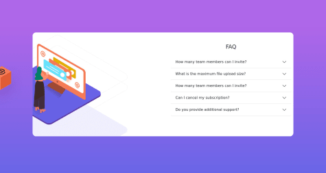
    Maybe just refocus the content of your FAQ a bit so that it sticks less to the right edge.

    Good continuation

    0
  • @StudioWebpic

    Submitted

    Hi,

    Second challenge with HTML / CSS abd Flexbox. Not easy to place the circels !

    Thx to everybody who let a feedback :)

    @SarahHenriette

    Posted

    Hi Studio Webpic , 🙂

    Well done because it's really well done and the visual is almost identical 👍

    yes I agree enough to place the circles it is not obvious, I had also had a little trouble especially on the mobile

    Good continuation

    1
  • @SarahHenriette

    Posted

    Hi Aljon De Lumen 🙂

    The realization of this project is really good. The responsive is great and I really like the effect you put on the responsive menu 👍

    Maybe just put:

    • the "cursor: pointer" on the creations of "our creation"
    • the hover that you put on the links of the nav puts it back on the links of the footer

    Good continuation

    0
  • Bonrey 1,130

    @Bonrey

    Submitted

    That was quite a tough challenge, but I think I learned quite a lot (working with setInterval(), setTimeout() in JS; adding animation via JS, etc.)!

    The most difficult part was to animate the cards. I struggled for some time with css and then tortured myself with js, but eventually it worked 😅 (There's a bug where numbers kind of skew a pixel or two every time they flip. I've tried really hard to get rid of it, but the only solution was to change the width/height of the card, which worked only for the desktop design. P.S. I tried all kinds of length units, like px, rem, %, vw, etc.).

    In terms of functionality, you can do the following:

    • Press "Space" key to pause/resume the timer;
    • Press "Enter" key to see what happens at the end of the countdown (there's some extra animation I added);
    • Click social-media links to refresh the page and therefore restart the timer.

    As always, any feedback is welcome!

    Happy coding, everyone! 😉

    @SarahHenriette

    Posted

    Hi Bonrey !

    Wow, well done for your project 😃

    I did it too but I clearly did not manage to make the animations on the maps and I admit that I did not have the patience to do it either.

    Well done for the features 👍

    good continuation !

    2
  • @SarahHenriette

    Posted

    Hi Adaeze Dawari 🙂

    Bravo for the project I find it very well done ! 👍

    I don't find the responsive to be null, on the contrary it's pretty good I think. I find the phone very successful !

    I think it would just be necessary from the tablet version (768px) to center your "phone container" class. I believe you can do:

    • margin: auto
    • left: 0
    • right: 0
    • top: 6em

    and maybe just adjust the background by making the body white and adding the second background to the right

    Good continuation !

    0
  • P
    ApplePieGiraffe 30,545

    @ApplePieGiraffe

    Submitted

    Hello, everyone! 👋

    This is my first challenge with React and as usual, I learned a lot! 😆

    At first, I was pretty confused about how to organize the files in my project and I'm still unsure if my React is very clean in some places (since I just began learning React). My Sass turned out to be, well, kind of messy (and I'll keep in mind to use a better file structure next time because I simply created separate files for my components for this project). 😅

    On the bright side, I created this pretty sweet hover effect for the cards in the "Creations" section from scratch, and I quite like it. 😊

    Any feedback (especially on React) is welcome and appreciated! 😀

    Happy coding! 😄

    @SarahHenriette

    Posted

    Hi ApplePieGiraffe 😊 !

    I'm just a fan of the hover effect you put on the images in the "our creations" section and also of the effect you put on the burger menu 😃👏

    4
  • @stephentyers1975

    Submitted

    This is the last pure HTML/CSS challenge before moving onto learning Javascript :). I used only grid for the layouts. I just coded up the two design layouts as best as I could. I also put a few scaling and brightness effects on the buttons. The main takeaways for me are that I need to revise my semantic HTML, I just find it a bit dull hahaha compared to the visual design work. Many thanks Steve

    @SarahHenriette

    Posted

    Hi Stephen 🙂,

    Well done for your project I find it very well done ! 👍

    It is true that it is not easy to use the html semantics well, often we use too many divs.

    well done and good luck learning javascript 😉

    0
  • @Cats-n-coffee

    Submitted

    Hello everyone! I completed this challenge using the React library that I set up with Parcel, if anyone has any suggestion regarding the set up of this project I'll be happy to change things around. I wanted to set up React from scratch and use the router as well as practice React of course. Let me know what you think about the card flipping and the form validation. The form validation is messy as I wanted to add setTimeOut for error display but I couldn't figure out how to make a single function for it (or anything else to validate the form). Any feedback on anything is very much appreciated. Thank you!

    @SarahHenriette

    Posted

    Hi 😊,

    Bravo for the project, I find it very well done !! 👍 I really like the flip effect on the cards in the "Meet the Directors" section of the "about" page !

    I may have a suggestion:

    • remove the focus of the input from your form. It seems to me that in your css you can do: "input: focus {outline: none}"

    and also maybe put a "cursor: pointer" on the input submit

    In any case good work and good continuation 😉

    0