Skip to content
  • Unlock Pro
  • Log in with GitHub
Profile
OverviewSolutions
21
Comments
7

Shard Codes

@Shard-Codes430 points

Hey there👋, I'm a junior developer making websites here and there but I'm always learning from every project I make, And I specialize in Html and CSS.

I’m currently learning...

Javascript.

Latest solutions

  • News homepage solution, Made with HTML, Css, And Javascript.

    #bem#accessibility

    Shard Codes•430
    Submitted over 2 years ago

    0 comments
  • Project tracking intro component solution

    #accessibility#bem

    Shard Codes•430
    Submitted almost 3 years ago

    0 comments
  • Insure landing page, Made with Html, Css, and some Javscript

    #bem#accessibility

    Shard Codes•430
    Submitted almost 3 years ago

    1 comment
  • Huddle landing page, Made with Html aand Css

    #bem#accessibility

    Shard Codes•430
    Submitted almost 3 years ago

    0 comments
  • Single price grid component, Made with Html, and Css

    #bem

    Shard Codes•430
    Submitted almost 3 years ago

    1 comment
  • Loopstudios landing page, Made with Html, Css and Javascript

    #bem#accessibility

    Shard Codes•430
    Submitted almost 3 years ago

    0 comments
View more solutions

Latest comments

  • Oubaid•180
    @oubaidelmoudhik
    Submitted almost 3 years ago

    Three-column-preview-card-component using CSS Grid

    2
    Shard Codes•430
    @Shard-Codes
    Posted almost 3 years ago

    Hello Oubaid, You great job on the challenge

    Here are some tips to improve your solution.

    • On the body tag add a min-height of 100vh like this.
    body {
       background-color: var(--clr-very-light-gray);
        display: flex;
        justify-content: center;
        align-items: center;
        padding: 0;
        min-height: 100vh; /* Add this */
    }
    
    • On your container div remove the margin and min-height you set like this.
    .container {
        display: grid;
        overflow: auto;
        margin: 5rem 1.5rem; /* Remove this */
        grid-template-columns: repeat(auto-fit, minmax(15rem, 1fr));
        min-height: 30rem; /* Remove this */
        border-radius: 0.5rem;
    }
    

    And also remove the min-height on your column element, as well.

    And with that, you should be set Happy coding 😊

  • erwin•60
    @lanszesz
    Submitted almost 3 years ago

    Plain CSS solution

    1
    Shard Codes•430
    @Shard-Codes
    Posted almost 3 years ago

    Hello Erwin, You did a great job on the challenge

    Here's how you can fix your problem.

    1. on your column-card element, add a max-width of 968px and width to 90%.

    2. on your card element, remove the height and set your width to 100%.

    3. Get rid of your 350px media query, As you don't need it.

    I hope this helps happy coding.😊

    Marked as helpful
  • EHO•265
    @hermannleboss
    Submitted almost 3 years ago

    Profile card component

    #accessibility#sass/scss#vite
    1
    Shard Codes•430
    @Shard-Codes
    Posted almost 3 years ago

    Hello there EHO, You did an amazing job on the challenge!

    Though I have some suggestions for you.

    1. on your card element switch the width property to max-width like this.
    .card {
       background-color: white;
       height: 374px;
       max-width: 350px;  /* Like this */
       box-shadow: 0px 50px 100px -20px rgba(8, 70, 94, 0.504835);
       border-radius: 15px;
       overflow: hidden;
    }
    
    1. on your main element remove the flex-direction property because you don't need it.
    .main {
       display: flex;
       justify-content: center;
       align-items: center;
       flex-direction: column;  /* Remove this */
       min-height: 100vh;
       background-color: $dark-cyan;
       background-image: url("../../public/images/bg-pattern-top.svg"), url("../../public/images/bg- 
       pattern-bottom.svg");
       background-repeat: no-repeat, no-repeat;
    
       background-position: top -150px left -200px, bottom -150px right -200px;
       background-size: 80%, 80%;
       @media (min-width: 992px) {
        background-position: top -400px left -400px, bottom -400px right -400px;
        background-size: 65%, 65%;
      }
    }
    
    1. On your banner image set the width property to 100% instead of 350px.
      &__banner {
        height: 140px;
        width: 100%; /* Like this */
        background-image: url("../../public/images/bg-pattern-card.svg");
      }
    

    Ok, that's all I have to say, I hope this helps and Happy coding.

  • Rishabh Jasiwal•10
    @itsRishh
    Submitted almost 3 years ago

    Responsive landing page using CSS flex

    2
    Shard Codes•430
    @Shard-Codes
    Posted almost 3 years ago

    Hello there, Rishabh you great job on the challenge

    Though I do have some suggestions for you to improve.

    1. Remove the text-align property from the body and add min-height 100vh as well as justify-content to center, And add padding 1rem to the left and right, Like this.
    body {
        display: flex;
        align-items: center;
        justify-content: center;
        flex-direction: column;
        min-height: 100vh;
        margin: 0;
        padding: 0 1rem;
        background-color: HSL(212, 45%, 89%);
        font-family: 'Outfit', sans-serif;
    }
    
    1. Now remove the margin-top from your card element and set text-align to center, Like this.
    .card {
        background-color: white;
        padding: 15px;
        border-radius: 1rem;
        max-width: 250px;
        text-align: center;
        margin-top: 100px;  /* Remove this */
    }
    

    And with that, you are good to go. I hope this helps, Happy coding 😊

    Marked as helpful
  • Jason Greenwald•200
    @jaycgreenwald
    Submitted almost 3 years ago

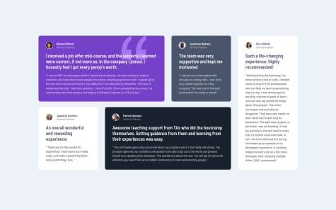
    Testimonials grid using SCSS and BEM

    #bem#sass/scss
    1
    Shard Codes•430
    @Shard-Codes
    Posted almost 3 years ago

    Hello Jason, You did an excellent job on the challenge!

    I think you did better than me, Honestly.

    And yes you should use rem to your heart's content, Because it's the right way to go in terms of typography. It's the best practice.

    As for your second question it's okay to use px at times maybe for like border-radius, box-shadow, border, and etc.

    Everything else is perfect. Happy coding, Regards.

    Marked as helpful
  • Trae Zeeofor•490
    @traez
    Submitted almost 3 years ago

    @traez's Stats preview card component using HTML and CSS

    3
    Shard Codes•430
    @Shard-Codes
    Posted almost 3 years ago

    Hello Trae Zeeofor.

    You did a fine job on the challenge.

    I can't rewrite your code right now. But I can refer you to my code so you can learn from it. Here's the link to my GitHub repo. And as for your accessibility issues, you must always include the Src attribute on your images, So that if your image has any error the alternate text will appear. And it also helps the visually impaired.

    I hope this helps, Regards.

    Marked as helpful
View more comments
Frontend Mentor logo

Stay up to datewith new challenges, featured solutions, selected articles, and our latest news

Frontend Mentor

  • Unlock Pro
  • Contact us
  • FAQs
  • Become a partner

Explore

  • Learning paths
  • Challenges
  • Solutions
  • Articles

Community

  • Discord
  • Guidelines

For companies

  • Hire developers
  • Train developers
© Frontend Mentor 2019 - 2025
  • Terms
  • Cookie Policy
  • Privacy Policy
  • License

Oops! 😬

You need to be logged in before you can do that.

Log in with GitHub

Oops! 😬

You need to be logged in before you can do that.

Log in with GitHub

Oops! 😬

You need to be logged in before you can do that.

Log in with GitHub

Oops! 😬

You need to be logged in before you can do that.

Log in with GitHub

Oops! 😬

You need to be logged in before you can do that.

Log in with GitHub

Oops! 😬

You need to be logged in before you can do that.

Log in with GitHub

Oops! 😬

You need to be logged in before you can do that.

Log in with GitHub

Oops! 😬

You need to be logged in before you can do that.

Log in with GitHub

Oops! 😬

You need to be logged in before you can do that.

Log in with GitHub

Oops! 😬

You need to be logged in before you can do that.

Log in with GitHub

Oops! 😬

You need to be logged in before you can do that.

Log in with GitHub

Oops! 😬

You need to be logged in before you can do that.

Log in with GitHub

Oops! 😬

You need to be logged in before you can do that.

Log in with GitHub

Oops! 😬

You need to be logged in before you can do that.

Log in with GitHub

Oops! 😬

You need to be logged in before you can do that.

Log in with GitHub

Oops! 😬

You need to be logged in before you can do that.

Log in with GitHub

Oops! 😬

You need to be logged in before you can do that.

Log in with GitHub

Oops! 😬

You need to be logged in before you can do that.

Log in with GitHub

Oops! 😬

You need to be logged in before you can do that.

Log in with GitHub

Oops! 😬

You need to be logged in before you can do that.

Log in with GitHub

Oops! 😬

You need to be logged in before you can do that.

Log in with GitHub

Oops! 😬

You need to be logged in before you can do that.

Log in with GitHub

Oops! 😬

You need to be logged in before you can do that.

Log in with GitHub

Oops! 😬

You need to be logged in before you can do that.

Log in with GitHub

Oops! 😬

You need to be logged in before you can do that.

Log in with GitHub

Oops! 😬

You need to be logged in before you can do that.

Log in with GitHub

Oops! 😬

You need to be logged in before you can do that.

Log in with GitHub

Oops! 😬

You need to be logged in before you can do that.

Log in with GitHub

Oops! 😬

You need to be logged in before you can do that.

Log in with GitHub

Oops! 😬

You need to be logged in before you can do that.

Log in with GitHub

Oops! 😬

You need to be logged in before you can do that.

Log in with GitHub