


@Miranusm
Latest solutions
Latest comments
- @TamarawGuy
Very good work done! What I can suggest is:
- You can use the 'Young Serif' font for the titles of the paragraphs.
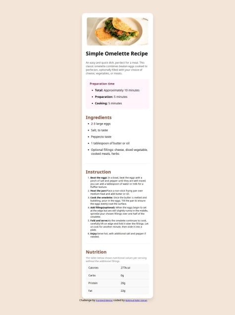
- Also the recipe card is a bit wider on the screenshot.
Overall, great job!
- @Mohamed14-7@TamarawGuy
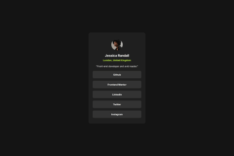
Very good job! I would suggest to bold the text in the buttons, make the name smaller, and also make the padding of the card a little bigger
- P@CoderAlchemy24@TamarawGuy
That's some good work done there, however I think there can be a few improvements done:
- Card not centered veritically You can use flexbox to center the content of the body both horizontally and vertically:
* { - margin: 0 auto; box-sizing: border-box; + display: flex; + justify-content: center; + align-items: center; }-
Padding in Card too big What I can see is that the padding in the card is a bit too large compared to the design, try using a smaller padding
-
Google Font family not used On the live preview I can see that you did not use the required font family from google fonts. Here are the links you need to add in the <head> tag above the <title> tag:
<link rel="preconnect" href="https://fonts.googleapis.com" />
    <link rel="preconnect" href="https://fonts.gstatic.com" crossorigin />
    <link
      href="https://fonts.googleapis.com/css2?family=Figtree:ital,wght@0,300..900;1,300..900&display=swap"
      rel="stylesheet"
    />
In order to use the font family you need to add the following lines in your css file:
<some-class> { font-family: "Figtree", sans-serif; }- Cursor is not pointer when hovering over the title of the card What you can do for better UX is to make your cursor a pointer when hovering over your <h1> tag:
h1:hover{ color: var(--color-yellow, #F4D04E); + cursor: pointer; }Marked as helpful - @CoderZ865What are you most proud of, and what would you do differently next time?
I'm most proud of the fact that I started. After spending a lot of time binging CSS tutorials and CSS battles, I finally pushed past the hesitation and built something on my own.
@TamarawGuyGreat job!