
@olenahelena

𝕍𝕝𝕒𝕕𝕪𝕤𝕝𝕒𝕧 𝕄𝕚𝕤𝕙𝕔𝕙𝕦𝕜
@VladMishchukAll comments
- @VladMishchuk
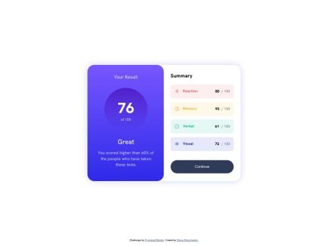
/* Для моб. пристроїв */
.summary {}
витерти
max-width: 317px; /* на планшетах через ліміт по ширині ця частина "відривається" від правого краю */

/* Для ПК */
.summary, total_score {
flex: 1; /* цікава річ) допомагає в ситуаціях коли треба зроби рівні по ширині/висоті флекс-елементи */
}
.summary {
margin: 30px; /* на око кинув щоб "Summary" правої сторони вирівнявся з "Your Result"  */
}

.wrapper {
min-width: 42rem; /* теж на око кинув) це щоб картки з оцінками не складались вдвоє */
}
витерти
width: 737px;
height: 510px;

.summary__points__wrapper {
margin-left: auto; /* щоб притиснути оцінку до правого краю */
}

.summary__points__red,
.summary__points__yello,
.summary__points__green,
.summary__points__blue {
gap: 1rem; /* для відступу між іконкою і назвою показника */
}
витерти
justify-content: space-around; /* більше не потрібен */

.summary__points__reaction,
.summary__points__memory,
.summary__points__verbal,
.summary__points__visual {}
витерти
padding-right: 100px; /* якщо не забрати то при звуженню екрану то картки з оцінками складатимуться вдвоє */

button {
padding: 20px 0;
width: 100%; /* щоб кнопка поводила себе як div тег - займала всю ширину */
}
Надіюсь буде корисним. І щоб жилося легше - коли помітиш що у групи елементів виходять однакові css властивості:
a, b, c { margin: 0; padding: 0; } a { color: black; margin: 1px; /* можна переназначити потім */ } b { color: red; }Marked as helpful - @heisemmaco-dev@VladMishchuk
Привіт, вітаю з Великоднем.💙
Your right background element is not positioned at the bottom of the content on mobile devices.
If you use Google DevTools (press F12 while on your website), and hover over the "background_color_down" element, then hover over the "body" element, you'll see that "background_color_down" is positioned at the bottom of the "body" block. This is because in your .css file, you didn't specify "which block to position the element relative to". Instead, by specifying the "position: absolute" property and not specifying "position: relative", your block is positioned relative to the "parent block" (in this case, the body).
To fix this, you can give the "main" tag the property "position: relative". It's also recommended to place the positioning blocks (background elements) inside the block that you're positioning relative to (main) in the .html file.
And remember - "The difference between a novice and a master is that a master has failed more times than a novice had tried."
Marked as helpful