


@Kiunga1
Hi, I'm Zubair. I am quite interested in the entire concept of coding. Generating a program from scratch and understanding the minute details associated with it is surprisingly pleasing. Currently I am a Front-End Web Developer though I'm improving myself to become a Full Stack Developer.
I’m currently learning...- React.js - Redux - Accessibility
Latest solutions
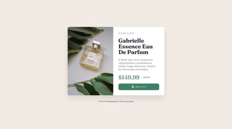
News-Letter Sign In with Success Message using React, SASS/SCSS
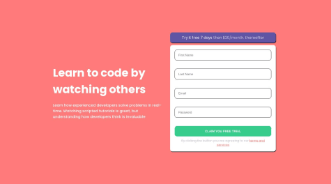
#react#sass/scssSubmitted almost 2 years agoBase Apparel Coming Soon Master using HTML, CSS and JavaScript
#react#sass/scssSubmitted almost 2 years agoIntro Component with Signup Form using HTML, CSS and JavaScript
#sass/scssSubmitted almost 2 years ago
Latest comments
- @ZubairAbid101
Hello!!! 👋
Congratulations on completing the challenge! 🎉
There are some things that you can improve in the code,
- Instead of using the
<section>element, use the<main>element instead since the<section>element is preferably used when there are multiple sections on a single webpage. Since this is a simple design with only one component a<main>element will suffice. - Give the
<body>element amin-height: 100vh. This will cause thealign-item: centerandjustify-content: centerto work properly making the component be at the center dynamically. - Another change that can be made is that for mobile layout don't give the
<body>element a fixed width. Instead set the<section>element to a width relative to the viewport size by doingwidth: 90vw. Also don't specify the height of the<body>element as a fixed value instead let the component occupy as much height as it needs to.
I hope you find this comment helpful! 🙂
Did you know that there's a mark as helpful and an up-vote option? 🤔
There's even a Follow button!!! 😁
Happy Coding!!! 💻
Marked as helpful - Instead of using the
- @lawalOyinlola@ZubairAbid101
Hello!!! 👋
Congratulations on completing the challenge! 🎉
There are some things that you can improve in the code,
- I viewed your GitHub. It seems like your creating multiple projects in the same repository. GitHub does not work quite like a folder management entity. Simply put each project needs to be in a separate repository. You cannot simply put other repositories as sub folders of another repository. You CAN, but try not to.
- The outer most
<div>component is not necessary. You can simply remove it. The<main>element should be the direct child of the<body>element. - Try using JavaScript to dynamically change the
srcpath for the<img>element using event handles. Your mobile design looks good. - To make the image responsive create a
divelement for the image in question. Give it awidthproperty and then set the<img>element towidth: 100%andheight: 100%.
I hope you find this comment helpful! 🙂
Did you know that there's a mark as helpful and an up-vote option? 🤔
There's even a Follow button!!! 😁
Happy Coding!!! 💻
Marked as helpful - P@Kamania@ZubairAbid101
Hello!!! 👋
Congratulations on completing the challenge! 🎉
There are some things that you can improve in the code,
- I noticed that you used the same styling for the
<html>and the<body>element in your CSS file. I advise removing the<html>tag from your styling as this will not change the appearance of the design. - Try using the prescribed image given for each viewport. A simple way to do this is to create two
<img>elements, one for the desktop and other for the mobile design. Set thedisplay: nonefor the mobile design as default. Then using media queries set it todisplay: blockfor the mobile design at the appropriate size. - Instead of creating a single media query, try making separate media queries inside each individual element in your CSS file.
- Try using
min-height: 100vhon the<body>element. This will give you more control over how the document behaves provided the height gets larger than100vh
I hope you find this comment helpful! 🙂
Did you know that there's a mark as helpful and an up-vote option? 🤔
There's even a Follow button!!! 😁
Happy Coding!!! 💻
Marked as helpful - I noticed that you used the same styling for the
- @lastiwan89@ZubairAbid101
Hello!!!
Congratulations on completing the challenge!
There are some things that you can improve in the code,
- It seems that the
<img>element does not appear for layouts between the desktop and mobile layout. I advise creating two<img>elements, one for desktop and the other for mobile design. Then set thedisplay: nonefor the mobile<img>element. Using media queries set thedisplay: blockwhen the screen size is that for a mobile layout. - Try to use media queries within each element rather than creating a singular media query for all the elements.
- Rather than using
height: 100vhtry usingmin-height: 100vh. - CSS Grid is a good way to format the layout so to speak but for single column or single row layouts try using display
display: flex
I hope you find this comment helpful!
Did you know that there's a mark as helpful and an up-vote option?
There's even a Follow button!!!
Happy Coding!!!
Marked as helpful - It seems that the
- @Lifewithmuskan@ZubairAbid101
Hello!!!
Congratulations on completing the challenge!
There are some things that you can improve in the code,
- An efficient way to dynamically center elements is to use
display: flex,justify-content: center,align-items:center. - Another way to do this is to assign the element in question a specific
widthandheightvalue and then usemargin: auto auto. - The background color for the
bodyelement is not correct. To keep the design as close as possible to the original use thestyle-guide.mdfile given to you. - You may notice that the font style for the design and that of your project do not match. Use Google Fonts and the
<link>tag alongside thefont-familyCSS property to match the font style with the design.
I hope you find this comment helpful!
Did you know that there's a mark as helpful and an up-vote option?
There's even a Follow button!!!
Happy Coding!!!
- An efficient way to dynamically center elements is to use
- @azzariprem@ZubairAbid101
Hello!!!
Congratulations on completing the challenge!
There are some things that you can improve in the code,
- To write custom styles I would recommend using a separate stylesheet dedicated to your CSS. To do this simply create a
styles.cssand then use a<link>tag to connect your HTML to the CSS stylesheet. - Another key feature is to use Semantic HTML. Though this project is short and does not necessarily require semantics it would be best practice to still implement it. To do this use HTML tags like
<main>,<header>,<footer>,<section>to name a few. - I would also recommend using a custom README.md file on your GitHub as this would better help other developers in understanding the purpose of your code.
I hope you find this comment helpful!
Did you know that there's a mark as helpful and an up-vote option?
There's even a Follow button!!!
Happy Coding!!!
- To write custom styles I would recommend using a separate stylesheet dedicated to your CSS. To do this simply create a