
@asad1001

accama muhammad
@accamamuhammadAll comments
- @accamamuhammad
you do not need to create a new project for the mobile design. you should go and watch the a video on youtube on responsive web design to understand it more
Marked as helpful - @rajendra2708578@accamamuhammad
Nice try at the design but you should not; 1.use specific height for main container it is better practice to use
height: fit-contentthen usepadding:to create spacing around keep in mind if your not usingbox-sizing: border-boxit will create extra spacing around the container. 2. if your not sure which colour to use there is a website called colour finder here is a link to it color finder when you visit the website drag and drop the design image provided to you by frontend mentor and click on the place you want to know the colour of and then copy the hex value of the colour to use in your css. 3.And dont forget to addborder: radiusto the image and the main container tag. - @MonstersInc-sudo@accamamuhammad
Nice design, it seems like someone has alreadt answered the question, but when your going for a laptop-first design you should put all the media queries in descending order but when your going for a mobile-first design you should put all the media queries in ascending order.
- @Zee-Here@accamamuhammad
Amazing design but i found some issues which are the following; 1.Use flex direction column on the body tag to move the attribute tag to the bottom 2.To make your design responsive use media queries learn more about them on youtube i would recommend kevin powell 3.Use align-items when using display: flex to align items straight to make your work look more professional
- @Kaung-Thant-Soe@accamamuhammad
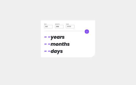
works perfectly but the `border radius at the bottom right should be more to match the design and the year, month and day should align to the left and their font sizes should be bigger
Marked as helpful - @acimThapa23@accamamuhammad
Nice shot at the main design but your not quite there.
1.To center the container use body{
width: 100%;,height: 100vh;,display: flex;align-items: center;justify-content: center;}2.To Achieve the two elemet side by side in but one having a borde and not affecting the other. -Create a div and sets its background to white and then create two div inside the div that you created inital then make the background of the first div the purple shade and sets its border radius to the right size and make the background color of the seond div inside the main div white.
- @MundiaNderi@accamamuhammad
Amazing design love the animations but instead of using a fixed height for the main component it is better to use padding, and the border-radius on you containers changes to 0 at 755px.
Marked as helpful - @ARMANIE4L@accamamuhammad
Wonderful design, but watch out for the
bottom-right-border-radius:. The component's width is smaller than it should be, and the age calculator doesn't seem to work correctly. I would advise using an api, but you can do that later as you start learning about apis. - @bhaskrr@accamamuhammad
Nice solution, however I noticed a few problems with it. These are the issues and their fixes.
1.The attribute should not be in the blog preview card it should be outside at the bottom of the page: To fix this remove the attribute div and place it outside then set it
position: absolutethenbottom: 0andposition: relativeon the preview card container to fix this.2.Use media Queries to apply style for different screen sizes learn more about them on youtube
3.Do not separate your paragraphs use
text-wrap: wrap;to make it change based on screen size4.USe the proper Font-weight for different texts based on designs
Marked as helpful - @Siphixx@accamamuhammad
Hi, Nice design
- Add line-height to p tag of 1rem - 1.5rem based on font-size to create space between line of text
- Use media Queries to make the design responsive for multiple screen sizes. i would recommend this youtube video: https://youtu.be/2KL-z9A56SQ?si=bWFCfd-OsPDze8mi
- @ZendeAditya@accamamuhammad
indian:
नमस्ते, बढ़िया डिज़ाइन लेकिन
- आपको डिज़ाइन छवियों में दिए गए टेक्स्ट का उपयोग करना चाहिए क्योंकि इससे स्टाइल करना आसान हो जाएगा और यह वास्तविक डिज़ाइन जैसा दिखने लगेगा।
- डिज़ाइन से मेल खाने के लिए मुख्य कंटेनर और छवि कंटेनर में बॉर्डर-त्रिज्या जोड़ें। *मेरा पेज चेकआउट करें, वहां आपको यह प्रोजेक्ट मिलेगा।
english:
hi, nice design but
- You should use the text given in the design images as this will make it easier to style and make it look like the actual design.
- Add border-radius to the main container and image container to match the design. *Checkout my page, there you will find this project.
- @Tech-Rocket@accamamuhammad
Hello, Nice design but i would recommend scaling down your projects size to make it easier to work with and you should reduce the padding between the text and its container. And you should position the attribute at the bottom, reduce its font and also add the link to your github as the location of the link.
- @Desheye@accamamuhammad
Your solution does not match the actual design.
-
Add padding to create spacing around the image and the text container.
-
Make sure the colours match the one on the design
-
Add border-radius to the image and the main container
-
Add the proper font specified in the style.md file in the folder
-
And your items are not aligned properly.
-
Here is an amazing course from FreeCodeCamp that will definitely help you with CSS: https://youtu.be/1Rs2ND1ryYc?si=ODYtC-raGfKbdVKx
-
- @Olokoburnfire@accamamuhammad
i was able to use javascript to toggle the text on and off: here's how i did it: HTML:
<div class="toggle" id="main"> <h3>What is Frontend Mentor, and how will it help me?</h3><img src="/assets/images/icon-minus.svg" alt="" id="toggle-minus" /> <img src="/assets/images/icon-plus.svg" alt="" id="toggle-plus" /> </div> <p id="display-text"> Frontend Mentor offers realistic coding challenges to help developers improve their frontend coding skills with projects in HTML, CSS, and JavaScript. It's suitable for all levels and ideal for portfolio building </p>JAVASCRIPT: const toggleMinus = document.getElementById("toggle-minus");
const togglePlus = document.getElementById("toggle-plus");
const displayText = document.getElementById("display-text");
const mainContainer = document.getElementById("main");
togglePlus.style.display = "none";
toggleMinus.addEventListener("click", () => { mainContainer.style.marginBottom = "15px";
displayText.style.display = "none";
togglePlus.style.display = "block";
toggleMinus.style.display = "none";
}); togglePlus.addEventListener("click", () => { mainContainer.style.marginBottom = "5px";
displayText.style.display = "block";
toggleMinus.style.display = "block";
togglePlus.style.display = "none"; });
- @Venktesh-Kaviarasan@accamamuhammad
use: HTML: use the code in your html body
<div class="container"> <div class="box"></div> </div>CSS: use the code in your css file
.container { width: 100%; height: 100vh; display: flex; align-items: center; justify-content: center; }
This will place the box at the center but add width and height of for the box based on what you are trying to build.
- @RoosterRoo@accamamuhammad
- The image and the other container (text container have the same height and width)
- Use padding to make your content look better
- Use *{margin: 0, padding: 0 } (to remove all preset margins and paddings)
- Use row gap to instead of margin to space horizontally placed elements equally
- justify-content works with "display: flex"
- Use "Position: absolute" & "bottom: 0" to place attribution at the bottom
Marked as helpful