


@gaurangsaini01
Latest solutions
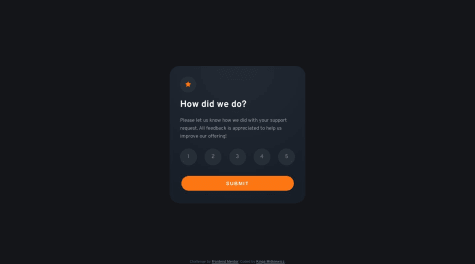
Interactive rating component
#accessibility#progressive-enhancement#styled-components#web-componentsSubmitted almost 2 years agoProduct preview card component
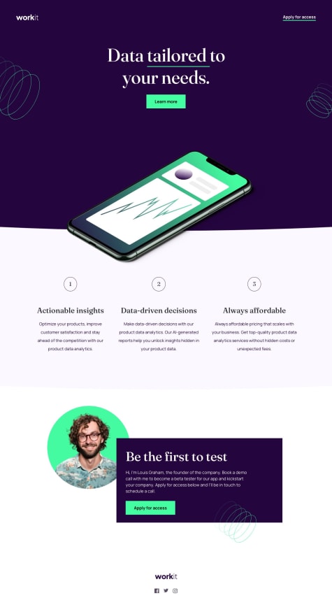
#accessibility#bootstrap#web-components#styled-componentsSubmitted about 2 years ago
Latest comments
- @codingbeary
Hi! Great work!
I have a few tips how you can improve this project :)
- You can put the attribution into a footer for better semantics (it help screen readers, search engines etc understand your website better, because the div itself doesn't have any semantic value)
- You're using different font that the one in the design, but you can fix it by finding this particular font on google fonts (you can find it's name in the starter pack in a file called "style guide"). If you have troubles with importing the font, let me know, I'll help you do it :)
In general you did a really great work, keep it up! I hope my tips were helpful! :)
Marked as helpful - @Levi-ikechukwu@codingbeary
Hi! You did great! :) I have a few tips for you how you can improve this project:
- You can use exactly the same background colour as the one in the design by using colour picker or you can find this value in the starter code itself in a file called "style guide" (or something similar, I don't remember exactly, but if you have trouble finding it let me know, I'll check it for you :)
- To center your project perfectly you can use: body{ display: flex; justify-content: center; align-items: center; min-height:100vh; }
- I can see you have a bit too much white space on the bottom of the card, but you can fix it by removing height: 70vh. from your container
- Remember about using semantic tags like <header> <main> etc. for better accessibility. You can find all information about semantic HTML here: https://www.w3schools.com/html/html5_semantic_elements.asp It's important to use proper semantics in HTML to make sure search engines and screen readers don't have problem with understanding the contents of your page. :)
I hope those tips were helpful :) Great work btw, keep it up! :)
Marked as helpful - @abelkm99@codingbeary
Hi! :) Your solution looks great, but I have a few suggestions :)
- Remember your HTML should be semantic which means it should have <main> section and a <footer> so it's easier to read by the browser and therefore is accessible to more people. :)
- I think you didn't add shadow boxes to the button and to the card itself so keep in mind to follow the design as close as possible :)
Overall your solution looks great! Keep coding :) I hope you find those tips helpful :)
- @AlexMercer4@codingbeary
Hi! :) The solution looks great but I would recommend improving a few things.
- Accessibility - you should add <main> section and <footer> so browsers can read your code better. Read about semantics in HTML :)
- To center the app perfectly you can wrap it into container and then from CSS add .container { display: flex; justify-content: center; align-items: center; min-height: 100vh; }
- Best practice is to write your HTML and CSS in separate files so keep that in mind :)
- In terms of responsiveness there is nothing to work with in this project because it's small by default
- I think you're using different font so remember to import fonts you want to use into your HTML :)
I hope those tips were helpful :)
Marked as helpful


