@kamiliano1

Link Sharing App, Firebase, React Hook Form, Radix-UI, dnd-kit
#firebase#next#react#tailwind-css#typescript

Hello, Kamil! 👋
Congratulations on finishing the challenge! The result looks fantastic, responds well, and it works just as expected.
Hello, dejuliansr! 👋
Congratulations on finishing the challenge! Your solution responds quite well, looks nice, and the form works as expected 👏
Hello, Sophia! 👋
Congratulations on finishing the challenge! The result looks fantastic, responds well, and it works just as expected.
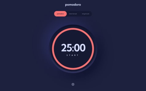
My only suggestion is to use:
font-variant-numeric: tabular-nums;
With the numbers in the timer to make the numbers move around less.
Happy coding! 💻
I am proud of ho this project came together and how it is essentially a full stack app using all modern tools such as Vite, Typescript, React, react-testing and tailwind.
What I would do differently however, is to use a state management tool such as Context API or Redux to manage the state for comments and replies in this project.
What challenges did you encounter, and how did you overcome them?Faced challenges with storing data and state management. I have faced a bit of prop drilling and also saving the current state to local storage to make the project feel more complete.
How I overcame them is just trial and error along with perseverance
What specific areas of your project would you like help with?How to get the users' username when replying to them in the comments. I could probably get it to work one day but I want to move onto to other projects.
Hello, Toba! 👋
Congratulations on finishing the challenge! Your solution responds quite well, looks nice, and the app works as expected 👏
Hello, Sipang! 👋
Congratulations on finishing another challenge! Your solution responds quite well, looks nice, and the app works as expected 👏
Honestly, I was struggling a lot with my first approach with API data and infinite pagination. This one is simpler and was much easier to create.
Hello, Bartosz! 👋
Congratulations on finishing another challenge! Your solution responds quite well, looks nice, and works as expected 👏
I am happy that the app works but I would definitely build it in simpler and cleaner way next time.
The game board does not perfect on all screen sizes I would use flex instead of grid layout.
What challenges did you encounter, and how did you overcome them?I decided to use useReducer and Context API to game state management. It caused me such a headache to satisfy TypeScript.
Hello, Bartosz! 👋
Congratulations on finishing another challenge! Your solution responds quite well, looks nice, and the game works as expected 👏
Hello, Marc! 👋
Congratulations on finishing another challenge! Your solution responds quite well, looks nice, and the website works as expected 👏
Hello, ferlaxi! 👋
Congratulations on finishing another challenge! Your solution responds quite well, looks fantastic, and I love the smooth animations! 👏
Hello, WilliamLop! 👋
Congratulations on finishing another challenge! Your solution responds quite well, looks nice, and the app works as expected 👏
Hello, Marc! 👋
Congratulations on finishing another challenge! Your solution responds quite well, looks nice, and the website works as expected 👏
Hello, Gakii! 👋
Congratulations on finishing another challenge! Good attempt. App is mostly working as expected. I've made a few observations that might interest you:
cursor: pointer on buttons, labels & radio elements for accessibilityinputmode="numeric" and type="text" on the input elementHappy coding. 💻
Dan
any feedback is greatly appreciated
Hello, azzykesuma! 👋
Congratulations on finishing another challenge! Your solution responds quite well, looks nice, and the app works as expected 👏
Hello, Koen! 👋
Congratulations on finishing another challenge! Your solution responds quite well, looks nice, and the app works as expected 👏
I'm getting more and more comfortable building responsive layouts. In particular with Grid. I used to nearly exclusively work with Flexbox to lay things out because I was somewhat overwhelmed with Grid. But I'm finding myself using Grid more often.
I used shadcn/ui to implement the modal for order confirmation. It was quite handy to work with because you have a lot of freedom to adjust that component to your needs. It took some getting used to, though. But in the end I kind of regretted using it and not building that component completely on my own. I probably would've learnt a bit more which is why we're doing these projects in the first place. In general I still have a bit of trouble deciding when to go with existing solutions/components and when to reinvent the wheel so to speak.
What challenges did you encounter, and how did you overcome them?I learnt the hard way to push my progress to GitHub more often because my laptop broke down in the middle of this project and quite a lot of work was lost with it. That probably won't happen to me again.
I also had a bit of trouble setting up Vitest & React Testing Library, configuring things etc. Sometimes I tend to get impatient instead of taking a step back and reading the documentation fully to grasp how things are working together. I wanted to use some ESlint plugins for Vitest and React Testing Library but because of recent updates I didn't get them to work properly.
I'm still not that experienced in testing, so I had some difficulties figuring out what elements to query and how to validate their (non-)existence. In particular. I learnt to use the within() method to limit the scope of the query which helped a great deal (e.g. querying only the content of a specific list). I still have to learn a lot and I'll definitely check out the "Introduction to front-end testing" career path after this one. I also wasn't sure if I should test for keyboard-navigation as well because that would mean quite a lot of duplication of tests and I primarily wanted to test that the interactions are working as expected.
What specific areas of your project would you like help with?I'm not really satisfied with the animation-side of things in this project. There are some transitions in there (e.g. for borders, colors etc.) but also some are missing. The different buttons for adding an item to the cart and selecting the quantity of an item have no transition when they are appearing / disappearing. I probably could've added an animation library to smooth things out but I thought it would be somewhat of an overkill for this project. But I definitely have to refine my skills in that department.
Also I didn't get to auto-focus certain elements for keyboard-navigation. I got it to work when the user adds an element to the cart, so that the focus is automatically on one of the buttons to adjust the quantity. But it doesn't work the other way around. When a user decreases the quantity to 0 using the 'Enter' key, the "add-to-cart" button is being rendered but not automatically in the focus. Instead the user has to press "tab" to focus the button again. I'm also not sure if its good practice to use auto-focus in these circumstances of if keyboard-users are expecting to press "tab" regardless.
Hello, Michael! 👋
Congratulations on finishing another challenge! Your solution responds quite well, looks nice, and the app works as expected 👏
Hello there. Good job on completing the challenge! 👏
I've made a few observations that might interest you:
max-w- and w-full instead of w-1/2 etc.Happy coding. 💻
Dan
Hello, AdamullaOsas! 👋
Congratulations on finishing another challenge! Your solution responds quite well, looks nice, and the calculator works as expected 👏
Hello there. Congratulations on finishing another challenge! Your solution responds quite well and looks nice 👏
I've made one observation that might interest you:
Happy coding. 💻
Dan