


@FavourEzuzu
Latest solutions
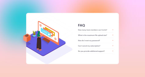
Responsive FAQ Accordion with HTML5, CSS & JS
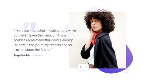
#accessibility#animation#sass/scssSubmitted over 2 years agoResponsive Testimonials Slider with HTML5, CSS & JavaScript
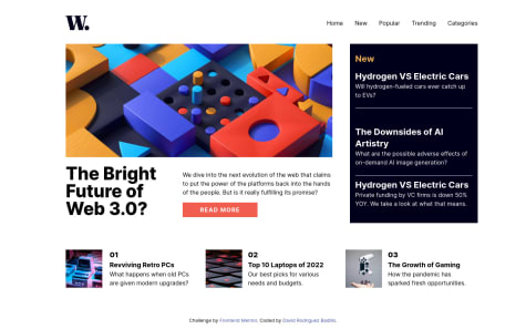
#accessibility#sass/scss#jssSubmitted over 2 years agoNews Hompage with HTML5 & Tailwind-CSS
#accessibility#sass/scss#tailwind-cssSubmitted over 2 years agoResponsive Tip Calculator With HTML5, Bootstrap & JS Vanilla
#bootstrap#jss#vanilla-extractSubmitted over 2 years ago
Latest comments
- @davidFreelance19
Hello developer.
Congratulations on completing this challenge.I've seen your code and thought I could give you some improvements:
Body {
       height: 100wh;
       flexible screen;
       bending direction: column;
       justify-content: center;
       align elements: center;
}
.attribution{
       align elements: end;
       height: 10%;
       flexible screen;
}
Now some recommendations:
- I recommend that you check the
background image propertyas this would save you from putting the two images in your container and only changing the value of this property given a breakpoint - Always put an alternative text (alt) on your images, this helps to have a better SEO
- Learn and research a little more about
display flexanddisplay grid, we don't always have to use a margin or padding to generate positioning.
I hope these comments help you, see you later!
David Rodriguez
Marked as helpful - I recommend that you check the
- @lynamara@davidFreelance19
Hello developer!First I would like to congratulate you for completing this challenge! I have seen your code and I bring you some options to improve it:
body{
     display: flex;
     width: 100%;
     height: 100vh;
     position:relative;
     align-items: center;
     justify-content: center;
}
.cartao{
   edge: 0;
}
.conteudo{
   width: 90%;
   margin: 0 auto;
}
.attribution{
     position: absolute;
     bottom: 5%;
     right: 35%;
}
I would also like to give you some advice: -Do some research on what HTML grouping tags are (We don't always have to use
<div></div>to group information)-Better learn display flex and *display grid. This will help you generate a responsive design in a better way, since you will be using its positioning properties.
-Learn some methodology like BEM or Utilities
David Rodriguez
Marked as helpful - @Remy349@davidFreelance19
Hello developer. I want to congratulate you on the good job you just did!
Regarding your comment, I would recommend that you do some research and learn a bit more about the properties of
display flexanddisplay grid. Within these themes, there are positions by group and by element. An alternative that could solve the positioning of the star and testimonial divs is to apply an align-self to each element and tell it if it is going to have analign-self: start, align-self: center or align-self: endand with this alternative it would be aligning the elements with respect to the parent div (This way is a better practice than applying a transform)Believe me that by mastering these themes you will already have 50% mastered CSS
David Rodriguez
Marked as helpful - @maulanafadilah@davidFreelance19
Hello developer. I want to congratulate you on the good job you just did! Now tailwind is an excellent library and on creating responsive layouts I give you the following tips:
- First, thoroughly master breakpoint topics, because Tailwind gives you that syntax to be able to apply properties to an element at the breakpoint you indicate
-Allows you to also generate an auxiliary style sheet, since designs often need
widths, heights, padding, margins, etc., whose values are not available in tailwind. So have the confidence to combine all the tools the library gives you and your CSS skills too and trust me you will have the world of CSS in your hands!David Rodriguez
- @guimar86@davidFreelance19
Hello developer!
First I would like to congratulate you on finishing this challenge successfully. Your design is amazing! I've brought some fixes to your code to make the desktop layout a bit more similar:
body {
       overflow-y: hidden;
       background repeat: no repeat;
}
.container{
       max height: 100wh;
}
.row .col5{
       flexible screen;
       bending direction: column;
       justify-content: center;
}
.btn{
       width: 40%;
       text alignment: center;
       padding: 1 rem 0;
}
I would recommend you review the positioning themes, believe me they will be of great help to generate a design much faster.
Now, I have seen that you have used Bootstrap and I congratulate you for venturing, but do a little more research on the subject and you will realize that there is what is known as custom and this will help you combine the tools of the library with your css skills !
David Rodriguez
Marked as helpful - @faheem4545@davidFreelance19
Hello developer! I have seen your code and want to congratulate you for completing this challenge. I'm also bringing you some improvements to your code to improve the design layout a bit (desktop only)
body{
    width: 100%;
    height: 100vh;
    background-repeat: no-repeat;
    background-size: cover;
    padding: 2rem 1rem;
    align-items: center;
    justify-content: center;
    display: flex;
}
.logo{
    margin-top: 0;
    position: absolute;
    top: 0;
    left: 0;
    padding: 3rem;
}
.hero-text, .hero-img{
    display: flex;
    justify-content: center;
}
.hero-text{
    flex-direction: column;
}
.btn{
       width: 35%;
}
.icons{
    margin: 0 auto;
    padding-left: -2rem;
    position: absolute;
    right: 0;
    left: 0;
}
I recommend you study a little more about display flex and display grid, this will help you generate a more organized and maintainable code. Also we don't always have to use margin or padding to make a similar design, believe me that with these two themes you will be able to generate responsive designs and create a pixel perfect!
David Rodriguez
Marked as helpful