Latest solutions
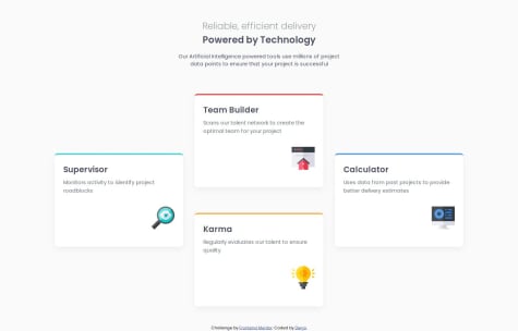
Responsive card layout using CSS Grid, Flexbox, and semantic HTML
Submitted about 1 month agoAny suggestions on advanced CSS techniques for responsive typography and layout flexibility would be very helpful.
QR code card using Flexbox and custom CSS
Submitted about 1 month agoMy biggest challenge was naming classes and keeping the structure organized. I also wasn’t sure whether to use <main> instead of a <div> for the main content.
Latest comments
- @Stif351@diegobezerra80
Your solution is really impressive! The way you organized the CSS variables for colors and typography shows great attention to scalability and design consistency. Also, your use of CSS Grid and media queries to create a fully responsive layout works really well across different screen sizes. Great job on balancing aesthetics with clean code! Keep up the excellent work. 🙌
- @julianchoripan@diegobezerra80
Great job on this challenge! The layout is clean, well-structured, and responsive. I really like your use of CSS variables and how you organized your code—it's easy to read and maintain. The card component design looks great across different screen sizes. Keep up the awesome work—you're definitely on the right track!
- @Stif351@diegobezerra80
The code is clean and well-structured, with meaningful and semantic class names like
.product,.main-img, and.btn, which make it easy to understand and maintain.
Good job! 👍


