
@benjach

Fernando Pérez
@fermopAll comments
- @fermop
Hi benjach, how are you?
I can see that the image is not showing because the value into the src attribute. It can be fixed by adding the following:
<img src="./images/image-qr-code.png" alt="codigo Qr">The
qr-code-component-mainfolder is the root of your project and yourindex.htmlis looking for an image into a folder of the root directory. Hope it helps! 😄Marked as helpful - @matteoprendi@fermop
Hi Matteo, how are you?
Answering to your question, you can get rid of that white space by doing the following:
.product-showcase {
  width: 100%;
  display: block;     <--
}
The img tag has a
display: inlineby default, which adds that white space.Suggestions
- You have one accessibility report and it's because your
imgtag doesn't have analtattribute. Images must have alt text unless it is a decorative image, for any decorative image eachimgtag must have emptyalt="". - I highly recomend you to always use rem, this way your page will always be responsive to any user's settings. There's a VS Code extension that converts px to rem and viceversa by tapping
alt+z. The extension is px to rem by Marco N.
The rest looks great! 🎉
Hope it helps! any questions feel free to answer this comment. :)
Marked as helpful - You have one accessibility report and it's because your
- @subhashishdutta@fermop
Hi Subhashish, how are you?
Answering to your question you can center the card by doing the following:
body {
  background-color: hsl(212, 45%, 89%);
  font-family: 'Outfit';
  text-align: center;

  min-height: 100vh;
  display: flex;
  justify-content: center;
  align-items: center;
}
If you are going to add the footer you have to add
flex-direction: column;, this way your boxes are aligned from top to bottom.Hope it helps! any questions feel free to answer this comment. :)
Marked as helpful - @immachuks7@fermop
Hi Machuks, how are you?
Answering to your question you can make the triangle by doing the following:
HTML
        <div class="card__socials">
          <p class="card__socials__text">Share</p>

          <img>
          <img>
          <img>

          <div class="triangle"></div>
        </div>
CSS
  .card__socials {
    position: absolute;
    display: flex;
    justify-content: center;
    align-items: center;
  }
@media(min-width: 887px) {
  .triangle {
    width: 1.125rem;
    height: 1.125rem;
    background-color: hsl(217, 19%, 35%);
    transform: rotate(45deg);
    position: absolute;
    bottom: -0.5rem;
  }
}
In this code, the container of the socials has a
position: absoluteand css flex withjustify-content: center;. If any of its children has aposition: absoluteit will be positioned according to its parent's properties, in this case, it'll be centered because of css flex and positioned to it because of its parent's position property.The triangle is because if you make a rotated square 45 degres with 18px width and height you'll have like a diamond shape, you'll only need to position it with the
bottomproperty to make from its half part to top disappear. It's important to point out that it has to be styled on a media querie on responsive design, this way it will not be visible at mobile design.Hope it helps, feel free to see my solution to understand better this part, any question we can get in touch!
Marked as helpful - @akash4102@fermop
Hi Akash, how are you?
I really liked the result of your project, but I have one tip that I think you will like:
I noticed that the discount price doesn't have the line-through just as the design has, to fix this we can do the following:
.price-2{
    position: absolute;
    color: gray;
    padding-top: 13px;
    𝘁𝗲𝘅𝘁-𝗱𝗲𝗰𝗼𝗿𝗮𝘁𝗶𝗼𝗻: 𝗹𝗶𝗻𝗲-𝘁𝗵𝗿𝗼𝘂𝗴𝗵;
}
The rest is great!!
Hope it helps 😄
Marked as helpful - @nevercanon@fermop
Hi Ari, you did a good job! your page looks so good.
As Hassia said, give the body a
background-sizeofcontain. To be honest, I can't understand the differences betweencontainandcoverbut remember that fortunately the documentation is in the MDN page. Here's the link if you'd like to chek it out!I noticed that the card is not centered at higher resolutions and the background is not positioned, to fix these things we can do the following:
body {
/* Positioning the background */
    background-size: 100% 50vmin;

/* Centering the card */
    display: flex;
    flex-direction: column;
    align-items: center;
    justify-content: center;
    min-height: 100vh;
}
.card {
    margin: 0;
}
.attribution {
    margin-top: 3rem;
}
There is an accessibility report due to semantic html elements. Instead of using a
divon your footer, try to use thefooterelement so it'll be easier for a screen reader to see the different parts of the page.I see that you are using px instead of rem. I highly recommend you to use rem because if the user has the size of their font smaller or larger your page would be the same. Here are two videos that explain it better:
If you have any questions feel free to send me a message or answer this comment. I hope it helps!
Marked as helpful - @tylermunn@fermop
Hi Tyler, first of all you did a good job! your page looks so good. Answering to your question, you can unlock de pro membership, that way you'll have access to Sketch and Figma files where you can see the exacly size you'll need to build a proyect.
I see that you have some accessibility reports and I have some suggestions for you:
- One of them is that you are not using semantic html elements. In this case, it requires the
mainelement (where the main content of your page should be) instead of adiv. - It says that your page should contain a level-one heading. I see that in your html you are using an
h2instead of anh1, remember that every page should contain at least a level-one heading. - Another one is that the QR Code image doesn't have an alternative text and it's best practice to have one just in case the image didn't show on your page. e.g.:
<img class="qr-img" src="images/image-qr-code.png" 𝗮𝗹𝘁="𝗤𝗥 𝗰𝗼𝗱𝗲">- I see that you are using px instead of rem. I highly recommend you to use rem because if the user has the size of their font smaller or larger your page would be the same. Here are two videos that explain it better:
If you have any questions feel free to send me a message or answer this comment. I hope it helps!
- One of them is that you are not using semantic html elements. In this case, it requires the
- @ianbuen@fermop
Hi Ian! You did a really good job! your page looks cool on mobile and desktop devices.
I have some suggestions for you:
- You have some accessibility reports because you are using a
divinstead of semantic html elements such asmain(where the main content of your page should be in). - It looks like there's another accessibility report due to the browser doesn't know if you have a
footerinside thebodyof your page. Although you have afooter, it doesn't recognize it because you have yourfooterout of yourbody:
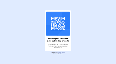
<body> <div class="card"> <img class="qr" src="./images/image-qr-code.png" alt="" /> <h1>Improve your front-end skills by building projects</h1> <p>Scan the QR code to visit Frontend Mentor and take your coding skills to the next level</p> </div> </𝗯𝗼𝗱𝘆> <--- <𝗳𝗼𝗼𝘁𝗲𝗿> <--- <div class="attribution"> <div>Challenge by <a href="https://www.frontendmentor.io?ref=challenge" target="_blank">Frontend Mentor</a></div> <div>Coded by <a href="https://www.frontendmentor.io/profile/ianbuen">@ianbuen</a></div> </div> </footer>- I highly recommend you to use rem instead of px in the css. Browsers have a default size which is 16px equals to 1rem but what if the user has their personalized font-size to large instead of medium? your page would be the same although the font-size is set as large. Here are two YouTube videos where it is explained better.
If you have any questions feel free to send me a message or answer this comment. I hope it helps!
Marked as helpful - You have some accessibility reports because you are using a
- @uspaz@fermop
Hola Matias! Excelente trabajo, tu página es responsiva para dispositivos móviles y en desktop.
Veo que al momento de tener un móvil en horizontal en tu página no se puede deslizar hacia abajo para ver todo el contenido. Este problema me pasó a mí cuando realicé este proyecto y lo pude solucionar poniéndole un min-height con pixeles al body, ya que el container que tiene el card es más grande que el height de un celular en horizontal y esto no incrementa de tamaño al body debido a que tiene asignado el 100vh. (no estoy muy seguro de que sea por esto, pero si alguien puede corregirme se lo agradecería muchísimo jaja)
También veo que en tu párrafo usas pixeles en su font-size. Te recomiendo usar rems, usualmente tienen un tamaño de 16px, usando rems permitirá que el tamaño de tus textos sea más responsivo en cada dispositivo, ya que no todas las personas tienen configurada el mismo tamaño de fuente. Este video explica muy bien los ems y rems: https://www.youtube.com/watch?v=_-aDOAMmDHI
Por otra parte, veo que en el apartado de reportes te sugiere usar elementos semánticos tales como main y footer, estos no son de gran impacto para el usuario pero sí para leer el código y ubicar más fácil las secciones de nuestra página. Y por último veo que te sugieren utilizar un h1 ya que estás utilizando un h3. Recuerda que las páginas solamente pueden tener un h1 ya que este es el título de toda la página, después los subtítulos (h2), luego subsubtítulos (h3) y así hasta llegar a h6.
De todas maneras hiciste un excelente trabajo, te ha quedado muy bien el proyecto!! saludos Matias :)
Marked as helpful