


@d4ndres
Submitted
Looking to hire developers?
@garcialexco
@d4ndres
Submitted
@garcialexco
Posted
Hello! Great job completing the challenge! 🔥
There's a couple parts of your code that I might be able to help with:
Hope this helps, and keep up the great work! 👍 Happy Coding!
Marked as helpful
@baarayy
Submitted
@garcialexco
Posted
Hello! Great job completing the challenge! 🔥
There's a couple parts of your code that I might be able to help with:
rem or em due to their scalability without breaking.Hope this helps, and keep up the great work! 👍 Happy Coding!
@Noneco01
Submitted
@garcialexco
Posted
Hello! Great job completing your first challenge! 🔥
There's a couple parts of your code that I might be able to help with:
Make sure to use semantic HTML, here's an article in the subject.
Link your fonts in the HTML head, it makes your page load just a bit faster.
Try to use classes instead of ID's wherever possible, ID's are reserved for when you are using JS to manipulate an element. Classes are ideal for styling because you are able to reuse them throughout your code.
Hope this helps, great job again on your first solution and keep up the great work! 👍 Happy Coding!
Marked as helpful
@SreeMouliChinta
Submitted
@garcialexco
Posted
Hello! Great job completing the challenge! 🔥
There's a couple parts of your code that I might be able to help with:
Make sure to use semantic HTML tags like the main, section, etc tags. Check out this article on the topic.
Also, be sure that you link fonts in the HTML head, it helps the page load faster.
If you are using CSS resets, I'd like to recommend normalize.css.
One last thing, use rem or em for unit sizes. They are scalable and are responsive on different screen sizes!
Hope this helps, and keep up the great work! 👍 Happy Coding!
Marked as helpful
@matheuspaixxao
Submitted
@garcialexco
Posted
Hello! Great job completing the challenge! 🔥
There's a couple parts of your code that I might be able to help with:
min-height: 100vh;
display: flex;
justify-content: center;
align-items: center;
Hope this helps, and keep up the great work! 👍 Happy Coding!
Marked as helpful
@gbspb
Submitted
@garcialexco
Posted
Hello! Great job completing the challenge! 🔥
There's a couple parts of your code that I might be able to help with:
dist to export your compiled CSS folders in.There is a channel on YouTube called CoderCoder that has a great video about Sass that breaks it down quite a bit!
Hope this helps, and keep up the great work! 👍 Happy Coding!
Marked as helpful
@epivanosilon
Submitted
I'm unhappy with the text spacing and with how the component shows up on mobile devices (it's not centered vertically). I also couldn't figure out a simple way to center the attribution text below the component. Any suggestions?
Edit: I've made some changes with @Hassiai's advice. Now the component is too big. I might cry. How do I resize it?
@garcialexco
Posted
Hello! Great job completing the challenge! 🔥
There's a couple parts of your code that I might be able to help with:
   position: absolute;
    top: 50%;
    left: 50%;
    transform: translate(-50%, -50%);
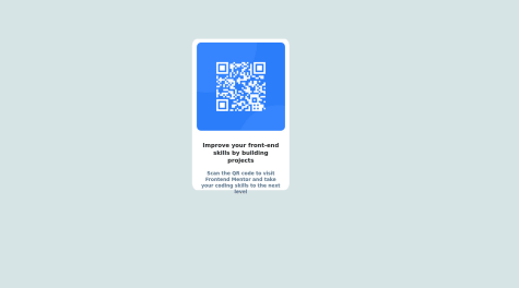
alt for your images, this will help screen readers and search engines! Example: alt="qr code"Hope this helps, and keep up the great work! 👍 Happy Coding!
@Noc662
Submitted
@garcialexco
Posted
Hello! Great job completing the challenge! 🔥
There's a couple parts of your code that I might be able to help with:
    position: absolute;
    top: 50%;
    left: 50%;
    transform: translate(-50%, -50%);
<div class="card"> and just put a class on main like: `<main class="main">'Hope this helps, and keep up the great work! 👍 Happy Coding!
Marked as helpful
@amcrochet3
Submitted
@garcialexco
Posted
Hello! Great job completing the challenge! 🔥
There's a couple parts of your code that I might be able to help with:
Make sure to use semantic HTML and use div sparingly. You can change <div class="container"> to <main class="main">. This will make your website more accessible to screen readers and search engines!
No need to use multiptle h1's, you can use headers in levels of importance. H1 being most important h2 second most etc. You can use p.
Also make sure to use classes instead of id's. Id's you'll only be able to apply that style once, whereas classes you can apply to different elements and they can be reused to cut down on redundant code.
Hope this helps, and keep up the great work! 👍 Happy Coding!
Marked as helpful
@ch4r4j4
Submitted
Any feedback will be very well accepted.
@garcialexco
Posted
Hello! Great job completing the challenge! 🔥
There's a couple parts of your code that I might be able to help with:
Make sure to link your fonts in the head of your HTML document, then assign as necessary in the CSS file. Decreases load times!
Instead of <div class="container">, make it sematic and put <main class="main"> this will make it easier for screen readers and search engines to access your website!
Hope this helps, and keep up the great work! 👍 Happy Coding!
Marked as helpful
@codeminex
Submitted
=> Areas where I felt difficult to build is to make the website view same as on desktop as well as mobile. Still I am not able to figure out how to get the desired look on Mobile devices.
@garcialexco
Posted
Hello! Great job completing the challenge! 🔥
There's a couple parts of your code that I might be able to help with:
    position: absolute;
    top: 50%;
    left: 50%;
    transform: translate(-50%, -50%);
em, rem, percentages etc. They are a lot more forgiving and not as exact as pixels when making it responsive!Hope this helps, and keep up the great work! 👍 Happy Coding!
@JohnPalmTree
Submitted
Still pretty new to front-end material, so any feedback would be appreciated!
@garcialexco
Posted
Hello! Great job completing the challenge! 🔥
There's a couple parts of your code that I might be able to help with:
It's best to link fonts in the HTML file, and then assign in CSS wherever necessary. This makes the page load a bit faster!
Centering things are super difficult , here's a tip to center an element in the middle of the page:
    position: absolute;
    top: 50%;
    left: 50%;
    transform: translate(-50%, -50%);
Hope this helps, and keep up the great work! 👍 Happy Coding!
Marked as helpful
@filafilafilafilafilafilafila
Submitted
this is my first independent project, I've only been learning frontend for a week, please be understanding))
@garcialexco
Posted
Hello! Great job completing the challenge! 🔥
There's a couple parts of your code that I might be able to help with:
https://dev.to/kenbellows/stop-using-so-many-divs-an-intro-to-semantic-html-3i9i
Hope this helps, and keep up the great work! 👍 Happy Coding!
Marked as helpful
I have just started to learn basic HTML and CSS so I'm trying to use what I've learnt early on.
This is the first project I've worked on so please any feedback would be most welcome and appreciated.
@garcialexco
Posted
Hello! Great job completing the challenge! 🔥
There's a couple parts of your code that I might be able to help with:
In your CSS, the style resets and defaults are a bit lengthy. You can get away with:
html {
    box-sizing: border-box;
    font-size: 100%;
    margin: 0;
    padding: 0;
}

*, *::before, *::after {
    box-sizing: inherit;
}
This will reset everything to where you are able to reasonably work with it as well as keeping file space low 👌
Hope this helps, and keep up the great work! 👍 Happy Coding!
@saketbyte
Submitted
I did not know how to give structure, or where to start. I found it difficult as I was am a beginner and I did not know about so many properties that I could adjust to achieve a certain look or appearance. I took help from youtube to learn. I hope to improve gradually. Hence taking help from internet and learning by building is my approach.
@garcialexco
Posted
Hello! Great job completing the challenge! 🔥
You did excellent for claiming to be a beginner! There's a couple parts of your code that I might be able to help with:
Hope this helps, and keep up the great work! 👍 Happy Coding!
Marked as helpful
@musanurbadr
Submitted
esponsive webpage with a stats preview card component. The page includes a head section with meta information, such as the character encoding, viewport, and links to external resources, such as Google fonts and a favicon.
The body of the page contains the main container div that holds the stats preview card component. The card has two sections, one with a background image and another with text. The text is divided into two sections: the main text section with a headline and a paragraph, and the status text section that displays three statuses with a number and a corresponding description.
At the bottom of the page, there is an attribution section with links to Frontend Mentor and the person who coded the solution. The style for the webpage is controlled by a separate CSS file linked in the head section of the HTML document.
@garcialexco
Posted
Hello! Great job completing the challenge! Theres a couple parts of your code that I might be able to help with.
HTML Try to stick with using semantic HTML wherever possible. For example, div should be used sparingly in favor of article, section etc. Here is an article about divs in regards to sematic HTML: https://www.freecodecamp.org/news/semantic-html-alternatives-to-using-divs/
It is usually best to link your fonts in the head of the HTML, then apply them wherever necessary in the CSS file. I've heard that it loads it loads faster!
CSS Good job with the positioning of the background and the circles. That one was a thinker for me.
Hope this helps, and keep up the great work! Happy Coding!
Marked as helpful
@KhadimHussain-99
Submitted
@garcialexco
Posted
Hello! Congrats on completing this challenge!
Your solution looks is perfect except for just a couple bits of redundant code. There's no need to add 'display: flex;', 'justify-content: center;' or 'text-align: center;' to your 'main' as you already did so in your 'body'.
Other than that, your solution is wonderful. Keep up the great work fellow coder!
Marked as helpful
@JackoWill
Submitted
What did you find difficult while building the project?
Which areas of your code are you unsure of?
Do you have any questions about best practices?
@garcialexco
Posted
Hello, congrats on completing this solution!
While I was working on this project, the biggest challenge I had was making it responsive as it was my first responsive project as well. Seems 'em',, 'rem' percentages or using anything scalable for your sizes makes it more accessible, and you definitely got that down pat. Your media queries look excellent!
Grid is a lot of fun, you definitely got the hang of it! The only thing I can see is that you have a couple redundant uses of 'display: grid' on lines 35 and 58 of your CSS. Since you already set it in your body, the rest of the elements should inherit it.
Great job! Here, take this interesting post on Reddit regarding CSS flex for your future coding adventures! https://www.reddit.com/r/webdev/comments/10ffo7a/css_flex_for_speed_learners/
Happy coding and great job on your solution!
Marked as helpful