Skip to content
  • Unlock Pro
  • Log in with GitHub
Profile
OverviewSolutions
12
Comments
10
Csaba Hell
@hellcsaba

All comments

  • Prem Kumar•370
    @prem-kumart
    Submitted 7 months ago
    What are you most proud of, and what would you do differently next time?

    Implementing react hooks for state management.

    What challenges did you encounter, and how did you overcome them?

    Challenge was to changes the images based on the viewport size. To overcome had to implement a custom hook which kept track of the viewport size.

    What specific areas of your project would you like help with?

    Better Code structuring and practices.
    Responsive Product Cart

    #react#tailwind-css
    1
    Csaba Hell•220
    @hellcsaba
    Posted 7 months ago

    Hi Prem Kumart,

    Nice solution! Your code is well-structured and easy to read. I'll provide my feedback for improvements that I saw relevant.

    • Your solution includes semantic HTML which is great. I think you could have use <section> tags as well (instead of <div>)
    • Instead of the custom hook for the proper images for the viewport size you can use the <picture> tag. It can handle the different images based on the condition (e.g. max-width or min-width)
    • It's better to use rem for images instead of pixels because they're more responsive

    I hope I could help with my feedback! Happy Coding! :)

  • P
    eMKa18•90
    @eMKa18
    Submitted over 1 year ago

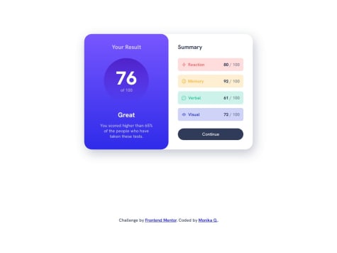
    Responsive results component using HTML, CSS and pure JS

    1
    Csaba Hell•220
    @hellcsaba
    Posted 9 months ago

    Hi eMKa18,

    Nice solution! I checked your code and live site, here's my feedback. In appearance the only difference I can see (maybe it's intentional) that the background color of the different skills are too strong. Your code is well-structured and readable which is great. You mention in the tags that you used React for the project but I don't see it in the code. Currently you have everything in the HTML except the data, that you get by a fetch call in the JS file (getData()). Additionally, you could have created a component for the skill and populate the DOM through JavaScript. For example a renderSkills function where you retrieve the summary div and through a for loop you append each skill to that div. Each skill is a component filled with the correct data.

    Overall, your solution is great and what I've mentioned above is a way to make it more reusable.

    Happy coding!

    Marked as helpful
  • Martin Liesche•590
    @marliedev
    Submitted 10 months ago
    What are you most proud of, and what would you do differently next time?

    smooth animations (display-property animation now works!)

    What challenges did you encounter, and how did you overcome them?

    i first tried to set up the success-message container as part of the form-container. My idea was to make a smooth animation from the bigger form-container to the smaller succes-message container. But i failed and couldn't manage to get a smooth width/height animation, because of the paddings of hidden containers. This cost me a lot of time...

    Responsive & Animated Newsletter Sign-Up Form

    #accessibility#animation#bem
    1
    Csaba Hell•220
    @hellcsaba
    Posted 9 months ago

    Hi Martin,

    I checked your solution and you did a great job! I really like the smooth animations and responsiveness. I saw that you also used semantic HTML, BEM notation and SCSS.

    The only thing I don't understand that in your solution tags you gave #react but it didn't seem like you used it.

    Happy coding!

  • P
    Gianmarco•260
    @gianmromero
    Submitted 9 months ago
    What are you most proud of, and what would you do differently next time?

    Apply the fundamentals of JavaScript. I will improve my code the next time.

    What challenges did you encounter, and how did you overcome them?

    How draw with CSS and how apply JavaScript. Making a research about it and observe examples.

    What specific areas of your project would you like help with?

    I want to improve my JavaScript skills.

    Responsive card preview with Grid, Flex and JS

    #accessibility#bem#foundation#pure-css
    1
    Csaba Hell•220
    @hellcsaba
    Posted 9 months ago

    Hi Gianmarco,

    You did a great solution! Your code is well-structured and easy to read. In appearance you caught it perfectly.

    In functionality, it would be nice if you press the share button again then it would close the share section. Another thing I've noticed, is that you can use rem/em instead of pixels for height and width.

    Keep up the good work!

  • P
    edpau•470
    @edpau
    Submitted 11 months ago
    What challenges did you encounter, and how did you overcome them?

    Color Banner on each card

    Instead of using-border, I learned form @MikDra1

    • Create a Wrapper Element for Each Card: Ensure each card is positioned relatively. This allows for absolute positioning of child elements.

    • Add a Decorative Element for the Line: Inside each card, create an additional element (e.g., ``).

    • Style the Decorative Element:

      • Set the position to absolute.
      • Apply the following styles:
        • height: 3px;
        • width: 100%;
        • top: 0;
        • left: 0;
        • background-color: [desired color]; (e.g., black)
    • Positioning and Sizing:

      • Ensure the card has position: relative; to serve as a reference point for the absolute positioning of the decorative element.
    • Alternative with Pseudo-Elements:

      • If preferred, use ::before or ::after pseudo-elements to create the line:
        .card {
          position: relative;
        }
        
        .card::before {
          content: "";
          position: absolute;
          height: 3px;
          width: 100%;
          top: 0;
          left: 0;
          background-color: [desired color];
        }
        

    This approach ensures that each card has a straight line at the top, and the use of relative and absolute positioning keeps the layout organized and consistent.

    Four card feature section using Grid

    #bem
    1
    Csaba Hell•220
    @hellcsaba
    Posted 11 months ago

    Hi edpau,

    I really like your solution, you did a great job. Your code is clearly understandable and you used the BEM notation perfectly.

    The only difference I managed to notice compared to the design is that your card's background color is not exact the same white.

    Happy coding!😊

  • Matias Altier•130
    @matiasaltier
    Submitted 11 months ago
    What are you most proud of, and what would you do differently next time?

    This time I tried to use the measurements provided through figma, I am quite satisfied with the result and I hope you like it

    What specific areas of your project would you like help with?

    I would like help with the semantics of my code and more than anything ways to optimize it

    Product Preview Card - BEM

    #bem
    1
    Csaba Hell•220
    @hellcsaba
    Posted 11 months ago

    Hi Matias,

    Very nice solution, so close to the design! The only difference stems form the paddings. Regarding your code, it's well-structured and readable. I saw that you used rem which is great, you can also you for width, max/min-width and height, max/min-height.

    Happy coding!

    Marked as helpful
  • oduwa-A•160
    @oduwa-A
    Submitted 12 months ago
    What are you most proud of, and what would you do differently next time?

    I was proud of the formatting in the HTML, as it made the CSS portion significant easier.

    What challenges did you encounter, and how did you overcome them?

    The image was a toughie, and I only managed to overcome it in the desktop portion by putting the image inside the container image. On mobile, I don't know how to "grow" it to fill the whole space.

    What specific areas of your project would you like help with?

    The text and bullet points would be good for starters, as I had no idea how to really separate them from one another and I had no idea how to leave the bullets all the way to the left. Really please rip into this whole project and lemme know everything I can fix.

    Frontend Recipe Page, kinda complete

    2
    Csaba Hell•220
    @hellcsaba
    Posted 12 months ago

    Hi Oduwa,

    You did a good job for the solution, it's easy to read and understand. Unfortunately I couldn't check you live solution because the website is pending. I took a look on your code and here's what I can suggest you:

    • Try to use semantic HTML whenever is possible instead of divs. Some of the semantic like main, header, footer, article, section elements. For example you can change the recipe-page div for main.
    • For the texts you can use line-height property to make it similar to the design.
    • You used the li:marker pseudo element. There you can change the font-size which results in a different size of bulletpoint.
    • If you target the list items li and change their padding-left then it will have more distance from the bulletpoints.
    • To align the bulletpoints all the way left you can manage to do it by setting the padding-left of the ol and ul elements.

    I love that you used rem values in your code. I hope I could help you. Keep up the good work!

  • Forester Erick•390
    @Forester04
    Submitted over 1 year ago

    Social Links Profile

    #animation#bem
    1
    Csaba Hell•220
    @hellcsaba
    Posted 12 months ago

    Hi Forester, I like your solution, in my opinion you successfully implemented the component based on the design. It's good to see that you used font-variation-settings and semantic HTML. The only thing that I've noticed that you could use rem values instead of pixels for margin, width, height properties (as you did for the padding).

    Have a nice day! Keep up the good work!

  • mohammed hammad•70
    @Jr1213
    Submitted 12 months ago

    blog-card-challenge

    1
    Csaba Hell•220
    @hellcsaba
    Posted 12 months ago

    Hi Mohammed, Your solved the challenge really nice! I see you paid attention for creating a responsive design. I checked your solution in more details and from my perspective I would like highlight the followings. Your code is well-structured and easy to read which is great! However, maybe you could've use more semantic HTML elements (article, section, etc.) besides the main. You missed using :hover, :active, :focus states and a different cursor.

    Overall, I think you did a great job on this challenge with minor differences. Wishes the best! Csaba

    Marked as helpful
  • Kitalphar•280
    @Kitalphar
    Submitted 12 months ago
    What are you most proud of, and what would you do differently next time?

    I don't really know to be honest.

    What challenges did you encounter, and how did you overcome them?

    Initially the QR code image wasn't visible due to a small typo in the source path.

    QR Code Component using HTML & CSS

    2
    Csaba Hell•220
    @hellcsaba
    Posted 12 months ago

    Hey Kitalphar!

    I've just checked your solution and I really like it! Good job! Your code is structured and easy to understand. Nice that you've used custom CSS properties. The only thing that I noticed for improvement is that you've missed the shadows of the card div. Keep up the good work!

Stay up to datewith new challenges, featured solutions, selected articles, and our latest news

Frontend Mentor

  • Unlock Pro
  • Contact us
  • FAQs
  • Become a partner

Explore

  • Learning paths
  • Challenges
  • Solutions
  • Articles

Community

  • Discord
  • Guidelines

For companies

  • Hire developers
  • Train developers
© Frontend Mentor 2019 - 2025
  • Terms
  • Cookie Policy
  • Privacy Policy
  • License

Oops! 😬

You need to be logged in before you can do that.

Log in with GitHub

Oops! 😬

You need to be logged in before you can do that.

Log in with GitHub

Oops! 😬

You need to be logged in before you can do that.

Log in with GitHub

Oops! 😬

You need to be logged in before you can do that.

Log in with GitHub

Oops! 😬

You need to be logged in before you can do that.

Log in with GitHub

Oops! 😬

You need to be logged in before you can do that.

Log in with GitHub

Oops! 😬

You need to be logged in before you can do that.

Log in with GitHub

Oops! 😬

You need to be logged in before you can do that.

Log in with GitHub

Oops! 😬

You need to be logged in before you can do that.

Log in with GitHub

Oops! 😬

You need to be logged in before you can do that.

Log in with GitHub

Oops! 😬

You need to be logged in before you can do that.

Log in with GitHub

Oops! 😬

You need to be logged in before you can do that.

Log in with GitHub

Oops! 😬

You need to be logged in before you can do that.

Log in with GitHub

Oops! 😬

You need to be logged in before you can do that.

Log in with GitHub

Oops! 😬

You need to be logged in before you can do that.

Log in with GitHub

Oops! 😬

You need to be logged in before you can do that.

Log in with GitHub

Oops! 😬

You need to be logged in before you can do that.

Log in with GitHub

Oops! 😬

You need to be logged in before you can do that.

Log in with GitHub

Oops! 😬

You need to be logged in before you can do that.

Log in with GitHub

Oops! 😬

You need to be logged in before you can do that.

Log in with GitHub

Oops! 😬

You need to be logged in before you can do that.

Log in with GitHub

Oops! 😬

You need to be logged in before you can do that.

Log in with GitHub

Oops! 😬

You need to be logged in before you can do that.

Log in with GitHub

Oops! 😬

You need to be logged in before you can do that.

Log in with GitHub

Oops! 😬

You need to be logged in before you can do that.

Log in with GitHub

Oops! 😬

You need to be logged in before you can do that.

Log in with GitHub

Oops! 😬

You need to be logged in before you can do that.

Log in with GitHub

Oops! 😬

You need to be logged in before you can do that.

Log in with GitHub

Oops! 😬

You need to be logged in before you can do that.

Log in with GitHub

Oops! 😬

You need to be logged in before you can do that.

Log in with GitHub

Oops! 😬

You need to be logged in before you can do that.

Log in with GitHub