
@Zainabeyy

ikitamalarose
@ikitamalaroseAll comments
- @ikitamalarose
First of all, congratulations, the work is well done. What I can add is just at the mobile view the titles are centred. Otherwise everything works perfectly.
Marked as helpful - @Emynex4realWhat are you most proud of, and what would you do differently next time?
I am proud that i was able to go back and learn the WCAG 2.1 guidelines and conformance levels and build the project to the best of my ability. What i would have done different is to build the project then add the WCAG guidelines later instead put it in one by one
What challenges did you encounter, and how did you overcome them?Looking for courses that teaches about WCAG guidelines There are not enough videos that accurately explain it in a simple and relatable way. I overcame by the help of chatgpt which helped me breakdown the explanation into simple bits and also in a relatable way.
What specific areas of your project would you like help with?Courses that are really explanatory on this
@ikitamalaroseGood job 🎉 My contribution would be just in terms of rendering includes buttons, hover, text size etc... But otherwise well done
- P@astnioWhat are you most proud of, and what would you do differently next time?
This project was a huge challenge for me, and not for quite the right reasons. I learned a lot about proper planning for a project, and considering the architecture more thoughtfully ahead of time. This project really shouldn't have been very complicated, and yet my lack of planning and forethought made it quite the challenge.
In my defense, I tried to create a more robust system that is dynamically expandable. You should be able to add more quizzes and questions to each quiz, and the code should take care of the rest in generating the questions and everything for you.
What challenges did you encounter, and how did you overcome them?I feel as though both my CSS and JavaScript are overly complicated for this project. I ended up throwing in all kinds of things into my CSS to account for edge cases, while I probably could have simplified the logic for a lot of this had I been more thoughtful.
Same thing with my JavaScript. In fact, the final product is much simpler than what I had midway through the project. I did quite a bit of refactoring that slimmed down the logic a bit here.
Overall, in the future, I will take more careful consideration of my projects, and probably write out an outline or draft in pseudo code to attempt to make things easier.
@ikitamalaroseFirst of all, congratulations for thw work done and here is my contribution.
1-Add the hover effect on the question with a colour on the boxes, check the figma model
2-The warning message changes its coulour in light mode to make it red
3-As you say, the code is loaded and you could have made sure that the js loads the content of each step automatically ( your first idea of coursse).
For my part, i separated a file
loadData.jsthat takes care of recovering the datadata.jsonwhich we need. A fileutils.jsthat takes care of creation of each component. And finally the filequiz.jsthat targets and adds the element in thehtmlfiles as we progress.I hope i was helpful :)
And otherwise it's great job
Marked as helpful - P@kayan2004@ikitamalarose
Congratulations on the work done.
I invite you to document yourself on
mousedownandtouchstartto make the customise slider. Then depending on the position, put the password strenght.Use div or button containing the icon to customise to create your own checkboxes.
Blocked the copy option when there is nothing in the password field.
Reduce the width of the main block.
You can take a look at the work i did to get an idea of all this.
:)
Marked as helpful - @echocode1What are you most proud of, and what would you do differently next time?
it was a first attempt and i did it
What challenges did you encounter, and how did you overcome them?get the input to execute while figure is entered was confusing since i haven't done any thing like that before but it became even more easier with the knowledge of input event listener.aside every other stuff seems pretty easy
What specific areas of your project would you like help with?i will request a detailed explanation on our to write a reusable javascript code cause my js-code looks a bit to jam-packed
@ikitamalarosecongratulations
- @leannekeenanWhat are you most proud of, and what would you do differently next time?
This was incredibly difficult. The CSS was hard for me in terms of layering the color of the stats container, the image within it, and the records over the image.
The JavaScript was also quite difficult in terms of how to use the specificity of nested arrays to locate content.
Lastly, while I got the project to work, per see, I could not get the values from the JSON file to stay in perpetuity on the DOM - the values flash on the screen when the stat option is selected from the user bar.
What challenges did you encounter, and how did you overcome them?-
Layering the stat container, stat image, report container, and the report content all as one object.
-
Getting the JSON values to stay in perpetuity in the DOM when a stat option button gets clicked.
Any help is welcome, but mostly I'm hoping to get help with the JSON values staying on the screen when the stat option button gets clicked.
@ikitamalaroseFirst of all congratulations on the effort made
then I took a look at your GitHub repository but I had a hard time finding my way there are too many files that I don't really know what to look at.
But I suggest you take a look at my solution on this project and look at the main.js file it could help you understand how to ensure that the data is always there with each click.
-
- @wazirwazirWhat are you most proud of, and what would you do differently next time?
It took less than 3 hrs to finish it
What challenges did you encounter, and how did you overcome them?Adding the email address on submit was a bit tricky
What specific areas of your project would you like help with?All reviews will be appreciated
@ikitamalaroseHello
I've takeen a look at your work. I suggest you use the following of this code to centre your card in the centre of the page.
body { height: 100vh; display: grid; place-content: center; }I also recommend that you implement a js function to return to the form when you click on the dismiss message button.Otherwise, it's a good job
- @8bit-shawtyWhat are you most proud of, and what would you do differently next time?
proud of how it came out just practiced mostly on js. will make sure to style it better
What challenges did you encounter, and how did you overcome them?How to get the share button to appear and disappear when clicked on
What specific areas of your project would you like help with?none
@ikitamalaroseHi, i think you confused the challenges. Insert the right link of online site. And update your README file
- P@cjdemille@ikitamalarose
Congratulations on the work done, i suggest you to read the documentation on CSS Grid, use the html element
<picture></picture>for the different images according to the screen size - @mverma45What are you most proud of, and what would you do differently next time?
I am proud of the fact that I got the opportunity to work on this project from this platform, this is a great platform to practice front-end development skills. Also from what I learned on this challenge is amazing.
What challenges did you encounter, and how did you overcome them?In this project I encountered the challenges of grid, I always have a problem working with grid/flexbox I have to look up the code and try to figure it out. Even though I have worked with grid on some of the other projects. I tried googling but is there a way see the grid I always guess/visualize in my head where the element will go.
What specific areas of your project would you like help with?I know this code isn't perfect when you go full screen, when I go mobile screen it looks on my computer, just want to know if it looks good on other people's screen sizes. If you have other suggestions please let me know how to fix it.
@ikitamalaroseFirst congratulations for the effort and the work done. I invite you to take a look at my solution on this challenge in order to get an idea.But also to document yourself on the CSS Grid.
Marked as helpful - @Mr-kings042@ikitamalarose
The site is no longer available to have a live overview damage. But by trusting the image, i advise you to review the size of the cards and that of the icons.
Review the letters spaces and the external margin of the different blocks.
Congratulations for the effort.
Marked as helpful - @Khemraj9815@ikitamalarose
Hello, try to important the right fonts and review the design of the mobile. You can try to look at my repository on this challenge to repair yourself.
Marked as helpful - @Jstar7890@ikitamalarose
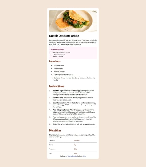
Add padding left on the "preparation" bloc, and bold the values (22Kcal, 0g ..etc). The README.md file follow the instructions.
Marked as helpful - @Essensity-devWhat are you most proud of, and what would you do differently next time?
...
What challenges did you encounter, and how did you overcome them?...
What specific areas of your project would you like help with?...
@ikitamalaroseI propose to make some changes to the CSS
- { text-decoration: none;/remove this/ list-style: none;/remove this/ margin: 0; margin: 0; box-sizing: border-box; } And put it here
.perfil ul li { list-style: none; } .perfil li a{ text-decoration: none; }
Marked as helpful - @ba311What are you most proud of, and what would you do differently next time?
Nothing exactly
What challenges did you encounter, and how did you overcome them?I had some issues with some css like making the .card_image fill the .card and the card shadow, but I was able to complete it with some help
What specific areas of your project would you like help with?Nothing exactly. just want be master my skill
@ikitamalaroseAbout the card_profile you can do this to align the elements
<div class="card_profile"> <img src="assets/images/image-avatar.webp" alt="image-avatar" style="width: 30px; height: 30px; margin-right: 10px;"> <p>Greg Hooper</p> </div>.card_profile { display: flex; flex-direction: row; align-items: center; }
- @juliancoder22What are you most proud of, and what would you do differently next time?
I'm proud of how quickly I coded, but next time I'll review the Figma design more thoroughly from the start instead of intermittently.
What challenges did you encounter, and how did you overcome them?I didn't find challenges.
What specific areas of your project would you like help with?The mobile and desktop sizes don't work well on all devices.
@ikitamalaroseInstead of using fixed values (px) for font sizes, consider using fluid units like percentages (%) or relative units (em, rem). Fluid values allow text to adapt more flexibly to screen size, improving the user experience on different devices.
Marked as helpful