isimeri
@isimeriAll comments
- @monicamclaughlan@isimeri
Hello! You did a pretty good job on this project. I'd still change a few things, though:
- Remove all the
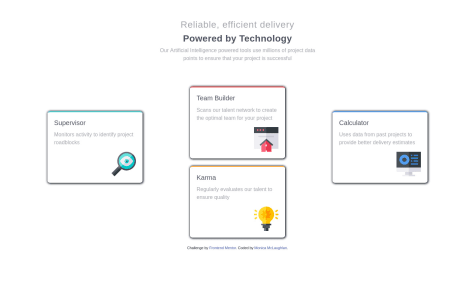
margin-bottomthat you set up for your cards. As the point of this project is to get you to know Flexbox better, rather set aheightormin-heightfor your.card-sectionand just let thealign-itemsandjustify-contentproperties do their job, instead of using the cards' margins to increase the.card-section's height by force. I'd suggest usingdisplay:flexwith aflex-direction: columnfor.middle-cardsas well, so you don't have to guess margins to position the cards. - Make the
<body>take up the full screen height. I'd actually use somediv.containerfor all the content, so i won't have any regrets if i decide to add some feature to the page some day(but it's no big deal for this specific project). - Remove the
max-width: 1440pxmedia query. The.card-sectionlooks very much wrong for screens wider than that. I know there was some mention in the project's instructions file, about the design being supposed to work for that width, but that shouldn't limit you from making it work for screens wider than 1440px. - The
<footer>is directly below the cards, but that is due to the<body>not taking the entire height of the screen. It really comes down to personal preference in this specific case, but i think it would look better if the<footer>was at the bottom of the screen.
Other than that, you did a great job. Keep it up!
- Remove all the
- @vjwalsh@isimeri
Hello. Your project looks pretty good overall, but it could be better, of course. Here are a couple of things i want to mention:
- Make the
<body>take up the entire height of the screen at least, because it takes up only as much as it's content does, if noheightormin-heightis specified. It can look ugly if there is not enough content to fill the entire screen height. - I'd rather use absolute positioning for those background image rings, so they adjust to the screen width.
- Change the font color of your
.credit, because it is very hard to see and read, and i would use absolute positioning here as well, to fix it to the page's bottom. If you reduce the width of your screen, you can see how it goes to heaven along with the profile card, but that's also due to the<body>'s height shrinking too much. - I'd place all those 3
.statsinside a container<div>and usedisplay: flex;withjustify-content: space-evenly(or space-around, doesn't matter too much), instead of bothering to pinpoint all the margins to make them look nice and evenly-spaced(but hey, if you like trying a bunch of margins until you find a good one, nobody can stop you :D ).
As i mentioned earlier, looks good overall, and taking into account that you are a complete beginner, you did a majestic job. Keep improving and have a good time!
- Make the
- @cguttweb@isimeri
Hello there. You are right, in some cases you can use those wavy patterns as
background-imageand forget about them, but in the case of the pattern that goes over the blue and the white background, you'd probably want to use absolute positioning. There is another interesting issue i found. By default, yournavhas the.show-hideclass, and if you reduce the width of your screen, to reach the mobile layout and press the hamburger button to close thenavmenu, then increase the screen width to go back to the desktop layout, there is nonavmenu and no button to make it appear. I'd actually create anothernavmenu, specifically designed for the mobile layout and just keep itdisplay: nonein the desktop layout, so there won't be any worries regarding thenavbeing there when switching between the mobile/desktop layouts. Also, your links and buttons don't have any hover states and the top logo looks a little distorted in the mobile layout, but those are minor issues. You have done a majestic job, mostly. Keep it up!Marked as helpful - @NJain0001@isimeri
Hello. I read through your code a little and it's great overall. Regarding your first question, i would place those svg circles inside the html
<img>tags instead, and then tackle the positioning withposition: absolute. About the second question: your card.user-cardhas a fixed height22.5em. The heights(margins and paddings included) of its children:.pattern-img,.user-infoand.user-number-infowhen added, make up more than the height of the parent.user-card. That's why you see the overflow. Another little thing, when defining the height of.pattern-img, you used vh(which is a responsive unit), but also usedemandremfor the other children. It's good being consistent, using vh or %, etc. everywhere(where it makes sense, of course). Reduce the height of your browser to see how.pattern-imgvs the rest of the card behaves. Cheers! - @cguttweb@isimeri
Hey there. Don't use those svg images as
background-image. Rather place them in<img>tags inside your html and useposition: absoluteand the top, left, bottom, right properties to position them. Cheers! - @cguttweb@isimeri
Hey there. The error icon thing doesn't appear anywhere at all on my side. I would wrap each input element in a
<div class="wrapper">and use the.wrapper::afterpseudo-element to handle this. Cheers!


