
@gautam32b7
What specific areas of your project would you like help with?
Hi there!
I am unable to implement the shared container on a mobile device. I would appreciate it if anyone could help me 🙏
I couldn't crop the images the same way as in the screenshots of the challenge. I don't know how bad is my Tailwind ;) Any feedback would be greatly appreciated.
Any feedback is welcome, especially on Tailwind CSS. ;)
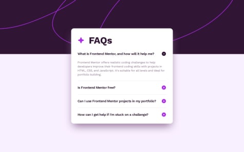
I used grid to display all the questions/answers. I wanted to rely on md:max-w-[524px] but with that there was a slight change in width when I unfolded the answer. I couldn't find a solution and I used a fixed value in the end (md:w-[524px]). Is there a way to avoid this resizing?
Also I tried to apply some animation when the answer appears but I was unable to get it working. And I don't know why :(
I tried things like: transition duration-300 group-open:opacity-100 opacity-0 on the paragraph of the answer, but no visible animation...
I tested with hover: instead of group-open: and then I can see the animation. group-open: is fullfilled (opacity is set to 100 when paragraph is visible...). Maybe I'm missing something obvious.
I always end up by adding margin/padding here and there. Maybe there is a better way...
If someone with experience in Tailwind and CSS could give me some directions, I would be forever grateful ;)
I used absolute positions for the icons, but maybe I'm missing something simpler?
Is it possible to do the 4 cards in that pattern with Flexbox only? (And still have this intermediate state with 2x2?)
If someone with experience in Tailwind and CSS could give me some directions, I would be forever grateful ;)
I added md: with margin and padding here and there... But it doesn't feel that great...
If someone with experience in Tailwind and CSS could give me some directions, I would be forever grateful ;)
Hi there!
I am unable to implement the shared container on a mobile device. I would appreciate it if anyone could help me 🙏
Just some generic comments, I hope it can still help for directions... For mobile design, you can change with the media query the top and right position of the container, and with padding make it the same size as the bottom of the card. Then use Z index to keep the Share button above it.
Im proud of Finally Finishing this Project and next Time i will try to Manage time when building this Project. This Project took me more time than i expected.
What challenges did you encounter, and how did you overcome them?Building Button Component was more challenging - I had to build a Button component that either return a link instance or a button instance.
What specific areas of your project would you like help with?I Need Help with the Issue of Horizontal scrolling, i don't know what's going on here. I have been handling this horizontal scrolling good when using CSS or Sass (by using margin: 0 auto, max-width: 1110px, width: 90%) but when it comes to TailwindCSS it just not coming the way i want.
Any Feedback will be Appreciated
I think the issue with horizontal scrolling could be from "herobgImg" & "featureBgIcon" absolute position with:
right-[-25%]
left-[-30%]
I'm not so advanced, so I may be wrong.
I did it in record time.
What challenges did you encounter, and how did you overcome them?defining custom colors, shadowbox and font in tailwind
What specific areas of your project would you like help with?well criticism is always welcomed
It looks great! One minor thing, I believe you should use <h1> instead of <h3>. Keep it up!
this is my first project which I only created using an image not figma.
What challenges did you encounter, and how did you overcome them?as I use image I have some problems in finding pixel measurements I think my website is almost similar to the design but it is so small.
What specific areas of your project would you like help with?someone please tell me how do you deal with this measurement problem. as you can see my website look similar but it is small
I'm not sure if it will help you, but I'm using "Pixel Perfect Pro" extension on Chrome, and it makes it easier to follow the design without figma.
I was able to get an approximate sizing of the cards resolution. I would in the future reduce the ammount of styling code and build starting from small media screens to have a better responivity.
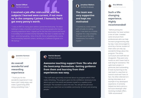
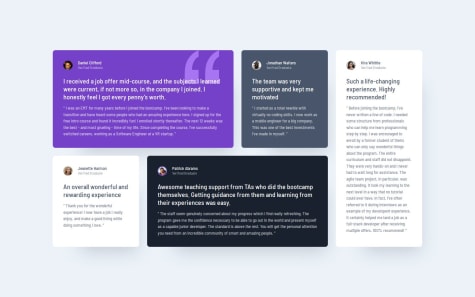
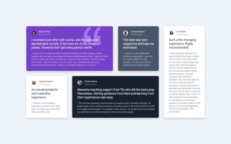
What specific areas of your project would you like help with?I would like to know why my grid elements do not stack on smaller screens knowing that I have specified the collumns to 1 col on below medium screens. Also I was unable to set the quotation image to absolute using tailwind, I declaired the parent container as relative, I had to move the image using CSS.
Hello,
I don't see in your code the default with grid-cols-1.
You could have for example something like: class="grid grid-cols-1 gap-6 md:grid-cols-2 lg:grid-cols-4"
Then on each card you have to be careful to set the correct spanning and row/col start depending on the media queries. For Kira, I have something like: class="md:col-start-2 md:row-span-2 md:row-start-2 lg:col-start-4 lg:row-start-1"
For the quotation image I did something like: bg-[url('./images/bg-pattern-quotation.svg')] bg-top bg-no-repeat [background-position-x:82%]
There is a bg-top-right available but then there is no space on the right of the card. I used a custom property to set "background-position-x".
I hope this is helpful, as I'm not very experienced in CSS / Tailwind.
Good luck! :)
I'm proud of understanding the grid layout concepts.
What challenges did you encounter, and how did you overcome them?I'm really wanna use grid in my next projects.
What specific areas of your project would you like help with?I'd like to say how the layout organize it's just such a wow thing and it's modern design.
Impressive css skills, it looks very clean with the use of grid-template-areas!