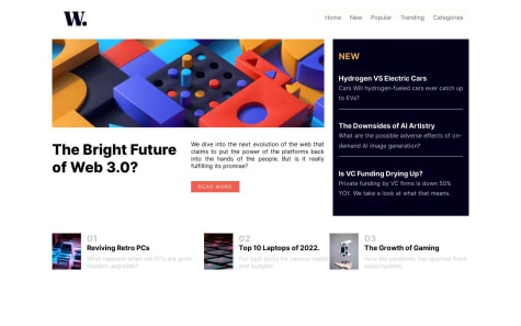
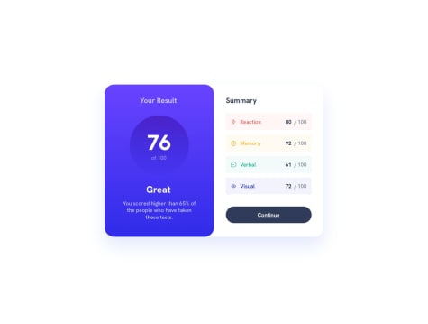
Hey coding buddies! 👋 Dreaming of being a full-stack web wizard 🕸🧑💻 here.Building user-friendly web pages is my jam. 🛠️🌐 Currently jazzing up my skills with JavaScript wizardry. Join me in this coding adventure! 🚀👨💻
I’m currently learning...𝙅𝙖𝙫𝙖𝙨𝙘𝙧𝙞𝙥𝙩 🧑💻。🇯🇸
Latest comments
- @Aaryan376@madhukar-30
🎉Congratulations on completing this challenge Here are a few suggestions from my side that I believe you'll find quite intriguing: 1.Use picture elment instead of using background image The <picture> element is an HTML element used for responsive web design. It allows you to define multiple image sources for different screen sizes or display conditions and lets the browser choose the most appropriate image to display. for example :
<picture><!--here you are defining the image to be used for screens with a width of 375px or less,--><source srcset="image url " media="(max-width:375px)"><!-- your initial image --><img src=" image url " alt="A description of the image"></picture>2.I've noticed that your layout is currently optimized for screens with a width of 375 pixels or less.To enhance responsiveness on other smaller devices, consider implementing media queries for them also .
"May this prove beneficial to you."
Marked as helpful - @Cheosphere@madhukar-30
pretty cool animations 👏
- @hikkenoace1@madhukar-30
just give position: relative to overlay div and use after ::after pseudo element to place the color over image the and then use mix-blend-mode property code:
.overlay {
width: 500px; position: relative;
}
.overlay::after {
content: "";
position: absolute;
left: 0;
top: 0;
width: 100%;
height: 100%;
background-color: hsl(277,64%,61%);
mix-blend-mode: multiply;
}
Hope it helps 👍
Marked as helpful - @CerealKiller01@madhukar-30
Hello can you tell me how your full page is visible in design comparison in my case only a portion of it is visible


