
@zp021

Mauger
@mauger1998All comments
- @mauger1998
The mobile design provided to you is a static jpeg you cannot go by the measurements of that. You should always go by the measurements in the spec. There arent any phones 750px wide, not any popular ones anyway. Your desktop one looks nearly the exact same as the screenshot well done
- @arnav-luhadiya@mauger1998
Hey great job, if this is your first challenge then your doing so well by the looks of things! I would like to give you a bit of feedback after looking at your code. First thing I would say is when importing fonts from google, dont use @import in your css instead use the <link and put it in your html, importing things in css can slow things down. Apart from that youve done an amazing job well done. If you want go check out other peoples code and how they did it.
Marked as helpful - @fedementre@mauger1998
Hey man, Im gunna do my best to answer some of your questions but your going to have to clear up a few things as I am a bit unsure what you are asking... first I will talk about the background images... Ive had a little browse over your code and from what I remember I didnt use "position" atall when I did this challenege, tbh tho the svgs arent my strong point so thats the most I can tell you on that, I can definately give you advice on responsiveness and the benefits of absolute and relative so... first on responsiveness, try using media queries along with things like calc() and clamp() and minmax() when sizing things, I wont explain what these do here but you can look into that for yourself, I always use measurements for height and width in vw and vh for responsivenss as this means your items resize with the view port, lastly I would like to let you know that after looking at your code what I can tell you about position absolute and position relative is that you are using them way toooo much, not everything needs its "position" defined, you should only really be using these properties for either things that go against the natural flow of your page or when you need to z-index something as z-index only works when position is defined. Most projects I dont definine position on anything unless I need something bought to the front or like I said I want to z-index it. Realtive means the item is positioned based on its relative so keep that in mind. What I would reccomend as this is how I learnt to be good with backgrounds is on VSCODE type in background: and look at the emmet drop down menu that appears reccomending all the background properties, then just go through them and play around so you can understand what they do. Also rather than putting the background images in seperate containers and positioning those, try just adding them as the background image for the body, much easier imo, also just go look at other peoples code and see how they did it. Sorry this is a lot to read, but hopefully somewhere in this jumbled mess of a message you can find some value :)
Marked as helpful - @mauger1998
Tip Calculator App in Vanilla Js, Pretty sure I got everything perfect
#accessibility#vanilla-extract#foundation@mauger1998when you put 0 in number of people and click a button, if you click multiple times the eroor keeps coming
- @smara-gda@mauger1998
Hey I took a quick look over your CSS and I see you have defined some elements as a flex container but then you have not used the "justify-content" property (for the main axis depending on your flex direction) and align-items (for your cross axis) keep in mind these properties only work if there is enough space for them to move, this is a lot better way of centering an element
Marked as helpful - @mauger1998@mauger1998
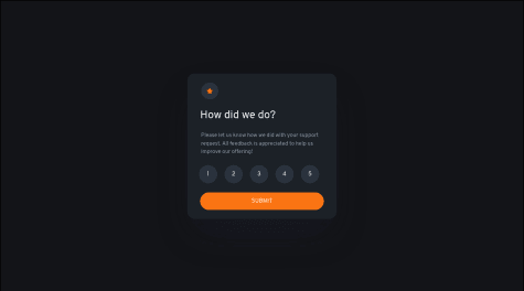
thankyou I have now fixed my problem, I still cannot get the message on the pop up to tell you how many stars you have selected though and the pop up is still coming up in a different place to where the card was depending on the screen size
- @mauger1998
This is my favourite so far I can feel myself getting better & better
#accessibility#foundation#animation@mauger1998This is very good advice I completely forgot about the background thankyou very much
- @Hibiscuit0@mauger1998
Hi I took a quick look at your style sheet, you should center the card by using flexbox... make the element that the card is in a flex container by putting display:flex; on it then all its children become flex items, then you can use justify-content:center; to center it on the main axis and align-items:center; to center it on the cross axis, I hope this helps
Marked as helpful - @mauger1998@mauger1998
The first part about the picture tag is great advice thankyou I will do that now but the advice about the image color doesnt work, what you said makes it the same color as the background whereas I want it the same color as the word "insight"
- @graynneji@mauger1998
Hey I am a beginner so take my advice with a pinch of salt but you haven't included the fonts, if you go to the readme for the styles it will show you how to get the fonts in google fonts and link them into your html and css, great work though, I see you have the same issue as me, the screenshot they use to compare your image to the example is squashed, this must be a bug they have. Great job man
- @mauger1998@mauger1998
Thanks this really helps, I thought the HTML looked very cluttered, this is great feedback!
- @mauger1998@mauger1998
I dont know why but the screenshot this site is showing is not the same as the site looks when you actually go to it