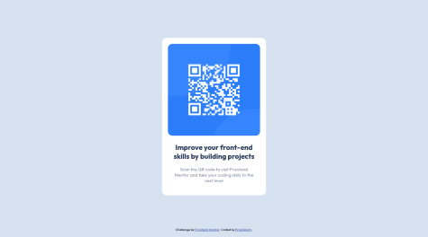
@physerikc

Melwyn
@melwyntAll comments
- @melwynt
Hi Erick! 👋 Congrats for your first challenge! 🥳
There's only one minor issue in your report:
Page should contain a level-one heading.You can easily fix this by replacing the
h2tag with anh1tag.In your CSS, try to replace all the
pixelunits withremunit. This will improve accessibility if the user is zooming the page in or out.You could for example add this in your CSS:
html {
  box-sizing: border-box;
  font-size: 62.5%; // 1rem = 10px, 10px/16px = 62.5%
}
Then, instead of using
font-size: 15px;, you can do:font-size: 1.5rem;For more information regarding this trick, this stackoverflow answer is perfect: stackoverflow.com/a/58421428/7246315
Cheers and happy coding!
Marked as helpful - @neenreva@melwynt
Hi! Great job on the integration of the design and API.
Regarding the issue with
fetchnot retrieving a fresh advice, it has to do with the fact that the data is being cached.One way to overcome this is to make sure the API URL you're requesting is always unique. This can be done by adding a timestamp in the URL.
And if you would like to view the solution directly, you can checkout my solution here.
I'm using React and Axios but the JS logic can be reused in your project.
Cheers and happy coding!
PS: by always changing the URL, you'll also be able to bypass the 2-second rule of the API
Marked as helpful - @Rayid-Ashraf@melwynt
Hi 👋
Changing the color was definetely a challenge for me too.
To do this, your
imgtag needs to be in adivwith the purple background color. Meaning that thelayerbehind your image needs to hold the purple color.In the HTML, you would have:
<div class="stats-card__hero-img">
<img src="path/to/image" alt="">
</div>
And in your CSS file, you would:
- apply the purple background color to the
div. - and for the
img, you need to usemix-blend-mode: multiplywith0.75opacity.
For more details, checkout my code here on Github.
And for more information on CSS blend modes, I found this article very helpful: getflywheel.com/layout/css-blend-modes/
Happy Sunday and happy coding!
- apply the purple background color to the
- @Maseho@melwynt
Hi 👋
You might want to check again how you display your footer.
For now it's broken as your footer is not appearing below your card.
This might be a flex issue where you would need to put the flex direction.
Have a great weekend and happy coding!
- @othmanhs@melwynt
Hi 👋 The Github link to view the code is not working in this Frontendmentor page.
Otherwise your version is perfect. On mobile, the margins are nice and they give a nice breathing space.
Good weekend and Happy coding!
- @AndyAshley@melwynt
Hi Andy 👋 Your solution is really good. I like the animation on the text placeholders. Some people might argue that it's too distractive but for the purpose of the challenge, it's a nice touch.
And the toast is definitely a good UX decision. This way you avoid the user into thinking that the form is not submitting anything.
My only comment would be on the readme file. Even if we are not the ones that created the designs, it might be good to add in the Readme file those UI/UX decisions and introspections 😃. Especially if those are decisions you took on your own and were not provided in the requirements.
Cheers and have a great weekend.
Marked as helpful - @dyntbn@melwynt
Hi 👋 I would also think that the "fix it as it breaks" approach is enough.
Otherwise this solution looks quite popular on Stackoverflow:
@media (min-width:320px)  { /* smartphones, iPhone, portrait 480x320 phones */ }
@media (min-width:481px)  { /* portrait e-readers (Nook/Kindle), smaller tablets @ 600 or @ 640 wide. */ }
@media (min-width:641px)  { /* portrait tablets, portrait iPad, landscape e-readers, landscape 800x480 or 854x480 phones */ }
@media (min-width:961px)  { /* tablet, landscape iPad, lo-res laptops ands desktops */ }
@media (min-width:1025px) { /* big landscape tablets, laptops, and desktops */ }
@media (min-width:1281px) { /* hi-res laptops and desktops */ }
Hope this was helpful.
Cheers and have a great weekend too 😀
Marked as helpful - @Kristina2025@melwynt
Hello Kristina,
The desktop version is nicely done.
However you might want to check again the responsiveness for the mobile version. I think there is an issue with the height of the container or card because the site is partially truncated. A media query with the correct pixel width will most likely resolve this.
Happy coding!
Marked as helpful - @Gareth-Moore@melwynt
Hi Gareth! 👋
Some more tips to make your life easier 🙂
These are the tools that you can use to make pixel-perfect versions:
- Pixel Perfect Pro - This helps me to display a screenshot on top of the webpage to easily check if dimensions were accurate. This is super useful is you need to create pixel perfect work.
- PX: Viewport Dimensions - This add-on will show you the dimensions of your viewport while resizing your browser.
Other tools:
- Figma - This helps me create a rapid mockup to get dimensions of components. I also use Figma to pick the colors from the screenshots to create a color palette.
Cheers
Marked as helpful - @franciscoprado4@melwynt
Hi! 👋
These are the tools that you can use to make pixel-perfect versions:
- Pixel Perfect Pro - This helps me to display a screenshot on top of the webpage to easily check if dimensions were accurate. This is super useful is you need to create pixel perfect work.
- PX: Viewport Dimensions - This add-on will show you the dimensions of your viewport while resizing your browser.
Other tools:
- Figma - This helps me create a rapid mockup to get dimensions of components.
Cheers
- @Adambentleyio@melwynt
Hi!
These are the tools you can use to create a pixel perfect website:
- Pixel Perfect Pro - This helps me to display a screenshot on top of the webpage to easily check if dimensions were accurate. This is super useful is you need to create pixel perfect work.
- PX: Viewport Dimensions - This add-on will show you the dimensions of your viewport while resizing your browser.
Other tools:
- Figma - This helped me create a rapid mockup to get dimensions of components.
In case you have a screen smaller than the designs provided (usually they have 1440px in width), you can open the developer tools in Chrome or Firefox and display the page with the exact dimensions you need (desktop or mobile).
- @navidabdi@melwynt
The image overlay is perfect. if I may ask, how did you find the correct parameters for the overlay?
There is nothing much to add here. Just one minor thing: the stat headings should be in uppercase.
Cheers!
- @Willwf@melwynt
Hi there!
Good job on the design.
Regarding the dice button, I think you are facing the same issue that I had. I also used React for this project. Please feel free to check my solution here.
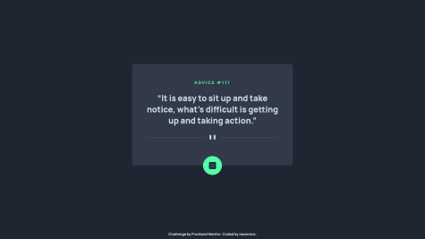
Fetch(orAxios) is caching the data. Because of this it will always return the same value. To overcome this, the URL needs to be always different. This can be done by inserting a timestamp in the url. Here's an example withAxios:const getData = async () => { const url = 'https://api.adviceslip.com/advice'; const data = await axios.get(`${url}?timestamp=${new Date().getTime()}`); setAdvice(data.data.slip); };All the best!
- @Adhi-S12@melwynt
Hi there!
Good job on the design.
For the quotes, you might want to use those symbols instead to respect the design: Reversed Double Prime Quotation Mark
The dice button is not working. I also used React for this project. Please feel free to check my solution here.
I think you are facing the same issue that I had.
Fetch(orAxios) is caching the data. Because of this it will always return the same value. To overcome this, the URL needs to be always different. This can be done by inserting a timestamp in the url. Here's an example withAxios:const getData = async () => { const url = 'https://api.adviceslip.com/advice'; const data = await axios.get(`${url}?timestamp=${new Date().getTime()}`); setAdvice(data.data.slip); };All the best!
Marked as helpful - @AmodeusR@melwynt
Great job with the design and React!
I was curious about the 3 dots on each card but it doesn't do anything, does it?
Cheers!
- @Mhmd-Tarek-Mhmd@melwynt
Nothing much to say apart that it is really well done :-)
If we wanted to be really picky, we could say that in the active state design provided in the starter files, when there is an input error, the placeholder disappears.
But that's really if you want to be picky :-)
Cheers!
PS: the link to your github account in the "try it free 7 days" link is not working.
- @CubaLibra97@melwynt
Hi there!
Minor tweaks:
- it looks like the card is not centered vertically.
- you could use some transitions with some delays to change the state of your elements in a smoother way
- and it looks like there is a small warning in the report that could be fixed
All in all, good job 👍
- @DavidEmad01@melwynt
Hi! That's pretty neat! In terms of responsiveness, it looks like the text on the right could benefit from a larger text area at breakpoint 991px. The space between the phone and the description could be smaller at that breakpoint.
There are some accessibility and html issues as shown in the report. Perhaps resolving them could lead to better SEO.
Other than that it's a great job! 🙌
Marked as helpful