@MrNomis

Mohammad Ebrahimi
@moheb2000All comments
- @moheb2000
Good work 🌸🌸🌸
If you want to center a component with flexbox you can use this:
.your_div {
  display: flex;
  justify-content: center;
  align-items: center;
}
and the parent element for your div must have
height: 100%;Some other suggestions for achieving a better work:
- Don't use h3 if you don't have h1 and h2. Use h1 instead and change its styles with css
- Use margin and max-width instead of using width and height and also use rem unit instead of using pixels
I hope my advice help you. Keep going! 🌸🌸🌸
- @thainadlopes@moheb2000
Awesome work. I have some suggestions for a better result:
- When User click on reset button, custom tip field doesn't clear
- When user enter zero in people number field error will disappear
- Add a check for computing tips and total price so when user enter an invalid data, "Nan" and "Infinity" don't appear in price labels
Keep going these awesome works 🌺🌺🌺
Marked as helpful - @Khadijarejjaoui99@moheb2000
Awesome! Really good work. Some suggestions for better result:
- I think It's better to use equal width and height like 40px for rating numbers to achieve a complete rounded circle.
- Using transitions for button and rating numbers is nice too.
- Also you can use bold font weight for button text and increase its letter spacing a little bit.
Good work! Keep going🌸🌸🌸
Marked as helpful - @GrzywN
- @ljmarket13@moheb2000
Hey! That's Awesome. Really good work. For better transition on social media icons you can use to transitions like this:
a:hover i {
  /* Other codes */
  transition: background-color 0.5s, color 0.5s;
}
and
a i {
  transition: background-color 0.5s, color 0.5s;
}
Good luck!
- @ColdLikeMcFlurry@moheb2000
Great job ❤️❤️
1- title color is a bit lighter than black. You can use 'Dark blue' color for title. its value is in style-guide.md file.
Good lock 👌👌👌
Marked as helpful - @AditNovadianto@moheb2000
Awesome 👏👏👏
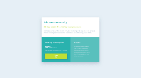
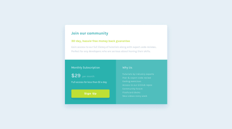
1- For 'Why Us' section it's better to use lists in HTML because it actually is a list but if you don't want to use that you need to put them in different lines.
2- don't use flex method for centering element in mobile view because it's cause overflow issues. You fixed overflow in vertical direction but in horizontal direction some texts aren't readable.
Great work. Good lock ❤️❤️❤️
Marked as helpful - @catherineisonline@moheb2000
Fantastic 😍😍😍 I think it's better use font weight 600 for headings and replace black color in 'Such a life-changing experience. Highly recommended!' heading with """Very dark grayish blue""". Awesome work👏👏👏 Good lock!
- @snake321@moheb2000
Really good 👏👏👏 I think using a lighter color in box shadow for button makes your result better.
- @CodyJPerry@moheb2000
Awesome 👏👏 Only one suggestion: Your component has radius on top corners but has no radius on bottom corners.