Full-stack Developer & Rails enthusiast that loves good design. Philomath, musician. Stack: JavaScript, Ruby, Rails, React, Redux. Looking for my next dope job!
I’m currently learning...Refreshing my knowledge of React, Nextjs, Rails. Learning how to use Vim, Doom Emacs, Clojure, tmux, and Clojurescript!
Latest solutions
Responsive Meet Landing Page using Grid, Flexbox, Parcel, and Sass
#sass/scss#parcelPSubmitted almost 3 years agoResponsive Pod Landing Page built with React, Parcel, JS, HTML, Sass
#parcel#react#sass/scss#accessibilityPSubmitted almost 3 years agoResponsive landing page using grid, flexbox, html, and sass
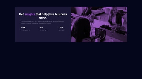
#sass/scss#parcelPSubmitted almost 3 years agoStats preview card component (fully-responsive with HTML and CSS only)
#sass/scss#parcelPSubmitted about 3 years ago
Latest comments
- @0GeNN0P@nikoescobal
Hello Omar! 👋
Congratulations on finishing your challenge! 🎉 Amazing job! Looks really close to the original!
Here's some feedback/suggestions on this solution:
- I recommend learning Sass as it helps keep code clean and easy to understand since there's the added ability to be able to nest classes. This enables you to mimic the structure of the HTML in your CSS.
- When clicking the add button, it seems the cart on the top right gets updated, but not the text with the price itself. You should make this dynamic rather than static.
- I'd recommend practicing building layouts without relying on absolute positioning unless necessary -- you can achieve much of the same results with just padding and margins. This would be especially helpful when it comes to adjusting the responsiveness of your website across any screen size
- Check the report to fix accessibility/HTML issues - you currently have 11 accessibility issues and 3 HTML issues listed
I hope this is helpful and all the best with your coding journey!
Marked as helpful - @JulienK94P@nikoescobal
Hello Julien! 👋
Congratulations on finishing your challenge! 🎉 Unfortunately, you haven't properly gotten the site deployed, as you have a 404 error.
Here's some feedback/suggestions on approaching this solution:
- You should build mobile-first, meaning all your CSS classes should apply to the mobile viewport first, then add media queries to manage the other screen sizes
- Add padding to the text so it doesn't touch the sides of the card.
- Check the report to fix accessibility/HTML issues - you currently have 10 accessibility issues and 2 HTML issues listed
I hope this is helpful and all the best with your coding journey!
Marked as helpful - @dvbenthemP@nikoescobal
Hello Danny! 👋
Congratulations on finishing your challenge! 🎉
One lesson that really stuck with me, which I got from Kevin Powell, is that the web is responsive by default, meaning that any time you build a project, as long as you don't mess with negative margins or absolute positioning, your content is by default, responsive. That said, it makes so much more sense to go with a mobile-first approach, then meaning all your CSS classes should apply to the mobile viewport first, after which you then add media queries to manage the other screen sizes. Doing it this way also makes it easier to scale and adjust in the future, even if you will add changes to your layout.
As for using flexbox vs grid, it's best to practice both. For anything that has to do with tables, you should use the grid approach, whereas flex can be used to manage layouts that are simpler. Given that you ran into the difficulty of trying to make the columns the same size, the only solution is to use grid-template-columns with the fractional (fr) value, which guarantees they will always be the same size. An example of this looks like this
grid-template-columns: repeat(auto-fit, minmax(min(320px, 100%), 1fr));;Try giving it a shot -- the best way to learn is by practicing and applying new things little by little.Here's some other feedback on this solution:
- It seems like the filtered image is a bit too dark. You could either adjust the opacity or instead use background-blend-mode or mix-blend-mode with the property set to multiply.
- For your text below the numbers, you're not using the correct font, font size, and font weight
I hope this is helpful and all the best with your coding journey!
Marked as helpful - @AgusSaMacP@nikoescobal
Hello there! 👋
Congratulations on finishing your challenge! 🎉
Here's some feedback on this solution:
- You should build mobile-first, meaning all your CSS classes should apply to the mobile viewport first, then add media queries to manage the other screen sizes
- It seems like you didn't resize the fonts for mobile view
- Add padding to the text so it doesn't touch the sides of the card.
- Check the report to fix accessibility issues - you currently have 1 listed
I hope this is helpful and all the best with your coding journey!
Marked as helpful - @binthrootP@nikoescobal
Hello there! 👋
Congratulations on finishing your challenge! 🎉 Feel free to check out my project here, and the source code here
Here's some other feedback on this solution:
- You can add min-height to the tables for each breakpoint. It looks quite small on desktop
- Your buttons lack padding, as they're considerably smaller compared to the original design
- You could do with increasing the grid gap for desktop
- It seems like you didn't apply the correct letter spacing, font colors, and padding for the 1200px breakpoint
- Check the report to fix accessibility issues - you currently have 1 listed
I hope this is helpful and all the best with your coding journey!
Marked as helpful - @aryandogra2003P@nikoescobal
Hello there! 👋
Congratulations on finishing your challenge! 🎉
Here's some other feedback on this solution:
- Keep in mind that the web is responsive by default
- This is why it's suggested to always start with mobile-first, then use media queries to cover the other screens
- Check the report to fix html issues - you currently have 2 listed
I hope this is helpful and all the best with your coding journey!
Marked as helpful


