Not Found
Not Found
Not Found
Not Found
Not Found
Not Found
Not Found
Not Found
Not Found
Not Found
Not Found
Not Found
Not Found
Not Found
Not Found
Not Found
Not Found
Not Found
Not Found
Not Found

All comments

  • John Norman• 880

    @norman02

    Posted

    Congrats on completing this challenge. It looks pretty good! The only suggestion I would make is to fix the accessibility issues listed in the report. Happy coding!

    Marked as helpful

    0
  • John Norman• 880

    @norman02

    Posted

    You're right, thank you for the suggestions!

    0
  • John Norman• 880

    @norman02

    Posted

    Thanks for the feedback!

    0
  • John Norman• 880

    @norman02

    Posted

    Thanks! I'll make that change.

    0
  • John Norman• 880

    @norman02

    Posted

    Thank you for the suggestion!

    0
  • John Norman• 880

    @norman02

    Posted

    It is showing up fine for me on both Chrome and Firefox. Only thing I would suggest is to set outline: none; this will remove the blue box that shows up when you click the button.

    0
  • Jan• 500

    @eljasiu

    Submitted

    Hello guys, this is my solution to this challange. I hope you like the smooth way the bar with social media icons appears. I had some struggles with that. 'transition' property didn't seem to work with JavaScript, so I had to use 'setTimeout' function to make the animation work. I hope you like this method. I would be very grateful for your thoughts on this projects. Hava a great day, Jan

    John Norman• 880

    @norman02

    Posted

    It looks good, I like the transition delay animation. Two things I noticed: there is no shadow on the main element. The share element doesn't transition back to default state.

    1
  • John Norman• 880

    @norman02

    Posted

    It looks great! I wasn't able to view your code so can't comment on that.

    0
  • John Norman• 880

    @norman02

    Posted

    Thanks for posting this! I'm just starting to use Sass over raw CSS and yours is a great example of SCSS structure.

    0
  • John Norman• 880

    @norman02

    Posted

    This looks pretty good. A couple things the background color for the bubble should be #FFF. There should be a background image. Looks like you got all the hard parts right.

    1
  • John Norman• 880

    @norman02

    Posted

    I really like this! One minor suggestion, if you add name="email" to the email input it allows many browsers to suggest the user's stored email addresses.

    0
  • John Norman• 880

    @norman02

    Posted

    The main thing I see is that the button should have a white background

    0
  • John Norman• 880

    @norman02

    Posted

    This is a hard project to start with I'm not sure why it's in the newbie section. I'd do some of the others and come back to this.

    0
  • John Norman• 880

    @norman02

    Posted

    The only thing that really looks off is the button. It's sized a bit differently and missing the drop shadow. It's hard to get an exact match without the sketch file, but measuring the jpeg with a free tool can get you close.

    1
  • John Norman• 880

    @norman02

    Posted

    That's just about perfect!

    0
  • Rahul Gupta• 80

    @rahulxyz

    Submitted

    I would appreciate any general feedback or improvements. I have following queries in particular:

    Q1) Is there a specific width below which is considered a mobile view?

    Q2) Which CSS properties are recommended or best practice to be kept defined for the whole application, i.e., in *{ }

    John Norman• 880

    @norman02

    Posted

    This looks very good! Only a little off from the design.

    The answers to your questions are pretty subjective but here is what I do:

    For mobile view I usually play around with the responsive design on google developer tools and set media queries where things start to break. I also us Sizzy to see several devices at once while I'm developing.

    The reset css I usually use is

    :root {
        font-size: 10px;
    }
    
    *, *::before, *::after {
        margin: 0;
    	padding: 0;
    	border: 0;
    	font-size: 100%;
    	font: inherit;
    	vertical-align: baseline;
        z-index: 0;
        box-sizing: border-box;
    } ```
    
    2
  • @Pragmaticbug

    Submitted

    I am new to css so I was unable to edit the button. Need help there

    John Norman• 880

    @norman02

    Posted

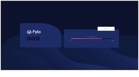
    This is a hard project to start with. There are a couple issues with sizing the components and the background. Also see your report for HTML and accessibility issues. There are a couple ways to style the status bar. Here is what I did:

    <div id="status-panel">
        <p id="storage-message">You’ve used <em>815 GB</em> of your storage</p>
        <div id="status-bar">
          <div id="status-bottom">
            <div id="status-middle">
              <div id="status-top"></div>
            </div>
          </div>
        </div>
        <div id="status-text">
          <p>0 GB</p>
          <p>1000 GB</p>
        </div>
    

    css:

    #status-bar {
        margin-left: 3rem;
        width: 85%;
    }
    
    #status-bottom {
        background-color: var(--VeryDarkBlue);
        width: 100%;
        height: 1.8rem;
        display: flex;
        border-radius: 10px;
    }
    
    #status-middle {
        background: linear-gradient(to right, hsl(6, 100%, 80%),  hsl(335, 100%, 65%));
        width: 81.5%;
        height: 1.4rem;
        margin: 0.2rem;
        z-index: 1;
        position: relative;
        border-radius: 10px;
        display: flex;
    }
    
    #status-top {
        z-index: 2;
        background-color: white;
        height: 1.2rem;
        width: 1.2rem;
        margin: 0.1rem;
        border-radius: 100%;
        position: absolute;
        right: 0;
        top: 1;
    }
    
    
    2
  • John Norman• 880

    @norman02

    Posted

    This looks good! Only thing that seems to be missing is the box shadow.

    1
  • Anna• 90

    @Bluechai03

    Submitted

    Hello! This is my first attempt completing a challenge on FrontEnd Mentor.

    Made with simple HTML and CSS Grid Desktop Mode Design

    I was able to replicate the website for the most part but I had no idea how to create that pointed corner for the small container on the right, could someone let me know how? Also I didn't know how to make the backgrounds for the icons on the left container be the same width and height without squishing the images, how would I go about fixing that?

    Feedback and advice is very much appreciated, thank you!

    John Norman• 880

    @norman02

    Posted

    This looks good. There are a couple ways to make the buttons work. My solution was to set the width of the images, and place them in a <div>. I used the div padding for the button.

    1
  • Kiran Sawant• 90

    @sawantkiranb

    Submitted

    Hello all,

    I am a backend programmer and I have never tried frontend development before. So open for improvements and suggestions.

    John Norman• 880

    @norman02

    Posted

    It looks pretty good. The spacing is off a little bit I think the article is centered within an element rather than centered on the page. There is also the html and accessibility issues listed in the report. Other than that it looks great.

    0
  • John Norman• 880

    @norman02

    Posted

    Great suggestions, thanks! I struggled with those social icons in Illustrator, I didn't think to use a border that way!

    0
  • Yogii Valecha• 70

    @yogi9898SH

    Submitted

    Any suggestions, improvements are welcome....!

    John Norman• 880

    @norman02

    Posted

    This looks pretty good. The differences I see are the button which needs more padding. The font should be a little bigger and colored.

    2
  • John Norman• 880

    @norman02

    Posted

    Thanks! I am pretty new to this. I will definitely use these suggestions

    0