Not Found
Not Found
Not Found
Not Found
Not Found
Not Found
Not Found
Not Found
Not Found
Not Found
Not Found
Not Found
Not Found
Not Found
Not Found
Not Found
Not Found
Not Found
Not Found
Not Found

All comments

  • Ricardo 20

    @WickedBlack

    Submitted

    • Sizing is something I find difficult. how or what is the process used when starting a project, and sizing it to the size stated in the style guide?

    • I was trying to add an animation to the QR image. Could you tell me how to make the background blurry or dim, so the QR image is the only thing in focus when you hover over the image?

    • any feedback is welcome, please feel free to suggest anything even if unrelated to the questions above.

    Thank YOU!

    AgilitiesZ 280

    @phichayut-pak

    Posted

    Hi! Congrats on your first project submission! 🎉🎉 Here are some suggestions from me:

    1. Check your image if it works when your website is deployed. From what I've seen in your code, you assigned the wrong path in <img> tag. How you can fix is to change it to <img src="./image-qr-code.png" alt="Qr Code">

    2. Sizing doesn't matter that much in here. But if you really want to make it challenging, it's easier for you to buy premium since you'll get an access to figma design which is more accurate than jpeg/png image.

    3. From your second question, I would recommend you implement JavaScript to make it interactive as you want user to hover, the qr code will scale up and background will get blurred.

    4. Try to make it to the center by making use of flexbox, it's one of the important features in css.

    5. Even though you're trying to make the qr code scales up on hover, but it might be a bit big. You might want to scale that down. Moreover, when user quits hovering the qr code, it immediately quits the scaling. You should try using transition on this.

    Happy Coding 👨‍💻👨‍💻

    Marked as helpful

    1
  • AgilitiesZ 280

    @phichayut-pak

    Posted

    Hey 👋 For your question, I think you're using margin-block-start and margin-block-end on the body making it moves and prevents it from having normal page. I would suggest you to use flex in div instead of body since it'll easily to see and it might fix this problem.

    Happy Coding!

    Marked as helpful

    1
  • @khalilnazari

    Submitted

    Dear members,

    It is the second submission for this challenge because the first one had a few bugs which is removed in the solution. The code is improved based on the comment on the previous solution.

    Kindly comment on your idea about this submission.

    Thanks & regards,

    Khalil

    AgilitiesZ 280

    @phichayut-pak

    Posted

    Congratulations on your fixed submission 🎉🎉 What I would suggest here is :

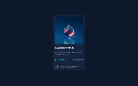
    1. Make the eye bigger ( the one that appears when you hover the image )
    2. change the font and font size of the title Equilibrium #3429
    3. Optional Do some transitions to make the website more alive

    Happy Coding!

    0
  • @thejackshelton

    Submitted

    This is my first ever project, and I can tell that I made a decent amount of mistakes. How do I get the image to display the icon with the background changed at the same time?

    I also had a lot of trouble getting some parts of the card inline with each other. Is there a better way to go at it then the way I implemented?

    I started my web development journey a week and a half ago, and would love some feedback on how to avoid redundancy in my code, make it easier, and some alternative ways I could've gone at it.

    AgilitiesZ 280

    @phichayut-pak

    Posted

    Hi! I would say it's a great start for you! But first of all, congratulations on your project! 🎉🎉 Here are the things I would suggest :

    1. For your question, I fixed it by playing with opacity on hover. You might wanna try that out, or another way is to use group and group-hover from TailwindCSS ( it's a css framework that pretty much makes our styling quicker and easier )

    2. You might be using padding without noticing that the overflow on x axis appears. Take a deep look on this, it'll affect a lot when you're working with different designs.

    3. Font size and Font weight matter! You can choose whether you want to fix on this one, it's just for more detail.

    Keep studying and practicing! 🔥🔥

    Marked as helpful

    1
  • AgilitiesZ 280

    @phichayut-pak

    Posted

    Congratulations on your project 🎉🎉 What I would suggest is to take a deeper look at the font size on 0.041 ETH and 3 days left. This is the only one I can suggest since you've done a pretty good job on this. Keep going on!! 🔥🔥

    0
  • AgilitiesZ 280

    @phichayut-pak

    Posted

    Hey! First of all, Congratulations on your project 🎉🎉 I've done reading your code and I saw that you're reloading the website everytime users click on the dice button. So here are few suggestions from me:

    1. Don't reload website, since it might affect other things if you want to add something more.
    2. When users click the button, fetch the data then it'll automatically change your value. You don't need to reload it anymore!

    You can check mine if you want, Advice Project

    Good luck on your next project! 🔥🔥🔥

    0
  • @pranjaljain0

    Submitted

    I got confused with the SVG for divider also the background color were difficult to find.

    AgilitiesZ 280

    @phichayut-pak

    Posted

    Hi! To start off, I would say that you've done a great job on the layout. The mobile design works out pretty fine. What I would suggest is to just JavaScript in this project as you have to fetch data from API given in guide of the project. Whenever you press the dice button, you'll have to make it choose quote randomly from the API. You'll gain lots of things from this! Keep it up!! 🔥🔥🔥

    1
  • FRAGGER 20

    @Aissam4

    Submitted

    i'm proud of wasting time for project like this , I use html css and nodejs for front end and python for scraping data from free nft api and swipper library for the slider

    AgilitiesZ 280

    @phichayut-pak

    Posted

    That's pretty cool! I would suggest that it'll be better if you can fetch actual current ETH of each NFT with owner's name. However, you've done a pretty good job on this! Keep going 🔥🔥

    Marked as helpful

    0
  • AgilitiesZ 280

    @phichayut-pak

    Posted

    Hi, I would suggest fixing the font size of lower parts to be most likely same as the references. Another one is about the hover. When I tried to hover, it seems like the hover part is bigger than the image making it looks not equal to each other. Last one is optional, try to make it as a transition to improve your project!! Keep it up! 🔥🔥🔥

    Marked as helpful

    1
  • audrie 40

    @audriecheong

    Submitted

    How to change the color of the icon while it's on the hover state? Feedback welcome.

    AgilitiesZ 280

    @phichayut-pak

    Posted

    Hi, I've also completed this one. For the question you asked, you might wanna make use of positions (relative and absolute). If you're fine with studying new things, I would suggest TailwindCSS, it comes up with easy things. We can simply use group, and toggle on/off with group-hover.

    However, you've done a great job! Well done! Keep it up 🔥🔥

    Marked as helpful

    1
  • Kivi02 30

    @Kivi02

    Submitted

    I'm a Newbie started learning Frontend development. To gain more experience, while learning I have started doing challenges on Frontend Mentor. It will be a great help, if you could provide feedback on my solution.

    Thanks, Kivi.

    AgilitiesZ 280

    @phichayut-pak

    Posted

    Great work! You might wanna fix font weight a bit on 0.041ETH.

    1