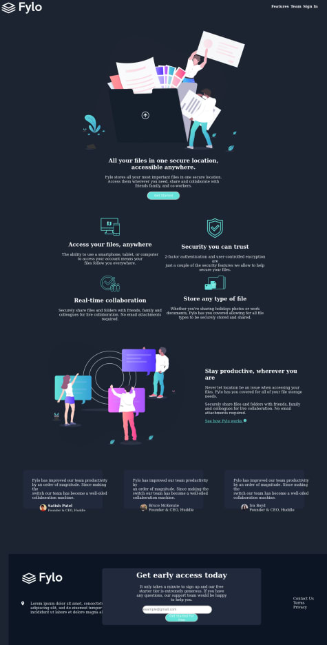
Not Found
Not Found
Not Found
Not Found
Not Found
Not Found
Not Found
Not Found
Not Found
Not Found
Not Found
Not Found
Not Found
Not Found
Not Found
Not Found
Not Found
Not Found
Not Found
Not Found

All comments

  • Roman Filenko 3,335

    @rfilenko

    Posted

    Hey, good job here, but I see a lot of small issues. To debug some of them use rule - * {outline: 1px solid orange;}. This will help to fix overflow problem. A few points for future projects:

    • don't set defined heigth on containers;
    • preferable don't use id's for styling;
    • img { max-width: 100%;} will make all images responsive;
    • it's better to set max-width on wrapping containers instead of just width.
    • use flexbox or css gris for layout, don't use position;
    • for spacing inside use padding.

    Try to fix some issues first, good luck😉

    Cheers, Roman

    2
  • Tiass 295

    @Tiasstiass

    Submitted

    Any idea how to use gap for Safari? I just realized it does not appear on Safari, any work-around? Every feedback appreciated

    Roman Filenko 3,335

    @rfilenko

    Posted

    Hey, you can use grid instead😉, cos currentrly gap for flexbox isn't supported in Safari yet. Or use negative margin/padding for placing items inside flex container.

    Cheers, Roman

    0
  • Roman Filenko 3,335

    @rfilenko

    Posted

    Hey, try to fix console error - Mixed Content: The page at 'https://react-clockapp.vercel.app/' was loaded over HTTPS, but requested an insecure resource 'http://worldtimeapi.org/api/ip'. This request has been blocked; the content must be served over HTTPS. Probably this is the issue here

    1
  • Roman Filenko 3,335

    @rfilenko

    Posted

    Hey, great work. Looks nice, but I have a few notes:

    • semantic html can be a little better
    • try to avoid deep nesting in css, like body .page .container .card-body h2, it's hard to overwrite and maintain styles.

    Cheers, Roman

    1
  • Monica 100

    @monicamclaughlan

    Submitted

    Am in my first few weeks of learning, but wanted to get responses on possibly a simpler way of formatting this without using quite so many classes. Any input appreciated.

    Roman Filenko 3,335

    @rfilenko

    Posted

    Hey Monica, nice try, but there some issues you can easily fix. First, add your your pattern images as background-image with css, this will fix positioning and overflow issues. And work on previous feedback.

    Cheers, Roman

    0
  • @dthuy901

    Submitted

    On the line with stars, I used span containing img star, I realized that img star not in span. I tried so hard to fix but I can't. Hope to receive your feedback.

    Roman Filenko 3,335

    @rfilenko

    Posted

    Hey, good job. Have a few tips for you:

    • .intro > ul > li > span > span - don't use some many selectors to target elements in css, usually one class is enough;
    • not sure what the issue is with the stars - would probably just use imgs or spans in a list (img as background).
    • you can try mobile-first approach on next project.

    Also you can look into sass or css variables. 😉 Cheers, Roman

    1
  • Roman Filenko 3,335

    @rfilenko

    Posted

    Hey Miguel, great work on this one, clean, nice code and responsive as well. Found few smaller issues:

    • add some transition for menu links(hover effect, add focus states as well);
    • hiding overlay by default, adding transition to it on a show;
    • slider buttons can be buttons;
    • grid properties can be written with shorthand like grid-template-column: 3/4 or using grid area to make it simpler.

    Hope this was helpful. Have a good one, Roman

    0
  • Nicolas 20

    @Nicolas-Rodriguez-Ch

    Submitted

    I had many issues with adapting the design to desktop screens, I didn't really know what was happening and why it wasn't working.

    I used a lot of flexbox in this project.

    Roman Filenko 3,335

    @rfilenko

    Posted

    Hey Nocolas, nice work. Some other suggestions how to improve:

    • wriite more semantic html tags (footer should be footer tag, a list of icons - also list of links, etc);
    • add desktop version using mediaqueries;
    • hover on burger menu isn't a proper way to show a menu - make it on click, just few lines in js;
    • in .insurance__text section - with z-index: -5 you can't really click a link;

    Keep practicing, Roman

    0
  • @RomainDesson

    Submitted

    Hello, thanks to take a look at my solution ! I'm here to take some tips about my code. I'm not really satisfied about that, it works well with the window width asked with the project but when you go on larger width, one div move out from her initial position. I had the impression of design the page only as i see it and i didn't took care about the window width.

    Thanks in advance, i'm working hard to improve myself !

    Roman Filenko 3,335

    @rfilenko

    Posted

    Hey Romain, good work, but your solution need some improvements. First, I suggest to not position .between block absolutely - you can define negative margin to push it down and add some z-index to make on top of the footer. You can check my solution - I've made similar, a dark challenge and apply some of my techniques from there (grid, hover effects, html structure). Good luck with coding😉

    Cheers, Roman

    0
  • P
    Grace 27,350

    @grace-snow

    Submitted

    This is designed to be a guide for one way to do this challenge mobile-first, using scss variables and some more advanced css techniques like nth-child.

    I used a VS Code extension to compile the scss.

    Note: In a real project I would work with the designer to fix the accessibility issues or color contrast and font sizes.

    Any questions or suggestions are welcome.

    Roman Filenko 3,335

    @rfilenko

    Posted

    Hi Grace, congrats, clean and nice code, almost perfect to me 😉

    Cheers, Roman

    2
  • @ArtemPonomarenko

    Submitted

    Hello Mentors,

    It seems like I really straggle with positioning elements. My code is full of hard-coded sizes, widths and heights. Mostly units are px's and %'s . Moreover all the numbers aren't even whole numbers e.g "margin-left: 214.756 px" , "padding-top: -49.589%" etc.... At the end it's close to the .sketch designs at required screen sizes, but somewhere between.... it's a complete disaster. Nothing is fluid or responsive.

    Trying to use min, max widths but it makes the matter even worse.

    Please advise! Help needed

    Roman Filenko 3,335

    @rfilenko

    Posted

    Hi Artem, you did a great job, mobile looks ok, just a few edits will help with issues you encoutered. You're right about hard-coded values and funky ones like padding-top: -49.589%" - try to avoid them, so my suggestions:

    • first, set box-sizing: border-box for all elements with * selector;
    • don't use fixed values, on containers, for example set max-width, like 1200px;
    • for images it's ok to set width and height, additionally object-fit will help to preserve proper picture proportions.

    Usually, it's better to start with mobile-first approach and then add needed changes with wider viewport width.

    Hope this was helpful😉. Good luck with edits.

    Cheers, Roman

    2
  • Roman Filenko 3,335

    @rfilenko

    Posted

    Hey, what issue are you implying to ? Here some fixed and improvements you can do:

    • don't use id's for styling;
    • it's better not to set margin, padding in %;
    • set max-width instead of just width on some containers.

    Cheers, Roman

    1
  • P
    Dave 5,245

    @dwhenson

    Submitted

    I'd never used a plugin before, and as I've done a few forms on other challenges I wanted to try Bouncer. It worked really well and was amazed by how painless it made form validation. Cheating?

    As usual my screenshot looks terrible! But I think the live site looks mostly OK, and seems to work fine. Any feedback is most welcome.

    Roman Filenko 3,335

    @rfilenko

    Posted

    Hey Dave, good work on this one. You can improve further by optimizing you js code - define variable only once on the top, use one function with if statement inside to not dublicate your code. Also you can wrap the whole code inside self executing function😉

    And work on feedback about styles.

    Cheers, Roman

    1
  • Lucas 20

    @lucasfvera

    Submitted

    How can i set the width of my cards correctly? Because i couldnt make them very responsive haha

    Roman Filenko 3,335

    @rfilenko

    Posted

    Hi Lucas, to make all flex-items same size define flex:1 shorthand property. Check this article for details - https://css-tricks.com/snippets/css/a-guide-to-flexbox/. But would rather change techniques - make .card-profile-container as css grid container and layout all elements inside the .card-profile box with flexbox😉

    Have a good day, Roman

    1
  • P
    Dave 5,245

    @dwhenson

    Submitted

    Feedback most welcome. Any suggestions on the following would be appreciated:

    1. What is the best way to get the image to span the entire height of the viewport? I currently have it positioned outside of the main tag, which is not ideal.

    2. I am not happy with the alignment of the items inside my form input. I tried flexbox and other approaches but nothing seemed to work. Any best practices here?

    EDIT: not sure what's happening with that button? It looks fine to me on Chrome here and on Vercal. Any ideas anyone?

    Roman Filenko 3,335

    @rfilenko

    Posted

    Hey Dave, nice work, just a few minor touches left:). To fix your issues:

    • for image to be fullpage set {height: 100%; object-fit: cover;), that should do the trick. Also check if all grid properties are applied;
    • form: make it as flex container, and just position button to the right {right: 0, disable funky left value};
    • add some transition for btn on hover effect.

    Overall, would advice to use Firefox, devtools are very usefull, specially when debugging flex or gird problems, give it a try😉 Cheers, Roman

    2
  • @TheLiberal

    Submitted

    This time I had trouble with the mockup image as I didn't know wheter it should be put in a container representing the left part of the bigger flex container or just sitting there alone. I settled with the latter, which later presented a problem with widths of 1100px+ until a certain point. If anyone could explain that to me and give me any tips regarding anything that's still wrong about this implementation, I'd be very grateful. Also I made the same mistake as the last time, because I styled some element/s using IDs and now I know that I shouldn't.

    Roman Filenko 3,335

    @rfilenko

    Posted

    Hi Błażej, good job, but with a few corrections can be a lot better. I was wondering about choices you made, so here a few tips for improvement:

    • please don't use !important, id's you already mentioned;
    • add max-width to .container and center it;
    • fix img distorted proportions(max-width: 100% for all imgs, object-fit:contain as option for big one image);
    • why social icons have absolute position?
    • what the purpose of address in footer? Hope this was helpful feedback for you, have a good day.

    Keep practicing, Roman

    2
  • @ArtemPonomarenko

    Submitted

    Hello guys,

    At first it seems like a very simple project, but it has few tricky bits. Progress bar is quite hard to customise. And background keeps sliding sideways on the mobile version. It was quite a challenge =)

    Is there a way to test your mobile solution against the design? The same way I check it for the desktop version, with vertical line?

    Roman Filenko 3,335

    @rfilenko

    Posted

    Hi Artem, great work on this one. As for screenshot - it probably because puppeteer (would guess in this case) creates screenshot before yor styles kickoff. Have a few notes though:

    • tags could be more semantic;
    • progressbar is rather hard to style, add vendor prefixes to make it crossbrowser;
    • some strange values like height: 201px; width: 918px; margin-bottom: 34.2px; - a bit lack of consistency here, but you probably used all values from sketch file;

    Cheers, Roman

    2
  • P
    Tor Huus 435

    @torhuus

    Submitted

    If you have the opportunity to take time out of your busy day to see through my project, I would appreciate any kind of feedback, especially any feedback regarding code structure and/or any redundant code which could have been omitted or done in a better way.

    Thanks!

    Roman Filenko 3,335

    @rfilenko

    Posted

    Hi, congrats on your challenge, looks good. I have a few notes how to improve a little bit:

    • try to use less selectors to target element, usually one class is enough, so don't do this #app .main-wrapper main .row .col.content-text .hero-title.
    • logo probably should be a link, usually homepage;
    • max-width: 100% on images will make them responsive, and setting width and height would just distort proportion;
    • more subtle box-shadow on a button;
    • would make .social-links as ul list of links;
    • next time try mobile-first approach.

    Keep coding😉, Roman

    1
  • P
    ApplePieGiraffe 30,545

    @ApplePieGiraffe

    Submitted

    Hey, everybody! 👋

    This was a nice, simple challenge that I enjoyed and in which I was reminded of the joys of using CSS grid! 😂

    I added some subtle hover effects to the testimonial cards to keep things a little interesting. 😉

    BTW, if anyone's interested, here's a little cheat sheet for CSS grid that I find is a nice, quick reference.

    As always, feedback is welcome and appreciated! 😊

    Happy coding! 😁

    Roman Filenko 3,335

    @rfilenko

    Posted

    Hey, great job on this one, specially css grid usage. Would maybe use more semantic tags. Also noticed stagering, wobbl text, when hover effect appears on a .card (scale is causing it, play around with values to fix it, adding line-height, backface-visibility or font-smoothing could help). Still don't understand what's the purpose of this hover effect - it's not an interactive element (button, link), but could rather confuse user from ux perspective😉, in my mind. Hope this was helpful.

    Cheers, Roman

    3
  • @jfprentice

    Submitted

    I am always open to feedback and appreciate any and all critiques!

    This was the first project I've done that has used JS - I've been wanting start incorporating JS into my projects but I wasn't sure if I was good enough with HTML/CSS yet to branch off to JS. I also don't have much experience with JS DOM manipulation.

    Even though the JS part was really simple, I did have a few issues getting it to work properly - tried using document.getElementsByClassName but couldn't get it to work properly so I had to add a couple of id tags and use .getElementById. I also had an issue toggling the visibility of my share div. I tried using a ternary conditional statement and then just an if/else, both would only make the div visible but not back to hidden. (I left my ternary conditional in the index.js file as a comment if someone wants to look and see where I went wrong) I ended up making a separate class for visibility and used .toggle() to switch between the classes.

    As before, any tips/tricks/critiques are welcome - your feedback really helps me improve!

    Thanks for looking!

    Roman Filenko 3,335

    @rfilenko

    Posted

    Hey, good job on this one. To make a card be centered on a page you missed one important property - min-height. So set on a body {display: flex; justify-content: center; align-items: center; min-height: 100vh;}. Also wrap all other child elements inside one container, that should do the trick😉, also disable margins, paddings as well.

    Cheers, Roman

    1
  • Roman Filenko 3,335

    @rfilenko

    Posted

    Hey, probably it's bad approach - you can just leave min-height: 100% on body and don't set height and overflow as well. To fix scrollbar - adjust ##background-mobile-image-top width (not 105%). Try to not use id's for styling, it's hard to overwrite them due to higher specificity.

    Best, Roman

    1
  • evannor 70

    @evannor

    Submitted

    Thank you for taking the time to look this project over!! Below I've listed issues I had or future improvements I'd like to make: Issue with buttons sitting correctly at different screen sizes. Utilize image assets provided, so hover on social links doesn't show. Would switch to Font Awesome to correct this. Refactored mobile code and added comments expressing desire to keep refactoring tablet and full screen styles once Javascript was added.

    Please let me know if there is more I could do or if there is something I've missed.

    Roman Filenko 3,335

    @rfilenko

    Posted

    Hey, good job, with smaller adjustments you can really improve this solution. Here are few issues I found:

    • don't set width with vw on body, that causes issues;
    • try to use more semantic html tags;
    • use classes for styling instead of id's;
    • more consistency with values (margin-left: 11.7rem; padding-left: 10%; margin-top: 2.5rem;padding: 0.2rem 0.9rem;)
    • buttons issue ( use max-width to constrain they or define flexbox on parent div and adjust position);
    • setting .logo width: 15% causing it to grow way to big on desktop, use just px or rems;
    • would make company-links a ul list.

    Start with fixing those first😉

    Keep practicing, Roman

    1
  • Roman Filenko 3,335

    @rfilenko

    Posted

    Hi Luis, probably it's because you need to apply your sticky styles to header itself. Also add some height to .dropdown like 320px (now its 100vh). Try to play with values😉.

    Cheers, Roman

    1