I'm trying to improve my documentation skills, so if you could read my README and propose improvements, I'd certainly appreciate it. 👍
Latest comments
- @alberto-rjWhat are you most proud of, and what would you do differently next time?@rowanrooster
That readme.md is great just sayin!
- @omk1rWhat are you most proud of, and what would you do differently next time?
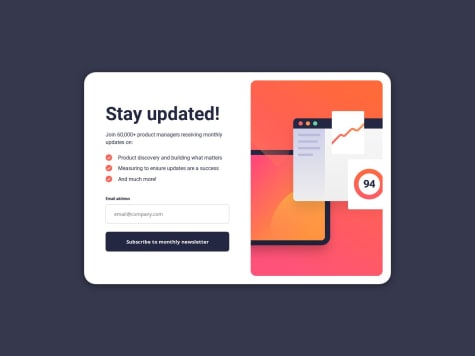
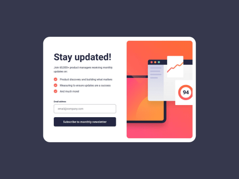
I am most proud of implementing a responsive design and effective form validation for the newsletter sign-up form. Next time, I would enhance user experience with animations and transitions, and explore more advanced form validation techniques.
What challenges did you encounter, and how did you overcome them?I encountered challenges with form validation and ensuring a responsive layout. I overcame them by using regular expressions for accurate email validation and employing CSS Flexbox and media queries to adapt the design to different screen sizes.
What specific areas of your project would you like help with?I would like help with optimizing the form validation logic to handle edge cases more effectively and improving the overall user experience with smoother animations and transitions.
@rowanroosterIt works as it should from what I can see. I did test it out a bit, nicely done!
Marked as helpful - @kiaraaa123What specific areas of your project would you like help with?
I'm having trouble with the margins for the profile image. I've made it a block element, which allows me to center it, but then removes the top margin. Any help would be appreciated. Thanks! :)
@rowanroosterTry using padding on the
.cardelement instead of margin. But, i think if you add even 1px of padding you should start seeing the margins - this is because of margin collapse / stacking margins.if im right, check this article for more on stacking margins: FreeCodeCamp
Hope that helps, but good work! Clean code and I like the comments in the css!
Marked as helpful - @NyanSunboWhat are you most proud of, and what would you do differently next time?
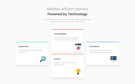
Grid-template-areas is very useful for this project.
What challenges did you encounter, and how did you overcome them?Layout because before this project I only use flex.
What specific areas of your project would you like help with?width, padding, margin and relative units
@rowanroosterThe grid-template-area works so well, it scales down nicely - looks great all the way down to mobile!
Im going to have to try this method as well!
Well done!
- @SDprasanth0012@rowanrooster
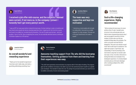
Nicely done! All I can comment on is the missing border radius on the image, the top and bottom left borders. You can add it to the image itself:
border-radius: 8px 0 0 8px; - @sakr2000What are you most proud of, and what would you do differently next time?
- Applied my knowledge of CSS and CSS-grid
- Applied my knowledge of responsive web design and media queries
@rowanroosterYour code looks good - sizing is slightly different but it works as it should!
The only thing I could say is check out CSS custom properties (variables) might help save some time and make things a bit easier to work along: W3Schools
Also I think adding the height/width to the image itself will stop it from loosing its aspect ratio - sometimes the image container shrinks a bit to fit the image and name in the same line on smaller screens making the image squash a bit and becoming oval.
Nice work!


