Skip to content
  • Unlock Pro
  • Log in with GitHub
Profile
OverviewSolutions
11
Comments
5

Tabassum Fatima

@tab21215 points

I’m a mysterious individual who has yet to fill out my bio. One thing’s for certain: I love writing front-end code!

Latest solutions

  • easybank landing page using Bootstrap Studio


    Tabassum Fatima•215
    Submitted about 3 years ago

    1 comment
  • Responsive huddle landing page


    Tabassum Fatima•215
    Submitted about 3 years ago

    0 comments
  • Tip Calculator using javascript

    #jquery

    Tabassum Fatima•215
    Submitted about 3 years ago

    1 comment
  • Time Tracking dashboard using CSS grid

    #fetch#jquery

    Tabassum Fatima•215
    Submitted about 3 years ago

    1 comment
  • Responsive FAQ accordation using jvascript - (jquery)

    #jquery

    Tabassum Fatima•215
    Submitted over 3 years ago

    1 comment
  • Sign Up Form using Javascript


    Tabassum Fatima•215
    Submitted over 3 years ago

    0 comments
View more solutions

Latest comments

  • alcpereira•190
    @alcpereira
    Submitted about 3 years ago

    Responsive Stats preview card component

    2
    Tabassum Fatima•215
    @tab21
    Posted about 3 years ago

    Hi @alcpereira

    Congratulations on completing the challenge !!

    Here I have some suggestions to improve it :

    First why you have space in mobile preview on right of the image is that because simply that is the actual image width and it doesn't increase it. Actually you have written height : 100% twice. You can just simply remove both the heights and add width : 100% which will also change its height in ratio to its image.

    Then also in mobile preview I suggest you give some top and bottom margin too to your card instead of auto.

    Also in desktop preview add these to .stats to add even spaces between your .stat (stats components)

    .stats{
        width: 100%;
        justify-content: space-between;
    }
    

    This takes the whole card width then spread the items in it with even space between them to justify.

    Overall you did great !!

    Hope this helps

    Happy Coding :)

  • Riaz Ahamed•50
    @riazahamedsikandar
    Submitted about 3 years ago

    single-price-grid-component (using HTML,CSS)

    1
    Tabassum Fatima•215
    @tab21
    Posted about 3 years ago

    Hi @riazahamedsikandar

    congratulations on completing the challenge !!

    But you have submitted it in the wrong challenge so you can see through that.Also I have some suggestions to improve it

    first for margin you can just give it '.main{ margin : 5% auto ;}' . As 5% for top and bottom margin(you can set as you find optimal ) and auto for making it center as it give the element same margin on both left and right making the element center.

    Also for desktop view instead of just .main{width: 45%;} atleast increase it to width: 60%; . so that it is more wider. Also remove these from body as in mobile view they don't let us give top margin and also some are superfluous.

    display: flex;
    justify-content: center;
    align-items: center; 
     position: relative;


    Hope this helps :)

    Happy coding!!

    Marked as helpful
  • Hannah O•80
    @hannahro15
    Submitted about 3 years ago

    Stats preview card component first attempt

    1
    Tabassum Fatima•215
    @tab21
    Posted about 3 years ago

    @hannahro15 hi !

    Congratulations on completing this challenge. However, I have some suggestions for the same.

    first about your question it may be that you designed your project specific to a width which wasn't 1440px as the ss here it takes the image of how your project looks at this width which is a desktop width generally.

    HTML: I suggest you make a div around all the written part (like .text)so that its easier to place as all are aligned to each other.

    CSS : Here don't repeatedly use the same things and write your code again as you have done for box-1,2,3 and number-1,2,3 and text-1,2,3. as they all have the same style just give them the same class and write the code once only. and in number and text you don't even need to give classes as they have different tags eg:

        margin-bottom: 5px;
        font-family: "Inter";
        color: hsl(0, 0%, 100%);
    }
    
    h4 {
        font-size: 8px;
        font-family: "Inter";
        color: hsla(0, 0%, 100%, 0.6);
    }
    /* since they have the same font family you can just give this font family to all */
    

    don't give padding to div since it gives space between img and container instead give padding to text you have wrapped around all the written parts. And also don't give flex-container 100px rather 100% width so that it can place the contents in it all over the .text

    .text {
        padding: 5%;
        width: 45%;
    }
    
    .flex-container {
        width: 100%;
        display: flex;
        justify-content: space-between;
        align-items: center;
        text-align: center;
    }
    

    for making it responsive I suggest using flex and making the width and height of the container auto and making the width of the picture 100%

    @media screen and (max-width:800px) {
        .container {
            display: flex;
            flex-direction: column;
        }
        main {
            width: auto;
            height: auto;
            overflow: hidden;
        }
        img {
            width: 100%;
        }
        .text {
            width: 90%;
        }
    }
    

    for the purple part in the image, you can give the colour to imgdiv and lower the opacity of the img

    .imgdiv {
        background-color: hsl(277, 61%, 48%);
    }
    
    img {
        opacity: .5;
    }
    

    also, add border-radius to the container

    I hope this helps :)

    happy coding !!

    Marked as helpful
  • Francisco Prado•80
    @franciscoprado4
    Submitted about 3 years ago

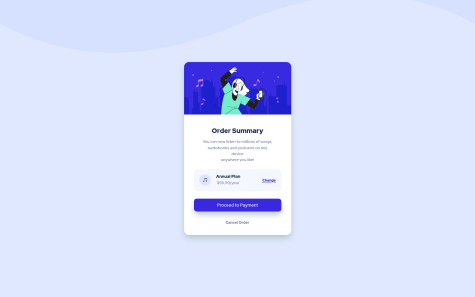
    Order Summary challenge - Flexbox and Grid

    5
    Tabassum Fatima•215
    @tab21
    Posted about 3 years ago

    @FranciscoPrado04 Hi!

    Congratulations on completing this challenge.

    Here I have some suggestions to improve:

    First, in HTML at line 25, you have a closing tag </h2> which doesn't have a starting tag. So you can remove that or you can use h2 instead of h3 in .tittle-text. It should also remove the accessibility issue.

    Second don't use the <br> tag repeatedly instead just make the width of .tittle-text as width: 100%; this will adjust the text like in the design. And in the future too it's better to not break lines using the <br> repeatedly tag rather use padding to adjust the way you want.

    hope this helps

    happy coding😃!

  • itsekor damilola•20
    @itsekordamilola
    Submitted about 3 years ago

    Responsive landing page using css grid

    1
    Tabassum Fatima•215
    @tab21
    Posted about 3 years ago

    @itsekordamilola hi

    You did a nice job on this one but :

    I have gone through your code and website saw that just HTML is there so use '<link rel="stylesheet" href="style.css">' as in the HTML you have written 'project.css' instead of 'style.css' but your file is named as style.css or you can change the CSS file name to project.css.

    Also, push your images folder to Github for images to be live.

    hope this helps :)

    Happy Coding!

Frontend Mentor logo

Stay up to datewith new challenges, featured solutions, selected articles, and our latest news

Frontend Mentor

  • Unlock Pro
  • Contact us
  • FAQs
  • Become a partner

Explore

  • Learning paths
  • Challenges
  • Solutions
  • Articles

Community

  • Discord
  • Guidelines

For companies

  • Hire developers
  • Train developers
© Frontend Mentor 2019 - 2025
  • Terms
  • Cookie Policy
  • Privacy Policy
  • License

Oops! 😬

You need to be logged in before you can do that.

Log in with GitHub

Oops! 😬

You need to be logged in before you can do that.

Log in with GitHub

Oops! 😬

You need to be logged in before you can do that.

Log in with GitHub

Oops! 😬

You need to be logged in before you can do that.

Log in with GitHub

Oops! 😬

You need to be logged in before you can do that.

Log in with GitHub

Oops! 😬

You need to be logged in before you can do that.

Log in with GitHub

Oops! 😬

You need to be logged in before you can do that.

Log in with GitHub

Oops! 😬

You need to be logged in before you can do that.

Log in with GitHub

Oops! 😬

You need to be logged in before you can do that.

Log in with GitHub

Oops! 😬

You need to be logged in before you can do that.

Log in with GitHub

Oops! 😬

You need to be logged in before you can do that.

Log in with GitHub

Oops! 😬

You need to be logged in before you can do that.

Log in with GitHub

Oops! 😬

You need to be logged in before you can do that.

Log in with GitHub

Oops! 😬

You need to be logged in before you can do that.

Log in with GitHub

Oops! 😬

You need to be logged in before you can do that.

Log in with GitHub

Oops! 😬

You need to be logged in before you can do that.

Log in with GitHub

Oops! 😬

You need to be logged in before you can do that.

Log in with GitHub

Oops! 😬

You need to be logged in before you can do that.

Log in with GitHub

Oops! 😬

You need to be logged in before you can do that.

Log in with GitHub

Oops! 😬

You need to be logged in before you can do that.

Log in with GitHub

Oops! 😬

You need to be logged in before you can do that.

Log in with GitHub

Oops! 😬

You need to be logged in before you can do that.

Log in with GitHub

Oops! 😬

You need to be logged in before you can do that.

Log in with GitHub

Oops! 😬

You need to be logged in before you can do that.

Log in with GitHub

Oops! 😬

You need to be logged in before you can do that.

Log in with GitHub

Oops! 😬

You need to be logged in before you can do that.

Log in with GitHub

Oops! 😬

You need to be logged in before you can do that.

Log in with GitHub

Oops! 😬

You need to be logged in before you can do that.

Log in with GitHub