@DariaRomanowska
Aspiring UX/UI designer and front-end developer. I still feel weak regarding JavaScript and CSS, so I'm here to challenge myself to get better. Please leave me lots of critiques to help me grow!
I’m currently learning...CSS, JavaScript. Hoping to learn more frameworks. Very exciting :)
Latest solutions
Meet Landing Page Animation
#accessibility#animationPSubmitted 3 months agoI placed section 2 under main. Would putting it under footer be valid too?
When using media query, should I add "screen and"? Does that hinder or help accessibility?
Currently I have to go back and adjust every margin and padding as needed when changing from mobile to tablet to desktop in the media query. Is there a way to only change margin and padding once, and have it adjust by itself?
I had to add extra divs in the html for animation purposes. Please let me know if there's better ways to do that. If there's foundations I'm missing, any mistakes or accessibility pitfalls I'm making, please let me know as well.
Four Card Feature with Grid and Animation
#accessibility#animationPSubmitted 4 months agoI would like advice on a few topics I feel iffy about, and would love guidance on:
- Did I use aria landmarks correctly? Are there other aria roles I should add, or any accessibility concerns I should change?
- I used rem for max-width for the card containers. Would ch be a better choice, and why or why not?
- The pseudo element ::after that I used to style the colored rectangles have inaccurate border-radius, as they differ from the design given. I am unable to get it to look like the design.
- Are there any foundations I need work on? Best practices that I'm not doing?
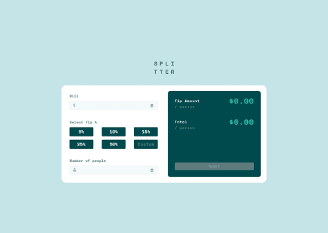
Responsive Tip Calculator with JavaScript
PSubmitted 5 months agoAs an amateur front end developer, I have not had the chance to receive professional critiques that teach me about best practices in HTML, CSS, and JS. I would really appreciate for someone to point out any bad habits that I'm doing that could potentially break my code or cause future issues, or any mistakes in general.
I also don't know how to center the page to make it look exactly as the solution. The current solution I have is a bit off along the Y axis
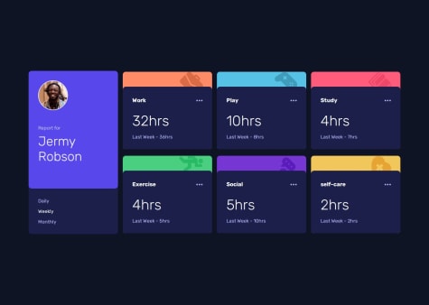
Time Tracking Dashboard
PSubmitted 11 months agoI am unable to loop over each class; I am only able to change the first of type upon clicking. I understand that querySelectorAll should be used with forEach, but I am unsure how to include it with my current code. I am still learning JavaScript so I need a lot of guidance. Please correct my mistakes and let me know what else I can do to make it work
Newsletter Signup Form
PSubmitted about 1 year agoIf there's any area I could improve on or condense my code, please let me know!
Article Preview Component
PSubmitted about 1 year agoAs it's my first time writing JS, I'm unaware of the best practices, or how to condense my code in a better way. Please give me any heads up, pointers, or tips, and let me know if there's anything I could have done better.
In addition, in the figma design the image is cropped differently in desktop view, and I am unsure as to how to crop the image exactly as it's portrayed in the design.
Latest comments
- P@wcyin9
There's minor UI adjustments that need to be fixed as they're different from the design given: font size for tip amount and total are inconsistent with the design. reset button font color and background color are off.
There needs to be an error alert when no number is entered into the number of people input. The custom input doesn't work.
Otherwise, great job!
Marked as helpful - @AbdullahSoulatWhat are you most proud of, and what would you do differently next time?
Managing data from a json file and displaying it properly on the page.
What challenges did you encounter, and how did you overcome them?Some issues with checking classes in JavaScript
What specific areas of your project would you like help with?Currently, I remove 6 cards, when updating the UI. I would like to remove all cards in the grid except the profile using classes
P@wcyin9Hi, great job on completing the challenge! Everything is working correctly and your solution is very close to the design given. One thing I would like to comment on is that the animation may be too distracting to the user, but that can be a personal preference. The user profile card also jumps a little bit upon clicking the tabs, which could make it look like a bug
- @CHBNDJWhat are you most proud of, and what would you do differently next time?
Im proud of being able to write JS code by understanding the logic behind it.
What challenges did you encounter, and how did you overcome them?None i was able to find everything that was new to me.
What specific areas of your project would you like help with?None
P@wcyin9Hi, great job on finishing the challenge! The solution looks nearly identical to the design, very nicely done.
One thing to note is that I am unable to advance to the success screen upon entering a valid email. There could be some error in your JS that you should revisit.
Marked as helpful - @RadaidehDanielWhat are you most proud of, and what would you do differently next time?
None
What challenges did you encounter, and how did you overcome them?There were two ways to display the share box, one for the mobile view and another for the desktop view. The desktop was easy but the mobile one was hard to do so I dropped it and made the design similar in both views.
What specific areas of your project would you like help with?None
P@wcyin9Hi there!
Very excellent job on your solution! One thing I would note is to add a code in your JS for the color of the button to go back to default after closing the share menu.
In terms of the CSS for the mobile version of the share menu, you can set its position relative to the author information, and use
topandbottomto adjust it to the bottom of the container. - @Mitko90P@wcyin9
Hello there, great job on finishing the challenge! It looks incredible, keep up the great work!
There are two areas I would like to comment on:
-
There's a lack of
:hoverstate on the buttons. This may be due to lacking access to the figma design, so it's absolutely not an issue, and is easily fixable. -
The footer overlay looks different from the design given. This is due to the fact that the footer image lacks opacity changes, and you used an overlay for the blue color. There are multiple approaches that are valid for the footer. The approach I'll give you below is one of many, and it can just serve as an example/reference point:
I used
picturetag withsourcetag in html for responsive purposes, as it works with media query to automatically change images upon different screen sizes. It eliminates the need to add extra code in CSS.<picture> for laptop dimensions: <source srcset="assets/desktop/image-footer.jpg" media="(min-width: 850px)"> for tablet dimensions: <source srcset="assets/tablet/image-footer.jpg" media="(min-width: 635px)"> for mobile dimensions using mobile first approach: <img class="footerbg" src="assets/mobile/image-footer.jpg" alt="chanel perfume"> </picture>Next, in CSS I targeted the
.footerbgclass that I gave to the image to give it an opacity of 0.1045, which was given in the Figma file, andposition: absolute;. Last, I targeted thefooterselector in CSS to give it abackground-color: ##4D96A9 ;. This will make the result look exactly like the one given in the design. The reason this works is because the image itself is on top of the footer. By giving it an opacity of 0.1045, it will let the blue color below it seep through.Hope this helped!
Marked as helpful -
- @ShivanshvohraWhat are you most proud of, and what would you do differently next time?
this seemed pretty easy
What challenges did you encounter, and how did you overcome them?unable to centre the outerbox to the centre of the page vertically.and couldnt apply focus element rather used hover
What specific areas of your project would you like help with?how to apply focus property to anything except an input label and how to centre the outerbox on the weboage verticaaly align items didnt work
P@wcyin9Hi there!
You can make it align vertically by adding the code below to the
bodyselector in css:display: flex; justify-content: center; align-items: center;In addition, I recommend using tags such as
mainin your html instead of relying ondiv. This is important for ARIA landmarks, which is helpful for screen readers to know where they are on the page. You can substitutediv class="outerbox"to simplymain.Hope this was helpful!