
yinnie
@wcyin9All solutions
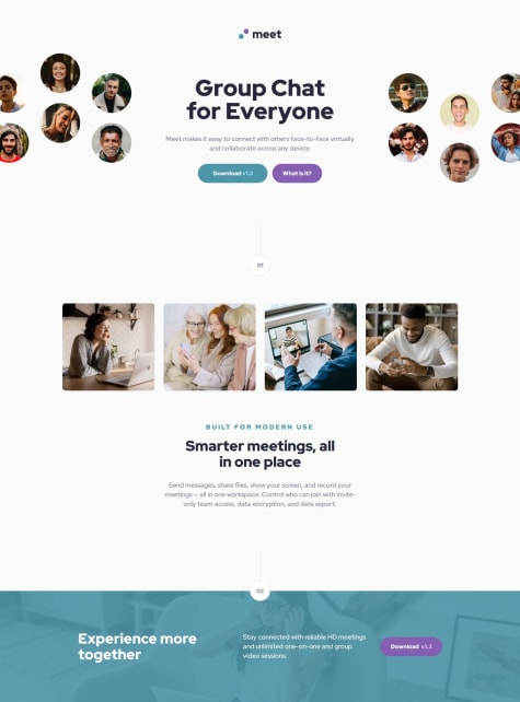
Meet Landing Page Animation
#accessibility#animationPSubmitted 3 months agoI placed section 2 under main. Would putting it under footer be valid too?
When using media query, should I add "screen and"? Does that hinder or help accessibility?
Currently I have to go back and adjust every margin and padding as needed when changing from mobile to tablet to desktop in the media query. Is there a way to only change margin and padding once, and have it adjust by itself?
I had to add extra divs in the html for animation purposes. Please let me know if there's better ways to do that. If there's foundations I'm missing, any mistakes or accessibility pitfalls I'm making, please let me know as well.
Four Card Feature with Grid and Animation
#accessibility#animationPSubmitted 5 months agoI would like advice on a few topics I feel iffy about, and would love guidance on:
- Did I use aria landmarks correctly? Are there other aria roles I should add, or any accessibility concerns I should change?
- I used rem for max-width for the card containers. Would ch be a better choice, and why or why not?
- The pseudo element ::after that I used to style the colored rectangles have inaccurate border-radius, as they differ from the design given. I am unable to get it to look like the design.
- Are there any foundations I need work on? Best practices that I'm not doing?
Responsive Tip Calculator with JavaScript
PSubmitted 5 months agoAs an amateur front end developer, I have not had the chance to receive professional critiques that teach me about best practices in HTML, CSS, and JS. I would really appreciate for someone to point out any bad habits that I'm doing that could potentially break my code or cause future issues, or any mistakes in general.
I also don't know how to center the page to make it look exactly as the solution. The current solution I have is a bit off along the Y axis
Time Tracking Dashboard
PSubmitted 12 months agoI am unable to loop over each class; I am only able to change the first of type upon clicking. I understand that querySelectorAll should be used with forEach, but I am unsure how to include it with my current code. I am still learning JavaScript so I need a lot of guidance. Please correct my mistakes and let me know what else I can do to make it work
Newsletter Signup Form
PSubmitted about 1 year agoIf there's any area I could improve on or condense my code, please let me know!
Article Preview Component
PSubmitted about 1 year agoAs it's my first time writing JS, I'm unaware of the best practices, or how to condense my code in a better way. Please give me any heads up, pointers, or tips, and let me know if there's anything I could have done better.
In addition, in the figma design the image is cropped differently in desktop view, and I am unsure as to how to crop the image exactly as it's portrayed in the design.
Responsive Landing Page, CSS grid and flex
#accessibilityPSubmitted about 1 year agoPlease let me know if grid was a better choice for this challenge.
In addition, I feel like my media query may have a lot of redundancy. If there's better ways to code responsive sizing, please let me know. If there's any other area where I could use more work on or I should change, please let me know as well. Thanks for your time!
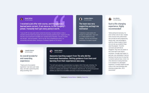
Testimonial section CSS grid
#accessibilityPSubmitted about 1 year agoPlease let me know if there's any mistakes I made, or if there's better code I can implement.
Four card feature section with CSS grid and flex
#accessibilityPSubmitted about 1 year agoPlease let me know if there's more efficient way to write out my grid code, and whether or not I made any mistakes overall. I would also like to know if I'm using best practices
Responsive product preview card using CSS flex and grid
#accessibility#animationPSubmitted about 1 year agoPlease let me know if my website is responsive enough, and if there's any areas, especially responsive code, that I need more work on.
Responsive Recipe Page CSS
#accessibility#animationPSubmitted about 1 year agoI feel as if my code could be condensed more, but I'm not sure how. There were a lot of repetitiveness that I could do without. In addition, I don't know if I overdid it with the classes and tags in the html.
If there's better approaches to responsiveness than what I wrote, please let me know. I will gladly take criticism from any weak areas you may spot.
Social Links Profile CSS
#accessibility#animationPSubmitted about 1 year agoWhen it comes to buttons, I'm not sure if I should use p with css styles to make it look like a button, or if I should use the button tag that already exists in HTML. I would like to know if there's specific situations where one is better than the other, or if it's just a personal preference for developers.
Another area is the sizing; currently I use fixed sizing (px) for the container since I'm trying to get the final product to look as similar to the design as possible. Should I instead use em/vw/vh/% to make it more responsive, despite given the specific dimensions in figma?
Blog Preview Card CSS Hover Effect
#accessibility#animationPSubmitted about 1 year agoI think I have a tendency to write redundant code, so if anyone has tips on how I can change my code to be more efficient that would be really helpful. I would also like to know if I chose the right html tags. All other critiques are also welcome!
QR Code using CSS
#accessibility#foundationPSubmitted about 1 year agoI am not sure if the code I wrote could have been written more efficiently. I think I have a habit of writing excess code, or doing things in a way that use more code than necessary. If anyone has more effective ways that I could implement, please let me know.