Skip to content
  • Unlock Pro
  • Log in with GitHub
Profile
OverviewSolutions
70
Comments
73
Wendy
@wendyhamel

All comments

  • P
    Kamran Kiani•2,780
    @kaamiik
    Submitted 4 months ago
    What are you most proud of, and what would you do differently next time?

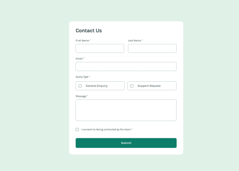
    Proud of: Successfully integrating React Hook Form, Zod, and TypeScript to create a robust, type-safe form with clear validation and error handling. Do differently: Explore more advanced form management techniques, such as dynamic form fields or multi-step forms, to further enhance user experience.

    What challenges did you encounter, and how did you overcome them?

    Challenges:

    • Handling form validation for numeric inputs from native HTML inputs (which return strings).
    • Ensuring type safety between form inputs and business logic.

    Overcame by: Using Zod to validate and transform string inputs into numbers, and leveraging TypeScript to enforce consistent types across the application.

    What specific areas of your project would you like help with?
    • Optimizing the performance of form re-renders with React Hook Form.
    • Improving accessibility for native inputs and custom components.
    • Exploring best practices for integrating Zod with complex form structures

    Feel free to share any additional thoughts or suggestions!

    Mortgage Repayment Calculator using React Tailwind TypeScript

    #react#react-hook-form#tailwind-css#typescript#zod
    2
    Wendy•2,150
    @wendyhamel
    Posted 3 months ago

    Hi there @kaamiik!

    Nice solution again here. The code looks good, it works smoothly and matches the design.

    I found a few small things you that could improve your solution. The border of the 'Mortgage Type' radio select dots is lime on a selected option in the design and the dots in your solution look a bit off center. The last issue I found is that if you click the 'clear all', the validation message of the 'Mortgage Type' shows up.

    I like the dotted outline you added on focus. It makes the focussed element stand out better than the focussed state from the design.

    Happy coding!

    Marked as helpful
  • Sam Hooker•780
    @35degrees
    Submitted 7 months ago
    What are you most proud of, and what would you do differently next time?

    I made some missteps at the start and some bad component architecture but I was able to do some research and restructure the components. I'm proud that I solved the currency conversion from numbers without installing a library and that I passed props across multiple components including functions. I would do more architecture testing up front instead of jumping in.

    What challenges did you encounter, and how did you overcome them?

    Lots of changes to get the components and props to work together. A good change in one components broke something in another component a couple of times but I worked through these issues.

    What specific areas of your project would you like help with?

    Passing props and using functions as props.

    Svelte Tailwind Product cart

    #svelte#tailwind-css
    3
    Wendy•2,150
    @wendyhamel
    Posted 4 months ago

    Hi,

    I like the add item animation in the cart. It is subtile and intuitive!

    Your design looks good, but it doesn't quite match the design on desktop size. Your card images are rectangular and in the design they are square. Your layout could use some padding on the top and bottom on all screen sizes so users know they reached the end of the page. Now you try to scroll down because it looks like there may be some more content below.

    You could improve the semantics of your project if you use HTML elements like <section> and <article>. It helps browsers organising the accessibility tree. Screen readers can walk trough your project better so their users can navigate and process the information. see MDN docs

    I can't help you with advise about passing props and using functions as props in react unfortunately. I do not work with react.

    Happy coding!

  • Elizabeth Sotomayor•230
    @elizabethrsotomayor
    Submitted about 2 years ago

    Responsive

    #accessibility
    1
    Wendy•2,150
    @wendyhamel
    Posted 6 months ago

    Hi, nice work on the mobile styling of this challange!

    The responsiveness could use some more of your attention though. If you get to the in between sizes the layout breaks.

    To explain your problem with the .item and get the .item-score to align-self: flex-end the align does set the .item-score to end. It's just that it pushes it down when the flex direction is row (this is default) and not to the right.

    The text-align: end fixed your problem on it's own.

    Happy coding!

  • P
    Kamran Kiani•2,780
    @kaamiik
    Submitted 7 months ago
    What are you most proud of, and what would you do differently next time?

    This challenge was one of the most difficult I’ve faced so far. The project involved multiple pages, each containing unique information. I put in my best effort to build the site using tools like Tailwind CSS, Sass, and Astro. I should also mention that I followed Kevin Powell’s course on Scrimba during this challenge, which taught me many valuable tips and techniques.

    What challenges did you encounter, and how did you overcome them?

    Navigation in the header is always a challenge. The styles needed to adapt for mobile, tablet, and desktop views, which added complexity to the code. Additionally, some functionality had to be handled with JavaScript, and Accessibility considerations were crucial.

    Apart from the homepage, all other pages featured a tab system to dynamically update the information based on user interaction, whether by mouse click or keyboard arrow navigation. Implementing this was challenging in CSS, JavaScript and Accessibility.

    What specific areas of your project would you like help with?

    I’d love to learn about alternative approaches to building this website. The project includes a data.json file, and I used Astro to develop it. I’m curious if there’s a more efficient way to manage the project with less code. For instance, I currently have four separate pages in the pages folder. Would it be better to use a single page and handle everything dynamically with the data.json file?

    I also made an effort to prioritize accessibility in my project, but there’s always room for improvement. If you notice any issues or have suggestions to enhance accessibility, I’d really appreciate your feedback.

    Space Tourism Website using Sass, Tailwind and Astro

    #accessibility#astro#sass/scss#tailwind-css
    1
    Wendy•2,150
    @wendyhamel
    Posted 6 months ago

    Hi! This project takes a lot of time to complete. Nice work finishing it.

    The approach you took with four pages is better than a single page in my opinion. This way you have the right url’s to go with the pages without any workarounds.

    For your accessibility, I read about the tab system and I get your idea there. However, if I try to navigate your site with voiceover, it does not work the way I think it should. I am not able to get it to read the texts aloud. Just the links. Screenreaders use semantic HTML and the DOM order to make Roters. These are helpful for navigating through the content of a site with a screenreader. On your site, the voiceover does not have any rotors available. Apart from the screenreader; When I try to navigate through the site using the tab key, it steps to the texts, which are not parts of your site you can interact with. Navigating through a site with the tab key should only tab between elements a user can interact with, such as links and buttons.

    I am also exploring the improvements for accessibility, so I hope this helps us both in our research to improve.

    Happy Coding!

    Marked as helpful
  • Katie Louise Snape•240
    @KSnape34
    Submitted 7 months ago

    Bookmark Landing Page with React + Tailwind CSS

    #react#tailwind-css
    1
    Wendy•2,150
    @wendyhamel
    Posted 7 months ago

    Very nice work!

    Nice use of the semantic <article> element. Did you know about the <details> element? This is a nice one to use for the FAQ for better semantic html.

    The image and the text of the tabs in the features section take different time to show. The images lag behind a bit.

    The fonts of your headings are a bit bolder than the design, but I do like the overall site. Your responsive solutions look good on small and large screens!

    Happy coding!

  • P
    Kamran Kiani•2,780
    @kaamiik
    Submitted 8 months ago
    What are you most proud of, and what would you do differently next time?

    The CSS structure, organized with SASS and the CUBE CSS methodology, worked very well and kept the code clean and modular. Using Astro components also improved the code structure, making it more readable. Next time, I might try a framework like Tailwind CSS to streamline styling even further and to make styling faster and more consistent.

    What challenges did you encounter, and how did you overcome them?

    One main challenge was setting up the CSS Grid layout, especially achieving an overlapping effect between the header and main sections. This required a careful setup of grid rows and columns, particularly in the desktop view. Experimenting with different grid configurations helped achieve a result close to the design. For animations, I kept them straightforward—one for site load and another for the image slider transition. Keeping these animations simple made them manageable to implement effectively.

    What specific areas of your project would you like help with?

    Feedback on CSS structure and animations would be very helpful. Suggestions on improving the CSS organization or refining the animations would be useful, especially if there are ways to make them more effective without extra complexity. Also, any recommendations for improving HTML, JavaScript, or accessibility would be appreciated, as these adjustments could enhance the code’s overall quality and accessibility.

    Room Homepage Master using Astro, Sass and cube css

    #accessibility#astro#cube-css#sass/scss
    1
    Wendy•2,150
    @wendyhamel
    Posted 7 months ago

    Nice job here!

    Nice solution for the layout with the grid. You could figure out some stages in between the mobile layout and the desktop layout. The sections and images are a bit largeon the higher end before your breakpoint, this pushes the content out of view.

    There is some room for more semantic use of html elements instead of the div's. Article is a nice option for the sections with information. This also improves accessibility.

    The animations are a bit jarring for my taste. The images are large and they have to move over a large empty space but is's mostly because the previous content does not animate out.

    I use Alpine.js in my projects, combined with Tailwind.css. It helps with these transitions. It makes coding them a lot easier.

    Happy Coding!

    Marked as helpful
  • Yusuf•170
    @whalay
    Submitted over 2 years ago

    loopstudios-landing-page

    #accessibility#react#react-testing-library#tailwind-css#airtable
    1
    Wendy•2,150
    @wendyhamel
    Posted 7 months ago

    Hi, nice to see you try this challenge.

    I noticed a few points you could improve.

    Match to the design

    • In the design the hero image has a subtile darker overlay
    • The fonts in your project are not a match to the design in some places: header menu and the body text)
    • The colors in your project are not a match to the design in some places: (active indicator line under the header navigation, body text)
    • The padding and margin is different from the design: (mostly padding and margin around the sections)

    Semantic HTML

    • I do not see a <main> tag
    • I noticed a lot of <div>'s. There are many more semantic html elements you can use. Try the use of <section> or <article> elements. You can read about it on MDN for example.

    Responsive You did a good job here for the mobile layout. But you might want to tweek some in-between states and the larger screens. There is some content overlapping (body text overlaps the button) or cramped together (header logo and menu) on some in-between sizes. If you look at your project on a larger screen, the site kind of falls apart because there is a lot of space between. (the body text stretches out a lot, the button gets very far away to the right from the grid that stays on the left) You could contain the width the content is allowed to take and center it, to make it all look good on a greater veriety of screen sizes.

    I hope this will help you.

    Happy coding!

  • P
    Kamran Kiani•2,780
    @kaamiik
    Submitted 9 months ago
    What are you most proud of, and what would you do differently next time?

    I am most proud of my efforts to ensure accessibility in my project, particularly in creating a responsive navbar and using dialog elements effectively. Next time, I would definitely use a framework to streamline the development process.

    What challenges did you encounter, and how did you overcome them?

    One of the main challenges was ensuring that the lightbox and cart dialogs were both functional and accessible. I had to pay close attention to various aspects in JavaScript to ensure necessary updates. I overcame these challenges by meticulously adhering to accessibility guidelines and thoroughly testing my code.

    What specific areas of your project would you like help with?

    I would like help with ensuring that my implementation of the lightbox and cart dialogs is as efficient and accessible as possible. Additionally, any feedback on improving the overall accessibility and responsiveness of the navbar would be greatly appreciated.

    E-commerce Product Page using Astro, Sass and Vanilla JavaScript

    #accessibility#astro#sass/scss
    2
    Wendy•2,150
    @wendyhamel
    Posted 8 months ago

    Hi there!

    Nice solution with just some minor layout issues I'd like to point out.

    Your menu items are not visible on desktop. Looks like .nav__content: opacity: 0 is the problem.

    The thumbnails are not square in your carousel.

    Your Javascript looks structured and the page is responsive and acceptably accessible.

    Happy coding!

    Marked as helpful
  • Wendy•2,150
    @wendyhamel
    Submitted over 1 year ago

    E commerce product page with Alpine.js and Tailwind.css

    #accessibility#tailwind-css#animation
    2
    Wendy•2,150
    @wendyhamel
    Posted 8 months ago

    Thnk you!

  • Wendy•2,150
    @wendyhamel
    Submitted about 1 year ago

    Contact Form Main with Alpine.js and Tailwind.css

    #accessibility#tailwind-css
    2
    Wendy•2,150
    @wendyhamel
    Posted 8 months ago

    Thank you!

    I did not test the success message for that. I'll look into it if I have the time!

  • Wendy•2,150
    @wendyhamel
    Submitted over 1 year ago

    Responsive News Homepage with Tailwind.css and Alpine.js

    #tailwind-css#accessibility
    2
    Wendy•2,150
    @wendyhamel
    Posted 8 months ago

    Thank you!

  • Wendy•2,150
    @wendyhamel
    Submitted over 1 year ago

    Newsletter Sign-up form. Used Alpine.js and Tailwind.css

    #accessibility#tailwind-css
    2
    Wendy•2,150
    @wendyhamel
    Posted 8 months ago

    Thank you!

  • Wendy•2,150
    @wendyhamel
    Submitted over 2 years ago

    Tip Calculator App with Tailwind.css and Alpine.js

    #accessibility#tailwind-css
    2
    Wendy•2,150
    @wendyhamel
    Posted 8 months ago

    Thank you!

  • Marc Francis•730
    @marcfranciss
    Submitted 9 months ago

    News homepage (React | Sass)

    #sass/scss#vite#accessibility
    1
    Wendy•2,150
    @wendyhamel
    Posted 8 months ago

    Great solution to this challenge!

    Your solution is extremely close to the screenshot and resizes nice on smaller screens. It does have a scrollbar on larger screens, when all the content is visible, so you might want to adjust the .margin-block: 90px on <main> to just margin top for example.

    You might want to look into more use of semantic HTML to reduce the meaningless div's for better accessibility. The .news-container and .populair-container could be <article>'s instead of a <div>'s.

    Last, a very small design difference: in the screenshot the text of the read more button is black, but in the design it is white.

    Happy coding!

  • Roid Zuhdianto•330
    @roidzuh
    Submitted 8 months ago
    What are you most proud of, and what would you do differently next time?

    React, Tailwind CSS, mobile-first approach

    What challenges did you encounter, and how did you overcome them?

    none.

    What specific areas of your project would you like help with?

    Any feedback is welcome!

    Contact Form using React.js and tailwind CSS

    #react#tailwind-css#vite#accessibility
    1
    Wendy•2,150
    @wendyhamel
    Posted 8 months ago

    Hi there,

    Nice work on this solution!

    I noticed a horizontal scroll bar on sizes < 185px wide screens. The margin on your <section> with the form (first one in the #root, not the second containing the success message) is the cause. One way to solve this is removing the margin from the <section> and use a padding on the containing <div id="root"> instead.

    But that's it! The rest of your code looks good.

    Happy coding!

    Marked as helpful
  • Papi•280
    @Papi84
    Submitted 9 months ago
    What are you most proud of, and what would you do differently next time?

    I’m most proud of how I effectively utilized HTML and CSS to create a visually appealing and responsive design. The project demonstrated my ability to implement modern web design principles and achieve a clean, user-friendly interface.

    Next time, I would focus on enhancing cross-browser compatibility and optimizing performance. Additionally, I’d explore incorporating more advanced CSS features and JavaScript to add interactive elements, which could further improve the user experience.

    What challenges did you encounter, and how did you overcome them?

    One of the main challenges was achieving consistent styling across different browsers and devices. I tackled this by using CSS resets to standardize default styles and thoroughly testing the design on various platforms to ensure compatibility. Additionally, I faced difficulties with responsive design, particularly with complex layouts. To address this, I utilized media queries and flexible grid systems to adapt the layout effectively. These steps ensured a cohesive and accessible user experience across different environments.

    What specific areas of your project would you like help with?

    I would appreciate feedback on optimizing my CSS for better performance and scalability, particularly in handling complex layouts. Additionally, guidance on improving cross-browser compatibility and suggestions for integrating more advanced interactive features with JavaScript would be valuable. Any advice on refining my design for enhanced user experience and accessibility would also be greatly appreciated.

    https://github.com/Papi84/frontened-parctice-13.09.2024/blob/main/styl

    #accessibility
    3
    Wendy•2,150
    @wendyhamel
    Posted 8 months ago

    Hi there!

    This is a very nice solution to this challenge.

    Normalising your css is a very good idea. It lets you focus on the design, without the hastle of working out bugs in the different browsers.

    Your css code looks neat and your class names are discriptive. This makes your code easy to maintain. I would change a few names to make it more accurate: for example

    • the card-overlay name => it's not really an overlay of the card
    • and the double class name for card-day (with the addition :first-child) => this first one is not really the day

    But this is me looking really hard to find things to improve for you.

    You could work on the semantic HTML by using more discriptive HTML tags like <section> or <article> for the card.

    You asked for help with optimizing the CSS and cross-browser compatibility, or more interactive features with JavaScript. In the case of this challenge I would discurrage that. It is a simple card, and adding to much transitions and animations can distract or even irritate users. But in other projects it may be usefull. If I have the time to look for improvements on some of your other solutions, I will keep this in mind.

    Over all, a neat solution for this challenge. I like the responsiveness without the need for or use of media queries. This card does not need them and you used nice other solutions.

    Happy coding!

  • P
    Tsukimi•820
    @hikawi
    Submitted 9 months ago
    What are you most proud of, and what would you do differently next time?

    I'm most proud of completing the challenge of not using JS for the solution. This was made completely in Astro components with no (or as little as possible) JS footprint.

    What challenges did you encounter, and how did you overcome them?

    Had some troubles with fluid typography as the library wasn't able to recognize arbitrary Tailwind values, just having to add those styles needed in the tailwind config and everything worked again.

    FAQ Accordion

    #astro#tailwind-css
    2
    Wendy•2,150
    @wendyhamel
    Posted 9 months ago

    Hi! Great solution to this challenge!

    Your solution is very much like the design and your code is very readable. I had to look hard to find anything to comment on. 🙂

    Nice to see you use the details / summary HTML solution.

    Accessible, pure HTML. Great.

    You could consider putting the elements in a list, to let users (screenreaders) know it is a list of questions grouped together.

    I never worked with Astro, so I can't comment on that.

    Happy Coding!

  • leodev•480
    @hangtime319
    Submitted 9 months ago
    What are you most proud of, and what would you do differently next time?

    In this project I managed to learn about accessibility. I still didn't know anything about this subject. In the next projects I will apply the accessibility rules.

    What challenges did you encounter, and how did you overcome them?

    I had difficulty finding the necessary attributes for screen readers.

    What specific areas of your project would you like help with?

    I would like more tips on accessibility to apply to future projects.

    Interactive rating with HTML, CSS and JS including Acessibility

    #accessibility
    1
    Wendy•2,150
    @wendyhamel
    Posted 9 months ago

    Hi, Great to see you are working on the accessibility!

    I noticed some styling differences:

    • If you look closely at the design, you can see the card has a gradient from top to bottom in the background.
    • the selected state of a rating is gray in the design
    • the hover state of the button has orange text in the design

    For your rating to work as a radio group, you need to use inputs instead if buttons. The type="radio" does nothing on a button. You need a <fieldset> with <input type="radio"> and give them all a name="" attribute. The name you use, should be the same for all the radio inputs. This let's html know this is a group of radio buttons. This lets you iterate the buttons in that group with the arrow keys. Better accessibility, without the need to add aria-attributes for yourself.

    Happy Coding!

    Marked as helpful
Frontend Mentor logo

Stay up to datewith new challenges, featured solutions, selected articles, and our latest news

Frontend Mentor

  • Unlock Pro
  • Contact us
  • FAQs
  • Become a partner

Explore

  • Learning paths
  • Challenges
  • Solutions
  • Articles

Community

  • Discord
  • Guidelines

For companies

  • Hire developers
  • Train developers
© Frontend Mentor 2019 - 2025
  • Terms
  • Cookie Policy
  • Privacy Policy
  • License

Oops! 😬

You need to be logged in before you can do that.

Log in with GitHub

Oops! 😬

You need to be logged in before you can do that.

Log in with GitHub

Oops! 😬

You need to be logged in before you can do that.

Log in with GitHub

Oops! 😬

You need to be logged in before you can do that.

Log in with GitHub

Oops! 😬

You need to be logged in before you can do that.

Log in with GitHub

Oops! 😬

You need to be logged in before you can do that.

Log in with GitHub

Oops! 😬

You need to be logged in before you can do that.

Log in with GitHub

Oops! 😬

You need to be logged in before you can do that.

Log in with GitHub

Oops! 😬

You need to be logged in before you can do that.

Log in with GitHub

Oops! 😬

You need to be logged in before you can do that.

Log in with GitHub

Oops! 😬

You need to be logged in before you can do that.

Log in with GitHub

Oops! 😬

You need to be logged in before you can do that.

Log in with GitHub

Oops! 😬

You need to be logged in before you can do that.

Log in with GitHub

Oops! 😬

You need to be logged in before you can do that.

Log in with GitHub

Oops! 😬

You need to be logged in before you can do that.

Log in with GitHub

Oops! 😬

You need to be logged in before you can do that.

Log in with GitHub

Oops! 😬

You need to be logged in before you can do that.

Log in with GitHub

Oops! 😬

You need to be logged in before you can do that.

Log in with GitHub

Oops! 😬

You need to be logged in before you can do that.

Log in with GitHub

Oops! 😬

You need to be logged in before you can do that.

Log in with GitHub

Oops! 😬

You need to be logged in before you can do that.

Log in with GitHub

Oops! 😬

You need to be logged in before you can do that.

Log in with GitHub

Oops! 😬

You need to be logged in before you can do that.

Log in with GitHub

Oops! 😬

You need to be logged in before you can do that.

Log in with GitHub

Oops! 😬

You need to be logged in before you can do that.

Log in with GitHub

Oops! 😬

You need to be logged in before you can do that.

Log in with GitHub

Oops! 😬

You need to be logged in before you can do that.

Log in with GitHub

Oops! 😬

You need to be logged in before you can do that.

Log in with GitHub

Oops! 😬

You need to be logged in before you can do that.

Log in with GitHub

Oops! 😬

You need to be logged in before you can do that.

Log in with GitHub

Oops! 😬

You need to be logged in before you can do that.

Log in with GitHub

Oops! 😬

You need to be logged in before you can do that.

Log in with GitHub

Oops! 😬

You need to be logged in before you can do that.

Log in with GitHub

Oops! 😬

You need to be logged in before you can do that.

Log in with GitHub

Oops! 😬

You need to be logged in before you can do that.

Log in with GitHub

Oops! 😬

You need to be logged in before you can do that.

Log in with GitHub

Oops! 😬

You need to be logged in before you can do that.

Log in with GitHub

Oops! 😬

You need to be logged in before you can do that.

Log in with GitHub

Oops! 😬

You need to be logged in before you can do that.

Log in with GitHub

Oops! 😬

You need to be logged in before you can do that.

Log in with GitHub

Oops! 😬

You need to be logged in before you can do that.

Log in with GitHub

Oops! 😬

You need to be logged in before you can do that.

Log in with GitHub

Oops! 😬

You need to be logged in before you can do that.

Log in with GitHub

Oops! 😬

You need to be logged in before you can do that.

Log in with GitHub

Oops! 😬

You need to be logged in before you can do that.

Log in with GitHub

Oops! 😬

You need to be logged in before you can do that.

Log in with GitHub

Oops! 😬

You need to be logged in before you can do that.

Log in with GitHub

Oops! 😬

You need to be logged in before you can do that.

Log in with GitHub

Oops! 😬

You need to be logged in before you can do that.

Log in with GitHub

Oops! 😬

You need to be logged in before you can do that.

Log in with GitHub

Oops! 😬

You need to be logged in before you can do that.

Log in with GitHub

Oops! 😬

You need to be logged in before you can do that.

Log in with GitHub

Oops! 😬

You need to be logged in before you can do that.

Log in with GitHub

Oops! 😬

You need to be logged in before you can do that.

Log in with GitHub

Oops! 😬

You need to be logged in before you can do that.

Log in with GitHub