P
@K1dou

This is a wonderful build of the project. First off, it is impressive that you're using React to develop this part of the project. Great job in getting it to be centered & responsive to the different screen sizes from mobile, tablet and desktop sizes. The links also change when you click on daily, weekly and monthly reflecting the data from the JSON source file. Overall great job. :)
I believe you did a wonderful job, the over all structure of your code is very neat, easy to read. I believe the spacing of the main container could be better but overall everything is close and identical to the design. It seems to be responsive and respective to the mobile and desktop sizes here. Great job using react!
In this project, I improved on how to implement responsive design principles effectively. I worked with different screen sizes using CSS media queries, ensuring the layout adapts seamlessly across mobile, tablet, and desktop devices. This also helped me improve my CSS skills in handling flexbox and grid layout systems, especially when creating components like the portrait section and buttons.
I also gained more practice with semantic HTML. For example, I used elements like <main>, <section>, <footer>, and <h1> to improve the structure and accessibility of the webpage. This helped ensure better readability for both humans and screen readers, making the content more accessible.
Additionally, I worked with custom fonts and enhanced typography to make the page more visually appealing while maintaining readability. The use of reusable CSS classes for typography and layout allowed me to keep the styles consistent across the page, while also making the code more maintainable.
What challenges did you encounter, and how did you overcome them?One challenge I faced was ensuring the design was responsive across all screen sizes. Particularly, the layout of the hero section and the grid of portraits on different screen widths required lots of adjustments. I had to test my media queries multiple times and adjust the grid template to ensure it displayed well on tablets and desktops.
Another struggle was optimizing the use of semantic HTML in a way that kept the page structure both functional and visually organized. I had to pay attention to not only the visual hierarchy but also how I could use tags effectively for accessibility without sacrificing the design.
To overcome these, I referred to the project brief frequently and cross-checked my layout in different browser tools, like Chrome's developer tools, to make sure everything looked good on various devices.
The project looks really good and fairly close to the design. The only thing I would say needs adjustment is the spacing of some elements like getting the footer image to be pushed down to the bottom more, fixing the border radius on the buttons and spacing out the grid images just a tad bit with space-between in CSS or margin left and right of each other. Other than that, great job! Happy Coding. :)
The project is amazing and great in desktop view. Great job at an organized and clean HTML and CSS code. You did a good job with most of the HTML, however maybe start incorporating more semantic HTML like sections, articles tags etc. to be able to make it more accessible especially for screen readers and other semantic HTML tags for accessibility. The only thing I would say you could implement is mobile responsiveness by incorporating media queries for the mobile version. Other than that, great job!
I am very happy with the responsive behavior of my site.
What challenges did you encounter, and how did you overcome them?I faced some issue with width and height of parent and child elements.
What specific areas of your project would you like help with?How do i make sure that my container covers the entire page and difference in height , width , max and min height and width and 100vw, 100% and 100vh ? when to use which?
Hi I am just going to go off the questions from front end mentor for the feedback, Does the solution include semantic HTML? - Yes Is it accessible, and what improvements could be made? - Great job using the alt key for accessibility for your icon. Does the layout look good on a range of screen sizes?- Yes good job on the responsive design. Is the code well-structured, readable, and reusable? - Yes great job for a well structured code, it is easy to read. Does the solution differ considerably from the design? - No but the only thing I would say is to adjust the background color to fit more closer to the original design but other than that, you did well!
Does the solution include semantic HTML? - Yes Is it accessible, and what improvements could be made? N/A Does the layout look good on a range of screen sizes? - Yes Is the code well-structured, readable, and reusable? - yes Does the solution differ considerably from the design? It is very close to the design. Overall great job!
Great job on getting it as close as you can to the original source!
Questions from Front end mentor Does the solution include semantic HTML? The only thing is using better semantic HTML, instead of using div's for better accessibility use you can use section.
Is it accessible, and what improvements could be made? Maybe in the future you could go back and add some accessibility features and modify it for using semantic html.
Does the layout look good on a range of screen sizes? On desktop yes.
Is the code well-structured, readable, and reusable? Yes easy to read.
Does the solution differ considerably from the design? Slightly very subtle differences and very close design.
Overall great job!
Questions according to Front end mentor website for feedback
Does the solution include semantic HTML? Yes, I think you did a great job using semantic HTML especially using the buttons for the links to the social media websites.
Is it accessible, and what improvements could be made? Maybe in the future you could probably come back and edit it to have some accesibility features.
Does the layout look good on a range of screen sizes? There was no responsive web design to fit different screen sizes but thats okay, you may also come back in the future to do it later.
Is the code well-structured, readable, and reusable? Yes very simple and by incorporating the styling in the head of the HTML section, it is very easy to read and understandable especially in this small mini project.
Does the solution differ considerably from the design? Yes but in a good way I love the way you personalized it with your own photo and location, overall great job.
im proud of using. flexbox
What challenges did you encounter, and how did you overcome them?few challenges with the responsiveness
What specific areas of your project would you like help with?Feedback is welcome!
Nice job on getting the design as close to the source material as possible. I believe you could have used border-radius to round off the edges of the learning block a little bit. I would also suggest to space the elements to "push" down on each other for example having the main blog image use spacing padding-bottom for each element to have that nice spacing to get it as close to source material as possible for spacing. Probably maybe use made it mobile responsiveness for better accessibility. Your code seems well structured, readable and reusable. Your design doesn't differ too much so good job overall though!
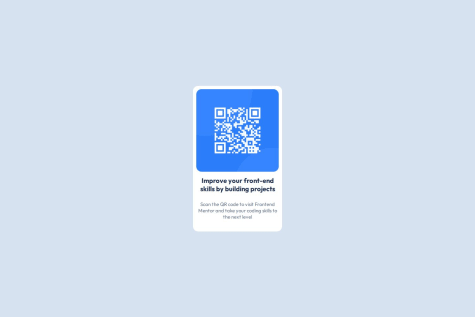
It looks great and very close to the design. I believe you could also implement media queries in CSS to make it responsive and have a mobile version of the QR component. Other than that great job!
Displayed share options with the help of display: flex property for small screen size and used position: absolute for larger screen size. I hope I have done it right.
If someone could review my JavaScript code and give me feedback, that would be really helpful
In one of your styles in CSS within the share options class add this "transition: transform 0.3s ease-in-out;" so that when you click it it has a nice smooth transition from when it disappears and appears again. Great job overall, you have it looking pretty much very closely to the picture. It looks good one a smaller mobile sized screen with media query. Your code is readable friendly, I would love your feedback on mine as well, when you have a moment. Thank you & happy coding.