
@exist08

Yonten
@yozidstAll comments
- @yozidst
Hi 👋,
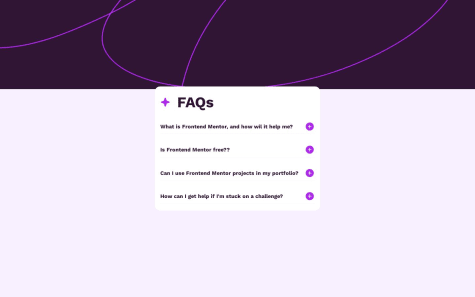
Awesome job on this challenge! Something I noticed; maybe it was intentional was if I click a question or the (+), (-) on an opened accordion, the accordion doesn't react or collapse. The collapse function seems to be only enabled by clicking on the opened answer or another question's question or its (+) (-) symbol. Because the questions change color on hover I hoped that clicking an opened question would also have the collapse functionality on its own. Just thought I would let you know, cheers! 👋
- @orijaopilex@yozidst
Hi there 👋
Great Job on your first challenge! For implementing the project's font you can do the following:
@import url('https://fonts.googleapis.com/css2?family=Montserrat:wght@500;700&family=Outfit:wght@400;700&display=swap');  // in your styles.css page

:root {
   --ff: "Outfit", sans-serif;
}

body {
   font-family: var(-ff);
   ...
}
Hope that helps! Good Luck & fight on!
Marked as helpful - @vuson1709@yozidst
Hi there 👋,
Yes, some of the challenges have one or two colors missing. Some browsers have those color eye droppers to pick up color codes on the web as an extension. Or you can sometimes for instance do the following:
root {
  --color-very-light-grey: hsla(217, 12%, 63%, 0.1);
hsla (a) - alpha: You can modify that to match similar colors with varied texture to create a different blend whether it be lighter or darker.
Hope that helps! Good Luck!
Marked as helpful - @Mohammdsaleh-Hooshmandi@yozidst
Hi, Great Job on the challenge!
I would recommend using
<hr>in between the sets of questions in the accordion to divide and show a break in between.Also, maybe padding-bottom on the main-wrapper so the last answer on mobile view doesn't end abruptly.
Keep going! 👊
Marked as helpful - @az0r234@yozidst
Hi there 👋
Great Job on the Challenge!
In terms of responsiveness, you can use the clamp function on the width of the container to perform scalable layouts.
eg.
@media only screen and (max-width: 1440px) and (min-width: 375px) { ... .orderSummary-card { width: clamp(350px, 30vw, 32.7rem ); // you can play around with the values. ... } ... }- the first value is the smallest case scenario.
- the middle value that occurs the most often and resizes depending on the screen width
- the last value is the max-width you are comfortable with for scaling.
Also, for your orderSummary-card, you listed two ways to center the container inside the main. Try to stick to one.
Hope it was helpful! Keep going!
Marked as helpful - @mbongoelvis@yozidst
Hello 👋
Congratulations! on the challenge. A quick tip I would recommend is to give your container a desired margin-top value.
eg.
.container {
    position: relative;
    display: flex;
    align-items: center;
    flex-direction: column;
    padding: 34px;   // depending on preference; bottom padding* mainly
    margin-top: 134px  // depending on preference; this was my setup
}
The padding or margin-top can be excluded for an inner div, depending on if you have another content div inside for all the info. This way your accordion is prevented from expanding higher and eventually cutting off your information; especially on the mobile layout. The padding will safeguard from contents from overflowing.
Keep up the grind! 👊
Marked as helpful - @LukasReegan@yozidst
Hello,
Congrats and Great job on your 1st Challenge! 👍
I would recommend the following for laying out your content for the future. This way you won't have to center the container using margins or padding and the full height of the screen is utilized.
eg.
body {
    margin: 0;
    padding: 0;
    min-width: 100vw;
    min-height: 100vh;
    display: flex;
    justify-content: center;
    align-items: center;
}
Also, after setting your body's font size, you can make use of rem to scale the other differing components.
- This means that 1rem equals the font size of the html element, which for most browsers has a default value of 16px.
- @AGutierrezR@yozidst
Hello 👋,
Congrats! on the challenge. Great job on the layout. Here is a minor/unnecessary tip:
html {
    border-left: #333 solid 1px;
    border-right: #333 solid 1px;
}
~This would hide that 1px for the pink line appearing from both sides by camouflaging with the monitor's side shadow.
Also, maybe implement a margin-top on your container, that way it stops the accordion from expanding higher. On mobile view on 375px, the content gets cut off from the bottom and can't be scrolled downwards. An accommodating margin-top and bottom padding will prevent content from getting cut off from the user's reach. Nevertheless, Keep going!
Here's my approach:
eg.
.container { position: relative; display: flex; align-items: center; flex-direction: column; padding: 34px; // depending on preference; bottom padding* mainly margin-top: 134px // depending on preference; this was my setup }Marked as helpful - @mkandan1@yozidst
Hi 👋
Congratulations! on the challenge. A quick tip I would recommend is to give your container a desired margin-top value.
eg.
.container {
    position: relative;
    display: flex;
    align-items: center;
    flex-direction: column;
    padding: 34px;   // depending on preference; bottom padding* mainly
    margin-top: 134px  // depending on preference; this was my setup
}
The padding or margin-top can be excluded for an inner div, depending on if you have another content div inside for all the info. This way your accordion is prevented from expanding higher and eventually cutting off your information; especially on the mobile layout.
Keep up the grind! 👊
Marked as helpful - @sherlineau@yozidst
Hi 👋
Congratulations! on the challenge. A quick tip I would recommend is to give your container a desired margin-top value.
eg.
.container {
    position: relative;
    display: flex;
    align-items: center;
    flex-direction: column;
    padding: 34px;   // depending on preference; bottom padding* mainly
    margin-top: 134px  // depending on preference; this was my setup
}
The padding or margin-top can be excluded for an inner div, depending on if you have another content div inside for all the info. This way your accordion is prevented from expanding higher and eventually cutting off your information; especially on the mobile layout.
- @RoosterRoo@yozidst
- I liked that your accordion stays in place and doesn't scale up and cut part of the top. Also, it's mobile-friendly.
- Your panel div should be included inside your accordion div; that way the answers wouldn't stretch past or you can set smaller widths on the container.
- Maybe some animations of the sort &
pointer: cursoron the accordion/ questions
~ Those aside, Great Work! Keep it up!
Marked as helpful - @Clonephaze@yozidst
Hi 👋, Nicely Done!
You could maybe add
<hr>in between the question sections to act as a clean divider.Just a tip; nevertheless, Great Job! Keep Going!
- P@Alexandra2888@yozidst
~ Hi, there
Great job on the challenge! A quick tip on the layout,
Instead of using Top, Left & transform like such,
.main__content-box {
    display: flex;
    flex-direction: column;
    background-color: var(--clr-white);
    position: absolute;
    width: 25rem;
    top: 40%;
    left: 50%;
    transform: translate(-50%, -50%);
    padding-bottom: 1.0063rem;
    border-radius: 1rem;
    box-shadow: 0rem 2rem 3.5rem 0rem rgba(80, 0, 118, 0.1);
}
I would recommend something along the lines of:
.main__content {
    position: relative;
    display: flex;
    align-items: center;
    flex-direction: column;
    padding: 34px;   // depending on preference; bottom padding* mainly
    margin-top: 134px  // depending on preference; this was my setup
}
This would allow for the content to stay in place instead of the accordion shifting up and getting cut off. I just completed mine. Although, I used java script, the layout maybe be helpful.
Marked as helpful - @PriyankaRC16@yozidst
Hi there,
Right below Design Comparison where they show the comparison of design to your solution; to the top right of that, there is a "Generate New Screenshot" button which updates the screenshot from the latest update from your provided link to the site. Note that there is a limit of 5 quantities for generating new screenshots which refresh every month for non-premium members. Also, the # of New Screenshots does not stack every consecutive month. Hope that helps. Cheers!
- @Mini-Elliot@yozidst
Possibly adding a bottom and top padding on the mobile view; the socials on the mobile view are cut off
Still, Great Work! 👍🏻
- @p4bloxx@yozidst
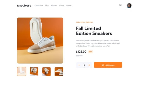
Hey, just wanted to point out something I noticed. For the image dialog box. Only the image with the shoe pointed to the left standing on two rocks matches the image of itself when clicked to view on dialog box. The rest is sort of in a shuffle. Nevertheless, Awesome job! 👍🏻
- @Mazz100@yozidst
- If you can implement display: grid and have grid-template-column into 3 equal parts it should simplify the challenge.
eg.
.content {
    display: grid;
    grid-template-columns: 307px 307px 307px;
    grid-template-rows: 30rem;
}