Not Found
Not Found
Not Found
Not Found
Not Found
Not Found
Not Found
Not Found
Not Found
Not Found
Not Found
Not Found
Not Found
Not Found
Not Found
Not Found
Not Found
Not Found
Not Found
Not Found

Submitted

3-column preview card component: Mobile first using Flex

P
Danielle 50

@DanielleLensly

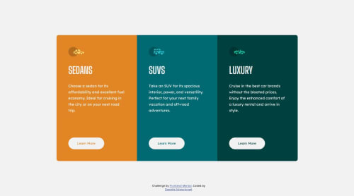
Desktop design screenshot for the 3-column preview card component coding challenge

This is a solution for...

  • HTML
  • CSS
1newbie
View challenge

Design comparison


SolutionDesign

Solution retrospective


I had to use !important thrice to force css changes. I'd like some advice on how to make the changes without the important tag.

Community feedback

@FazeenIjaz

Posted

Hi, For button you are setting its color on button a selector, while for hover you are just using button, so due to less specificity of button as compared to buutton a u need to add important tag.

For the width of main, you are using width two times in the same selector , that's why it is causing problem,

And flex-direction:row is working fine without important tag.

I hope this will help.

Enjoy Coding:)

Marked as helpful

2
P

@emestabillo

Posted

Hey @DanielleLensly, great job on completing your project! Some recommendations:

CSS:

  • add a reset to your stylesheet
  • use relative units such as rem instead of px
  • lines 116 and 122 are identical as mentioned previously. So are lines 80 and 141.
  • For the width of the cards:
    1. set amax-width in rem on the main container and
    2. remove all widths and max-widths on the cards. Use padding to keep the content from touching the gutter
  • For centering the component on the page:
    1. Remove position: absolute from main and position: fixed from attribution. You don’t even need static since that’s the default
    2. use flex (or grid) on the body:
body {
    min-height: 100vh;
    display: flex;
    
    flex-direction: column;
    
    align-items: center;
    
    justify-content: center;
}

HTML:

  • a tags redirect users to another page/section of a site, which is what we need here. Instead of buttons which perform an action (ex. submitting information or hiding/showing divs)
  • div class="main” can be replaced by <main>
  • Write your markup as if you are writing a word document. There should only be one h1 (main heading) on a page. There’s no clear heading in the design, but you can add one with the sr-only class. Check out this article and here's another one for the headings.

Hope this helps!

1

Please log in to post a comment

Log in with GitHub
Discord logo

Join our Discord community

Join thousands of Frontend Mentor community members taking the challenges, sharing resources, helping each other, and chatting about all things front-end!

Join our Discord