Skip to content
  • Unlock Pro
  • Log in with GitHub
Profile
OverviewSolutions
11
Comments
42

Raza Abbas

@RazaAbbas62Pakistan770 points

Hi, I'm Raza Abbas, a passionate front-end developer with a strong foundation in building engaging and responsive web applications. In the ever-evolving world of web development, I am enthusiastic about creating seamless user experiences through efficient code. Follow on GitHub

I’m currently learning...

Typescript

Latest solutions

  • Bookmark Landing Page, Vite + React + Tailwind

    #react#tailwind-css#vite

    Raza Abbas•770
    Submitted over 1 year ago

    3 comments
  • Responsive Landing page, Vite + React + Tailwind CSS

    #react#tailwind-css

    Raza Abbas•770
    Submitted over 1 year ago

    3 comments
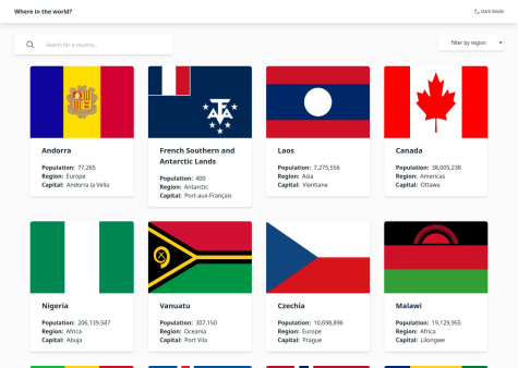
  • Rest Countries API ,Vite, React and tailwind css , with theme switch

    #react#react-router#tailwind-css#axios

    Raza Abbas•770
    Submitted over 1 year ago

    3 comments
  • Responsive space multipage web, using vite +react +tailwind +carousel

    #react#tailwind-css#vite

    Raza Abbas•770
    Submitted over 1 year ago

    2 comments
  • Responsive landing page with vite, react and tailwind css

    #react#tailwind-css#vite

    Raza Abbas•770
    Submitted over 1 year ago

    3 comments
  • Responsive Huddle Landing Page with curved section, using flex and js


    Raza Abbas•770
    Submitted over 1 year ago

    2 comments
View more solutions

Latest comments

  • Abi•300
    @abimh66
    Submitted over 1 year ago

    REST Countries API with Color Theme Switcher with Vue & TailwindCSS

    #tailwind-css#vue#axios
    2
    Raza Abbas•770
    @RazaAbbas62
    Posted over 1 year ago

    Hi, it looks good, but without the repo URL, I couldn't check your code.

    One suggestion is to handle cases where a country has no information like borders or other details, and display suitable information in those cases. For example, Antarctica doesn't have such detailed information, and the page shows a loading spinner. I had a similar issue with mine but realized that later

    Enjoy coding :)

  • Roksana•330
    @tloxiu
    Submitted over 1 year ago

    Frontend Development Workflow for FAQ Accordion

    2
    Raza Abbas•770
    @RazaAbbas62
    Posted over 1 year ago

    Hi, @tloxiu in your question p in CSS you can use

    transition: height 0.3s linear;
    

    it would make a smooth transition between hiding and showing your answer

    I hope it would help

    Enjoy coding :)

    Marked as helpful
  • Franck Bigand•20
    @FranckBigand
    Submitted over 1 year ago

    QR Code component with flexbox and custom properties

    3
    Raza Abbas•770
    @RazaAbbas62
    Posted over 1 year ago

    To achieve the desired behavior of fixing the footer at the bottom of the page and allowing it to be visible when the content is smaller than the screen height or requiring scrolling when the content is larger, you can use a combination of HTML and CSS. Here's an example:

    HTML structure:

    <!DOCTYPE html>
    <html lang="en">
    <head>
      <meta charset="UTF-8">
      <meta name="viewport" content="width=device-width, initial-scale=1.0">
      <link rel="stylesheet" href="styles.css">
      <title>Your Page Title</title>
    </head>
    <body>
      <div class="wrapper">
        <!-- Your page content goes here -->
        <div class="content">
          <!-- Your actual content -->
        </div>
      </div>
      <footer>
        <!-- Your footer content goes here -->
      </footer>
    </body>
    </html>
    

    CSS styles (styles.css):

    body {
      margin: 0;
      padding: 0;
      min-height: 100vh;
      display: flex;
      flex-direction: column;
    }
    
    .wrapper {
      flex: 1;
    }
    
    footer {
      background-color: #f0f0f0;
      padding: 10px;
      position: sticky;
      bottom: 0;
      width: 100%;
    }
    

    Explanation:

    1. The body element is set to display: flex and flex-direction: column to ensure that the main container (wrapper) takes up the available vertical space.

    2. The wrapper div is given flex: 1 to take up the remaining space and allow the footer to be pushed to the bottom.

    3. The footer is set to position: sticky and bottom: 0 to make it stick to the bottom of the page. It will remain at the bottom even if the content is smaller than the screen height.

    4. The min-height: 100vh on the body ensures that the body takes at least the full height of the viewport.

    With this setup, the footer will be fixed at the bottom of the page for small content and will be visible without scrolling. For larger content, you will need to scroll to see the footer. Adjust the styles according to your design preferences.

  • adfinem_rising•10
    @rising-dancho
    Submitted over 1 year ago

    Mobile Responsive QR-Code

    2
    Raza Abbas•770
    @RazaAbbas62
    Posted over 1 year ago

    You can use

        display: flex;
        flex-direction: column;
        gap: 20px;
    
    It would create the desired effect
    
    Marked as helpful
  • Nrosta•530
    @Nrotsa
    Submitted over 1 year ago

    Social-links-profile

    1
    Raza Abbas•770
    @RazaAbbas62
    Posted over 1 year ago

    There are two ways to achieve that behavior

    /* Regular cursor color */
    body {
      cursor: default;
    }
    
    /* Change cursor color on hover */
    body:hover {
      cursor: url('path/to/black-cursor.png'), auto;
    }
    

    Or if u don't have that black cursor image you can do like

    /* Change cursor color on hover to solid black */
    body:hover {
      cursor: url('data:image/png;base64,iVBORw0KGgoAAAANSUhEUgAAABAAAAAQCAYAAAAf8/9hAAAAf0lEQVR42mP8/wc/AwAB/ABsAAdUoJ9QAAAABJRU5ErkJggg=='), auto;
    }
    
    Marked as helpful
  • Angwenyi Ogata•200
    @AngwenyiOgata
    Submitted over 1 year ago

    Responsive Recipe page

    #accessibility#lighthouse
    1
    Raza Abbas•770
    @RazaAbbas62
    Posted over 1 year ago

    To use custom fonts:

    1. Include Font Files:

      • Place your font files in a folder (e.g., "fonts") within your project.
    2. Define Font Face in CSS:

      @font-face {
        font-family: 'YourFontName';
        src: url('path/fonts/your-font-file.woff2') format('woff2'),
             url('path/fonts/your-font-file.woff') format('woff');
      }
      

      Replace 'YourFontName' with the desired font family name, and update the file paths based on your project structure.

    3. Apply the Font in CSS:

      body {
        font-family: 'YourFontName', sans-serif;
      }
      

      Use the specified font family in the font-family property. If the custom font is unavailable, the browser will use a generic sans-serif font as a fallback.

    I hope it will help.

    Happy Coding :)

    Marked as helpful
View more comments
Frontend Mentor logo

Stay up to datewith new challenges, featured solutions, selected articles, and our latest news

Frontend Mentor

  • Unlock Pro
  • Contact us
  • FAQs
  • Become a partner

Explore

  • Learning paths
  • Challenges
  • Solutions
  • Articles

Community

  • Discord
  • Guidelines

For companies

  • Hire developers
  • Train developers
© Frontend Mentor 2019 - 2025
  • Terms
  • Cookie Policy
  • Privacy Policy
  • License

Oops! 😬

You need to be logged in before you can do that.

Log in with GitHub

Oops! 😬

You need to be logged in before you can do that.

Log in with GitHub

Oops! 😬

You need to be logged in before you can do that.

Log in with GitHub

Oops! 😬

You need to be logged in before you can do that.

Log in with GitHub

Oops! 😬

You need to be logged in before you can do that.

Log in with GitHub

Oops! 😬

You need to be logged in before you can do that.

Log in with GitHub

Oops! 😬

You need to be logged in before you can do that.

Log in with GitHub

Oops! 😬

You need to be logged in before you can do that.

Log in with GitHub

Oops! 😬

You need to be logged in before you can do that.

Log in with GitHub

Oops! 😬

You need to be logged in before you can do that.

Log in with GitHub

Oops! 😬

You need to be logged in before you can do that.

Log in with GitHub

Oops! 😬

You need to be logged in before you can do that.

Log in with GitHub

Oops! 😬

You need to be logged in before you can do that.

Log in with GitHub

Oops! 😬

You need to be logged in before you can do that.

Log in with GitHub

Oops! 😬

You need to be logged in before you can do that.

Log in with GitHub

Oops! 😬

You need to be logged in before you can do that.

Log in with GitHub

Oops! 😬

You need to be logged in before you can do that.

Log in with GitHub

Oops! 😬

You need to be logged in before you can do that.

Log in with GitHub

Oops! 😬

You need to be logged in before you can do that.

Log in with GitHub

Oops! 😬

You need to be logged in before you can do that.

Log in with GitHub

Oops! 😬

You need to be logged in before you can do that.

Log in with GitHub

Oops! 😬

You need to be logged in before you can do that.

Log in with GitHub

Oops! 😬

You need to be logged in before you can do that.

Log in with GitHub

Oops! 😬

You need to be logged in before you can do that.

Log in with GitHub

Oops! 😬

You need to be logged in before you can do that.

Log in with GitHub

Oops! 😬

You need to be logged in before you can do that.

Log in with GitHub

Oops! 😬

You need to be logged in before you can do that.

Log in with GitHub

Oops! 😬

You need to be logged in before you can do that.

Log in with GitHub

Oops! 😬

You need to be logged in before you can do that.

Log in with GitHub

Oops! 😬

You need to be logged in before you can do that.

Log in with GitHub

Oops! 😬

You need to be logged in before you can do that.

Log in with GitHub