Skip to content
  • Unlock Pro
  • Log in with GitHub
Profile
OverviewSolutions
11
Comments
42
Raza Abbas
@RazaAbbas62

All comments

  • Abi•300
    @abimh66
    Submitted over 1 year ago

    REST Countries API with Color Theme Switcher with Vue & TailwindCSS

    #tailwind-css#vue#axios
    2
    Raza Abbas•770
    @RazaAbbas62
    Posted over 1 year ago

    Hi, it looks good, but without the repo URL, I couldn't check your code.

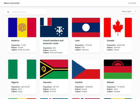
    One suggestion is to handle cases where a country has no information like borders or other details, and display suitable information in those cases. For example, Antarctica doesn't have such detailed information, and the page shows a loading spinner. I had a similar issue with mine but realized that later

    Enjoy coding :)

  • Roksana•330
    @tloxiu
    Submitted over 1 year ago

    Frontend Development Workflow for FAQ Accordion

    2
    Raza Abbas•770
    @RazaAbbas62
    Posted over 1 year ago

    Hi, @tloxiu in your question p in CSS you can use

    transition: height 0.3s linear;
    

    it would make a smooth transition between hiding and showing your answer

    I hope it would help

    Enjoy coding :)

    Marked as helpful
  • Franck Bigand•20
    @FranckBigand
    Submitted over 1 year ago

    QR Code component with flexbox and custom properties

    3
    Raza Abbas•770
    @RazaAbbas62
    Posted over 1 year ago

    To achieve the desired behavior of fixing the footer at the bottom of the page and allowing it to be visible when the content is smaller than the screen height or requiring scrolling when the content is larger, you can use a combination of HTML and CSS. Here's an example:

    HTML structure:

    <!DOCTYPE html>
    <html lang="en">
    <head>
      <meta charset="UTF-8">
      <meta name="viewport" content="width=device-width, initial-scale=1.0">
      <link rel="stylesheet" href="styles.css">
      <title>Your Page Title</title>
    </head>
    <body>
      <div class="wrapper">
        <!-- Your page content goes here -->
        <div class="content">
          <!-- Your actual content -->
        </div>
      </div>
      <footer>
        <!-- Your footer content goes here -->
      </footer>
    </body>
    </html>
    

    CSS styles (styles.css):

    body {
      margin: 0;
      padding: 0;
      min-height: 100vh;
      display: flex;
      flex-direction: column;
    }
    
    .wrapper {
      flex: 1;
    }
    
    footer {
      background-color: #f0f0f0;
      padding: 10px;
      position: sticky;
      bottom: 0;
      width: 100%;
    }
    

    Explanation:

    1. The body element is set to display: flex and flex-direction: column to ensure that the main container (wrapper) takes up the available vertical space.

    2. The wrapper div is given flex: 1 to take up the remaining space and allow the footer to be pushed to the bottom.

    3. The footer is set to position: sticky and bottom: 0 to make it stick to the bottom of the page. It will remain at the bottom even if the content is smaller than the screen height.

    4. The min-height: 100vh on the body ensures that the body takes at least the full height of the viewport.

    With this setup, the footer will be fixed at the bottom of the page for small content and will be visible without scrolling. For larger content, you will need to scroll to see the footer. Adjust the styles according to your design preferences.

  • adfinem_rising•10
    @rising-dancho
    Submitted over 1 year ago

    Mobile Responsive QR-Code

    2
    Raza Abbas•770
    @RazaAbbas62
    Posted over 1 year ago

    You can use

        display: flex;
        flex-direction: column;
        gap: 20px;
    
    It would create the desired effect
    
    Marked as helpful
  • Nrosta•530
    @Nrotsa
    Submitted over 1 year ago

    Social-links-profile

    1
    Raza Abbas•770
    @RazaAbbas62
    Posted over 1 year ago

    There are two ways to achieve that behavior

    /* Regular cursor color */
    body {
      cursor: default;
    }
    
    /* Change cursor color on hover */
    body:hover {
      cursor: url('path/to/black-cursor.png'), auto;
    }
    

    Or if u don't have that black cursor image you can do like

    /* Change cursor color on hover to solid black */
    body:hover {
      cursor: url('data:image/png;base64,iVBORw0KGgoAAAANSUhEUgAAABAAAAAQCAYAAAAf8/9hAAAAf0lEQVR42mP8/wc/AwAB/ABsAAdUoJ9QAAAABJRU5ErkJggg=='), auto;
    }
    
    Marked as helpful
  • Angwenyi Ogata•200
    @AngwenyiOgata
    Submitted over 1 year ago

    Responsive Recipe page

    #accessibility#lighthouse
    1
    Raza Abbas•770
    @RazaAbbas62
    Posted over 1 year ago

    To use custom fonts:

    1. Include Font Files:

      • Place your font files in a folder (e.g., "fonts") within your project.
    2. Define Font Face in CSS:

      @font-face {
        font-family: 'YourFontName';
        src: url('path/fonts/your-font-file.woff2') format('woff2'),
             url('path/fonts/your-font-file.woff') format('woff');
      }
      

      Replace 'YourFontName' with the desired font family name, and update the file paths based on your project structure.

    3. Apply the Font in CSS:

      body {
        font-family: 'YourFontName', sans-serif;
      }
      

      Use the specified font family in the font-family property. If the custom font is unavailable, the browser will use a generic sans-serif font as a fallback.

    I hope it will help.

    Happy Coding :)

    Marked as helpful
  • FidaUllah1•200
    @FidaUllah1
    Submitted over 1 year ago

    CSS Grid and Flexbox landing page

    1
    Raza Abbas•770
    @RazaAbbas62
    Posted over 1 year ago

    Your design looks good but in the footer you can change the color of icons using filter property.

    And one more suggestion to have cursor:pointer for the buttons. And have a little animation on hover on buttons.

    That's just a suggestion.

    Enjoy Coding :)

  • Ryan Abdaul•320
    @RyanAbdaul
    Submitted over 1 year ago

    None Additions, Stats Preview design

    1
    Raza Abbas•770
    @RazaAbbas62
    Posted over 1 year ago

    Certainly! If you're looking for information on how to optimize or deal with images for mobile screens, a relevant keyword to use in your search could be "responsive images for mobile." This should lead you to resources and guides on best practices for handling images in a way that ensures they display well on various mobile devices.

    Another relevant keyword you can use is "mobile-friendly image optimization." This phrase is likely to yield results that cover techniques and tips specifically tailored to make images work seamlessly on mobile screens.

    Marked as helpful
  • Laxman-Male•90
    @Laxman-Male
    Submitted over 1 year ago

    responsive feq page

    1
    Raza Abbas•770
    @RazaAbbas62
    Posted over 1 year ago

    Your design looks good, but you can also add functionality to these.

    It is very simple. You can check out my project click here

    HTML, and CSS looks good.

    Enjoy coding :)

  • Josh Michael•1,070
    @joshmichael23
    Submitted over 1 year ago

    Clipboard Landing Page using Vite+React & Tailwind

    #tailwind-css#vite#react
    1
    Raza Abbas•770
    @RazaAbbas62
    Posted over 1 year ago

    Hi,

    Yes, you should use filter to make a hover effect on images.

    Marked as helpful
  • AnishJain•10
    @AnishJain34
    Submitted over 1 year ago

    Responsive QR-code-component

    1
    Raza Abbas•770
    @RazaAbbas62
    Posted over 1 year ago

    Hi, your design looks good but one suggestion is to use max-width: 100% for img instead of width: 100% it will make it responsive.

    Enjoy Coding :)

  • Agshin Mammadov•10
    @agshinmammadov
    Submitted over 1 year ago

    Block post card with reusable CSS variables

    2
    Raza Abbas•770
    @RazaAbbas62
    Posted over 1 year ago

    Hi, your design looks good. To center the card, enclose your whole content including card-container and attribution, into a container div and apply the following to the body.

    body{
    display: flex;
    align-items: center;
    justify-content: center;
    }
    

    it will center your whole card in the body.

    Enjoy Coding :)

  • Victory Olise•50
    @Oliseh001
    Submitted over 1 year ago

    responsive landing page with css flexbox

    #accessibility
    1
    Raza Abbas•770
    @RazaAbbas62
    Posted over 1 year ago

    Hi, your design looks good but I suggest that you should add max-width for paragraphs to look better. overall, the design looks good.

    Happy coding :)

  • nisargasudeepmys•70
    @nisargasudeepmys
    Submitted over 1 year ago

    Results-summary-component-using-flex

    1
    Raza Abbas•770
    @RazaAbbas62
    Posted over 1 year ago

    Hi, To use static and variable fonts from the assets folder:

    1. Place font files in the assets folder.
    2. Link fonts in CSS using @font-face.
    3. Apply fonts to elements using font-family property.
    4. Ensure correct paths and test in various browsers.
    @font-face {
      font-family: 'YourVariableFont';
      src: url('path/to/assets/your-variable-font.woff2') format('woff2-variations'),
           url('path/to/assets/your-variable-font.woff2') format('woff2');
      font-weight: 100 900;
      font-stretch: 50% 200%;
    }
    
    body {
      font-family: 'YourVariableFont', sans-serif;
    }
    
    @font-face {
      font-family: 'YourStaticFont';
      src: url('path/to/assets/your-static-font.woff2') format('woff2'),
           url('path/to/assets/your-static-font.woff') format('woff');
      font-weight: normal;
      font-style: normal;
    }
    
    body {
      font-family: 'YourStaticFont', sans-serif;
    }


    I hope it will help.

    Marked as helpful
  • Fidelisuzoma•380
    @UzomaFidelis
    Submitted over 1 year ago

    Mobile first solution: Sass

    1
    Raza Abbas•770
    @RazaAbbas62
    Posted over 1 year ago

    Hi, Your usage of BEM methodology is generally good. To enhance it further:

    1. Consider using more generic block names, such as 'card' instead of 'cards'.
    2. Use modifiers like 'content__title--light' for better expressiveness.

    Hope this will help.

    Happy Coding :)

    Marked as helpful
  • CodzSchach•240
    @Joker4mas
    Submitted over 1 year ago

    Flex box

    #tailwind-css
    1
    Raza Abbas•770
    @RazaAbbas62
    Posted over 1 year ago

    It looks like you have a form submission event listener in your JavaScript code that should handle the form submission. However, the issue may be related to the validateEmail function, which is currently commented out. Also, the event listener for the form submission is preventing the default behavior, but you need to explicitly check if the email is valid before proceeding with the submission.

    Here's an updated version of your code with a simple email validation check using a regular expression:

    // ...
    
    // function to validate email using a regular expression
    function validateEmail(email) {
        const regex = /^\S+@\S+\.\S+$/;
        return regex.test(email);
    }
    
    // form event listener
    form.addEventListener('submit', (e) => {
        // prevent default form submission
        e.preventDefault();
    
        // get the email value from the input field
        const emailValue = mailInput.value.trim();
    
        // check if the email is valid
        if (validateEmail(emailValue)) {
            // update the user email on the success page
            updatedUserEmail(emailValue);
    
            // clear the input field
            mailInput.value = "";
    
            // toggle between the success page and home page
            switchPages();
        } else {
            // if the email is not valid, display an error message
            error.textContent = 'Enter a valid email address';
        }
    });
    
    // ...
    

    This code uses a simple regular expression to check if the entered email is in a valid format. If the email is valid, it proceeds with the form submission logic; otherwise, it displays an error message. Adjust the regular expression based on your specific email validation requirements.

    Enjoy coding :)

    Marked as helpful
  • Bhanumathi-a•10
    @Bhanumathi-a
    Submitted over 1 year ago

    faq-accordion

    #tailwind-css
    3
    Raza Abbas•770
    @RazaAbbas62
    Posted over 1 year ago

    Hi, That's great. Your design looks good.

    Enjoy Coding :)

  • Chockplay•60
    @Chockplay
    Submitted over 1 year ago

    Recipe page

    1
    Raza Abbas•770
    @RazaAbbas62
    Posted over 1 year ago

    Hi, your design looks good.

    You tried well.

    Enjoy Coding :)

Frontend Mentor logo

Stay up to datewith new challenges, featured solutions, selected articles, and our latest news

Frontend Mentor

  • Unlock Pro
  • Contact us
  • FAQs
  • Become a partner

Explore

  • Learning paths
  • Challenges
  • Solutions
  • Articles

Community

  • Discord
  • Guidelines

For companies

  • Hire developers
  • Train developers
© Frontend Mentor 2019 - 2025
  • Terms
  • Cookie Policy
  • Privacy Policy
  • License

Oops! 😬

You need to be logged in before you can do that.

Log in with GitHub

Oops! 😬

You need to be logged in before you can do that.

Log in with GitHub

Oops! 😬

You need to be logged in before you can do that.

Log in with GitHub

Oops! 😬

You need to be logged in before you can do that.

Log in with GitHub

Oops! 😬

You need to be logged in before you can do that.

Log in with GitHub

Oops! 😬

You need to be logged in before you can do that.

Log in with GitHub

Oops! 😬

You need to be logged in before you can do that.

Log in with GitHub

Oops! 😬

You need to be logged in before you can do that.

Log in with GitHub

Oops! 😬

You need to be logged in before you can do that.

Log in with GitHub

Oops! 😬

You need to be logged in before you can do that.

Log in with GitHub

Oops! 😬

You need to be logged in before you can do that.

Log in with GitHub

Oops! 😬

You need to be logged in before you can do that.

Log in with GitHub

Oops! 😬

You need to be logged in before you can do that.

Log in with GitHub

Oops! 😬

You need to be logged in before you can do that.

Log in with GitHub

Oops! 😬

You need to be logged in before you can do that.

Log in with GitHub

Oops! 😬

You need to be logged in before you can do that.

Log in with GitHub

Oops! 😬

You need to be logged in before you can do that.

Log in with GitHub

Oops! 😬

You need to be logged in before you can do that.

Log in with GitHub

Oops! 😬

You need to be logged in before you can do that.

Log in with GitHub

Oops! 😬

You need to be logged in before you can do that.

Log in with GitHub

Oops! 😬

You need to be logged in before you can do that.

Log in with GitHub

Oops! 😬

You need to be logged in before you can do that.

Log in with GitHub

Oops! 😬

You need to be logged in before you can do that.

Log in with GitHub

Oops! 😬

You need to be logged in before you can do that.

Log in with GitHub

Oops! 😬

You need to be logged in before you can do that.

Log in with GitHub

Oops! 😬

You need to be logged in before you can do that.

Log in with GitHub

Oops! 😬

You need to be logged in before you can do that.

Log in with GitHub

Oops! 😬

You need to be logged in before you can do that.

Log in with GitHub

Oops! 😬

You need to be logged in before you can do that.

Log in with GitHub

Oops! 😬

You need to be logged in before you can do that.

Log in with GitHub

Oops! 😬

You need to be logged in before you can do that.

Log in with GitHub

Oops! 😬

You need to be logged in before you can do that.

Log in with GitHub

Oops! 😬

You need to be logged in before you can do that.

Log in with GitHub

Oops! 😬

You need to be logged in before you can do that.

Log in with GitHub

Oops! 😬

You need to be logged in before you can do that.

Log in with GitHub

Oops! 😬

You need to be logged in before you can do that.

Log in with GitHub

Oops! 😬

You need to be logged in before you can do that.

Log in with GitHub

Oops! 😬

You need to be logged in before you can do that.

Log in with GitHub

Oops! 😬

You need to be logged in before you can do that.

Log in with GitHub

Oops! 😬

You need to be logged in before you can do that.

Log in with GitHub

Oops! 😬

You need to be logged in before you can do that.

Log in with GitHub

Oops! 😬

You need to be logged in before you can do that.

Log in with GitHub

Oops! 😬

You need to be logged in before you can do that.

Log in with GitHub

Oops! 😬

You need to be logged in before you can do that.

Log in with GitHub

Oops! 😬

You need to be logged in before you can do that.

Log in with GitHub

Oops! 😬

You need to be logged in before you can do that.

Log in with GitHub

Oops! 😬

You need to be logged in before you can do that.

Log in with GitHub

Oops! 😬

You need to be logged in before you can do that.

Log in with GitHub

Oops! 😬

You need to be logged in before you can do that.

Log in with GitHub

Oops! 😬

You need to be logged in before you can do that.

Log in with GitHub

Oops! 😬

You need to be logged in before you can do that.

Log in with GitHub

Oops! 😬

You need to be logged in before you can do that.

Log in with GitHub

Oops! 😬

You need to be logged in before you can do that.

Log in with GitHub

Oops! 😬

You need to be logged in before you can do that.

Log in with GitHub

Oops! 😬

You need to be logged in before you can do that.

Log in with GitHub