Not Found
Not Found
Not Found
Not Found
Not Found
Not Found
Not Found
Not Found
Not Found
Not Found
Not Found
Not Found
Not Found
Not Found
Not Found
Not Found
Not Found
Not Found
Not Found
Not Found

Submitted

Calculator app

LetsFrontendβ€’ 500

@B1N4R1

Desktop design screenshot for the Calculator app coding challenge

This is a solution for...

  • HTML
  • CSS
  • JS
3intermediate
View challenge

Design comparison


SolutionDesign

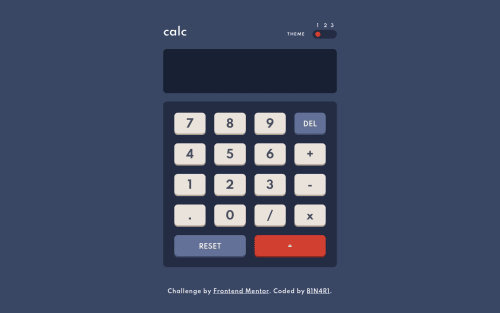
Solution retrospective


Really cool challenge! Great to practice your CSS Grid skills

Tell me if you would have done it differently

Community feedback

Account Deleted

Nice job on completing the challenge, everything looks good besides that you need to restrict multiple entry of the period(......) to avoid any possible errors.

Marked as helpful

1

LetsFrontendβ€’ 500

@B1N4R1

Posted

@thulanigamtee lol true πŸ˜… Thanks!

0
P
Chamuβ€’ 12,970

@ChamuMutezva

Posted

So far so good. Here are things that needs attention

  • i can not view the calculator on a device that is 375px without scrolling sideways
  • the multiplication is not working, eg 9 * 3 does not respond
  • some calculations overflows the display eg 2/3

Good lucky

Marked as helpful

0

LetsFrontendβ€’ 500

@B1N4R1

Posted

@ChamuMutezva Thanks for the feedback!

The 375px? that's strange, I tried different sizes with the chrome DevTools like Moto G4 (360x640), iPhone 5/SE (320x568), iPhone 6/7/8 (375x667), .... and it look good in all of them

I was already aware of the 2/3 calculations, I have to add some rounding for the result when needed. The multiplication not working is wired, it must be some bug or error in the code, I'll check it.

Edit: I just checked the multiplication, was comparing "*" with "x", and that's obviously false so nothing happened lol πŸ˜‚, it works now

Thanks again!

0
P
Chamuβ€’ 12,970

@ChamuMutezva

Posted

@B1N4R1 , this has to do with the min-width that has been set.

  • for example the body is set to a min-width of 415px - which i doubt has any impact. Maybe wrapping the contents of the body in a div . Also the .calculator has a min-width of 380px which means anything less than that has to be somehow cut off.
  • i also do not see a reset styling sheet which can really cause unexpected behaviour on different browsers.

Happy coding

0
LetsFrontendβ€’ 500

@B1N4R1

Posted

@ChamuMutezva I made some changes, the 415px min-width prevents the calculator from getting too small. I've test it in real smartphones this time and looks perfect.

The only thing is the height of the calculator: -For phones like the Motorola Moto G or the iPhone 4 the calculator's height doesn't fit because they are too small devices -But for other phones like the Motorola Moto G4 or an iPhone X looks great

Regarding the reset stylesheet, I didn't use one because:

  • The only elements that I use in these challenge are divs and buttons. With exception of an h1 for the title of 'calc' and a p for the words 'THEME'.

  • I don't really see the need to reset the styling of an input or the other 5 headings, a blockquote, lists,... when I'm not going to use them. It's just more code that the navegator has to load but the is not going to be used.

Although, I am using some basic resets and I have to say in more serious situations I would totally use a reset stylesheet.

With all this said, sorry for the large textπŸ˜…, I appreciate you taking the time to review my project and comment on it and as you said...

Happy coding!!!

0

@matheus-rodrigues00

Posted

Is there any particular reason for you to not use the variables with the scss syntax?

0

LetsFrontendβ€’ 500

@B1N4R1

Posted

@Rafok777 I didn't see the need to use variables, except for the colors for each theme

0

Please log in to post a comment

Log in with GitHub
Discord logo

Join our Discord community

Join thousands of Frontend Mentor community members taking the challenges, sharing resources, helping each other, and chatting about all things front-end!

Join our Discord