Not Found
Not Found
Not Found
Not Found
Not Found
Not Found
Not Found
Not Found
Not Found
Not Found
Not Found
Not Found
Not Found
Not Found
Not Found
Not Found
Not Found
Not Found
Not Found
Not Found

Submitted

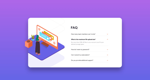
FAQ Accordion Card | HTML CSS Sass JS

#accessibility#lighthouse#sass/scss#bem
Vanza Setiaβ€’ 27,855

@vanzasetia

Desktop design screenshot for the FAQ accordion card coding challenge

This is a solution for...

  • HTML
  • CSS
  • JS
1newbie
View challenge

Design comparison


SolutionDesign

Solution retrospective


Hello Everyone! πŸ‘‹

I finally finished the first JavaScript challenge. πŸŽ‰

After learning JavaScript for about one month. Here's the result! 😎

Now for the questions:

  • Does this website looks good on your device?
  • For the FAQ, I uppercased the letter on the HTML file instead of doing it on CSS. I'm afraid that the screen reader will pronounce FAQ when it should spell F-A-Q (letter by letter). So, is the screen reader smart enough to spell the faq letter by letter?
  • Please try to navigate this website using your keyboard. If you don't know how to navigate using a keyboard, see the keyboard support section. Do all the keys work based on the functionality?
  • For those of you who have finished this challenge, which text uses a very dark grayish blue color (hsl(237, 12%, 33%))?

Any questions on the technique that I'm using are very welcome!

Also if you want me to give my feedback on your solution to this challenge, feel free to give me the link in the community feedback! I will be glad to help you too!

Hint: Try to disable JavaScript to get the pop-up box that will give you the link to the non-javascript version (using details and summary tag) or just click this.

Thanks!

Community feedback

P
Daveβ€’ 5,245

@dwhenson

Posted

Hey @vanzasetia lovely job here! πŸ™Œ Looks great and functions really nicely with the keyboard.

Did you consider using the details-summary tag here? If so I'd be keen to know why you opted not to use it. I just ask as it might have made your mark-up easier and require less aria attributes.

** Hang on I think I missed the link to your other solution without JS - did you just add this?

My only small suggestion would be to make the focus styles a bit easier to see, perhaps a bit thicker –using outline-offset with a small value can also help making it look nice. But this is really a small point!

Lovely job!! πŸ‘

Cheers πŸ‘‹

Dave

PS If you were concerned about the "FAQ" you could perhaps try aria-label, I'd need to check but I think this will stop readers accessing the content and read the content of the label, so you could try aria-label="frequently asked questions" - I'd need to test this to be sure though.

Marked as helpful

3

Vanza Setiaβ€’ 27,855

@vanzasetia

Posted

@dwhenson Thanks for your kind words! πŸ˜„

I was added the non JavaScript version after several hours I submitted the solution πŸ˜€. How did you notice it?

I already had outline-offset: 0.09em to give space between the text and the outline. I have made the outline a little bit thicker πŸ˜‰.

About the aria-label, I'm not going to use it, since aria-label is not translatable. Instead, I added the sr-only that tells what FAQ stands for, which is Frequently Asked Questions. I think this is useful since not all people know what FAQ stands for, especially for those of them who are not native English. So, when they try to translate the page, it will translate the Frequently Asked Questions words to their native language πŸ˜‰.

2
P
Daveβ€’ 5,245

@dwhenson

Posted

@vanzasetia oh, good point. I had not thought about aria label not being translatable. I didn't know that and will keep it in mind. Shame about that.

0
Eric Aguayoβ€’ 705

@EAguayodev

Posted

Your finished challenge looks good! Got a question, how were you able to make your panel transitions smooth when a user clicks on them to open them? I did this challenge a while ago and mine jumps up and down weirdly when I click on mine. Heres my live link https://frontendmentor-faq-accordian-page-ax6ky8byj-ericaguayo90.vercel.app/. Overall, very impressive!

Marked as helpful

0

Vanza Setiaβ€’ 27,855

@vanzasetia

Posted

@EricAguayo90 Thank you for your kind words! πŸ‘

To reduce the amount of the jumping layout, I made a function where I only allow the user to open only one accordion panel at a time.

About your solution, I have some feedback on it:

  • I would recommend using native HTML elements, details and summary for the accordion. They are accessible by default and have a built-in open and close functionality.
  • I would recommend using CSS classes instead inline styling with JavaScript. You might already know that inline CSS is a bad practice and the same principle apply when working with CSS in JavaScript.

I hope this helps! Happy coding! 😁

0
Yuko Horitaβ€’ 645

@Sloth247

Posted

It looks awesome! I like your banner on Github too. I also tried this challenge a while ago and could not close the panels by only HTML and CSS (without JS). I appreciate if you give me a feedback on mine too!

Marked as helpful

0

Vanza Setiaβ€’ 27,855

@vanzasetia

Posted

@Sloth247 Thanks for taking a look at the README file!

I have given you my feedback on your solution!

Hopefully that's helpful for you!

0
Pop Andreiβ€’ 120

@pccipri

Posted

Hey, just took a look over your solution, and I gotta say it looks awesome(although keep in mind that I am a beginner as well).So if u can give me any tips on well anything :) but especially responsiveness and if u have any tips on image positioning I would appreciate that as well. Anyway as for your question about the text color I think it's used on well, pretty much all the text. My solution - this is the link to my solution

Marked as helpful

0

Vanza Setiaβ€’ 27,855

@vanzasetia

Posted

@pccipru For the text color, I used the primary color (Very dark desaturated blue), which I think match the design.

I'm confused since there are a lot of similar colors πŸ˜….

Anyway, I have just given the feedback on your solution, feel free to take a look.

Also, I would recommend to use Markdown syntax to give your solution link.

[My solution](https://www.frontendmentor.io/solutions/profile-card-component-main-html-and-css-flexbox-grid-and-no-js-WdYYa5jEC)

It will render it as:

My solution

1

@mathias9968

Posted

Hey, nice challenge, looks awesome, just a comment. The shadow svg, is positioned above the woman svg. that is resolved with z-index: 2 in shadow, z-index: 1 in woman. Cheers.

0

Vanza Setiaβ€’ 27,855

@vanzasetia

Posted

@mathias9968 Sorry, I don't understand what do you mean, could you explain it in more detail? Are you talking about the box shadow on the box image?

For the illustration-woman, on desktop, I used background-image which, I can't control the z-index of it.

0

Please log in to post a comment

Log in with GitHub
Discord logo

Join our Discord community

Join thousands of Frontend Mentor community members taking the challenges, sharing resources, helping each other, and chatting about all things front-end!

Join our Discord