


Hey Jhabari,
Nice work on this project. It scales down very nicely, I know implementing the javascript part was not easy.
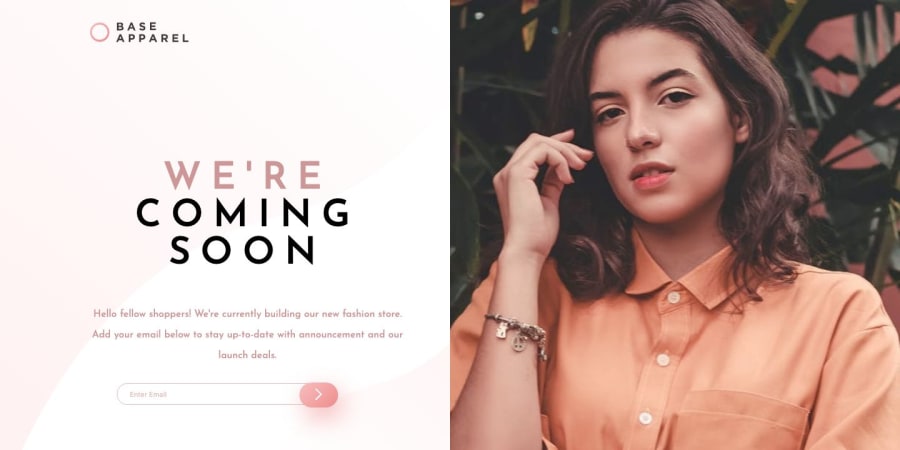
I have noticed that there is a bit of scrolling on the front page to see the rest of the image, maybe you could try to have the banner image have a height: 100vh.
- I also noticed you had some html issues with the form, its a minor one. if your not using the
action=""attribute in your form, then its safe to remove it.
@J-Guidry
Posted
Thanks for the feedback. For only seeing part of the image, on mobile view, being at 70vh height and 100vw width and background-position: top center, was me trying to get the image to focus on her face as the width gets smaller, but it looks like it may not work well. Removing top center looks much better but the image will still cut off somewhat at the sides. 100vh on mobile views makes it zoom in far more cutting much of the image. I am not sure vh will solve this completely, at least not without a lot more media queries. Perhaps testing screen ratio queries may be needed.
As for desktop view, I do have it at 100vh with 50vw floated with the rest of the content on the other side. It works except for ipad pro's 1024 x 1366 resolution which cuts off half the image. Looks like high heights to lower widths break the design depending on disparity.

