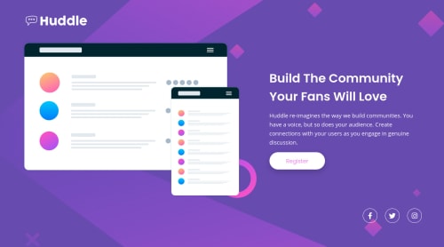
HTML5, CSS3 and BEM

Solution retrospective
Any feedback is appreciated!
Please log in to post a comment
Log in with GitHubCommunity feedback
- @ApplePieGiraffe
Hello, once again, Felipe Oliveira! 👋
Nice to see another solution from you (and good job on it)! 👍 Overall, your site looks pretty great! 👏
Like fraserwat touched on, I think there's quite a bit of empty space to the sides of the design in the tablet/mobile layouts. It should be fine to allow the image (and the text) to be a little bigger so that the content of the page takes up more space and presence in the tablet layout (and simply allow them to further decrease in size when necessary).
Also, I think the design JPGs are simply guidelines for those specific screen dimensions but it's expected to adjust the layout and add intermediary layouts between desktop and mobile layouts when necessary. 🙂
Keep coding (and happy coding, too)! 😁
- @fraserwat
This looks great! The one thing I'd add is that you could probably afford to have the mobile version have a bit of a bigger max-width (especially as the other layout doesn't kick in until 1200px)
Join our Discord community
Join thousands of Frontend Mentor community members taking the challenges, sharing resources, helping each other, and chatting about all things front-end!
Join our Discord