Not Found
Not Found
Not Found
Not Found
Not Found
Not Found
Not Found
Not Found
Not Found
Not Found
Not Found
Not Found
Not Found
Not Found
Not Found
Not Found
Not Found
Not Found
Not Found
Not Found

Submitted

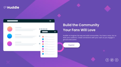
Huddle Landing Page created for #TOR100 project: 100 days of code

P
Tor Huusβ€’ 435

@torhuus


Design comparison


SolutionDesign

Solution retrospective


If you have the opportunity to take time out of your busy day to see through my project, I would appreciate any kind of feedback, especially any feedback regarding code structure and/or any redundant code which could have been omitted or done in a better way.

Thanks!

Community feedback

Roman Filenkoβ€’ 3,335

@rfilenko

Posted

Hi, congrats on your challenge, looks good. I have a few notes how to improve a little bit:

  • try to use less selectors to target element, usually one class is enough, so don't do this #app .main-wrapper main .row .col.content-text .hero-title.
  • logo probably should be a link, usually homepage;
  • max-width: 100% on images will make them responsive, and setting width and height would just distort proportion;
  • more subtle box-shadow on a button;
  • would make .social-links as ul list of links;
  • next time try mobile-first approach.

Keep codingπŸ˜‰, Roman

1

P
Tor Huusβ€’ 435

@torhuus

Posted

@rfilenko

Hi Roman, thanks for taking the time to help out!

  • I believe the multiple selectors issue you are referring to comes from the processing of my SCSS files to CSS due to the nested nature of the SASS language, correct me if I'm wrong or if I misunderstand.
  • Thanks, I have wrapped the logo in an a-tag now.
  • Images are now 100% width and the container has a width specified instead!
  • Used the exact box-shadow parameters from the design-file, so not quite sure what to make more subtle, but I reduced the box-shadow color opacity from 0.25 to 0.18.
  • Social links are now an unordered list!
  • Will look into doing it mobile-first on the next project!

Thanks, Roman, it's very helpful to get feedback like this. Have a great day! Tor

0
Roman Filenkoβ€’ 3,335

@rfilenko

Posted

@torhuus Hi Tor, nice, that was really fast on fixes, glad I was helpful.

As for sass usage - try to not go 3 levels deep in nesting, otherwise it raises specificity selector, it's hard to maintain or overwrite styles. On bigger projects this can be an issue. Most of the times I try to follow css BEM naming convention, that helps with code structure and works great with preprocessors.

My comment regarding button was mainly alpha channel, so you fixed it already. In sketch file you can get correct values. As for social icons - links inside li, so user can go to proper social media pageπŸ˜‰

Have a good one too, Roman

0
P
Tor Huusβ€’ 435

@torhuus

Posted

@rfilenko

I understand. I've read/heard a little about BEM, guess I'll have to dive deeper now!

Alright, great! Social icons now have a-tags ;)

Thanks again! Tor

0
P
ApplePieGiraffeβ€’ 30,545

@ApplePieGiraffe

Posted

Hey, Tor Huus! πŸ‘‹

Nice job on this challenge! πŸ‘

In addition to Roman's helpful feedback, I'd like to suggest,

  • Setting the background-size property of the background SVGs in the desktop and mobile layouts to cover so that they take up the entire area of the viewport (even when the screen is resized).

Keep coding (and happy coding, too)! 😁

0

P
Tor Huusβ€’ 435

@torhuus

Posted

@ApplePieGiraffe

Thank you for taking the time to help me out!

I initially had it at "cover", but changed it to "contain" because the mobile background did not look right. I have now changed it back to "cover" on desktop and "contain" on mobile.

Thanks! =D

0

Please log in to post a comment

Log in with GitHub
Discord logo

Join our Discord community

Join thousands of Frontend Mentor community members taking the challenges, sharing resources, helping each other, and chatting about all things front-end!

Join our Discord