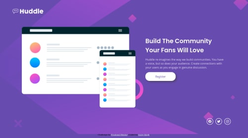
Huddle Single Page

Solution retrospective
One question I have is how to make it responsive without altering the main illustrations size. Can it be done using grid or flexbox would be more suitable? Please guys I really need to learn this and I need some good sources from where I can gather precise and concise info. If you please have any advice or leads on where I can learn more about CSS, please comment.
Please log in to post a comment
Log in with GitHubCommunity feedback
- P@palgramming
I guess the question is how are you defining the word responsive. I would say no matter the user device the site functions and looks as the designer intended. I do not think it means everything in exact scaled proportion from 375px wide to 1440px wide in the case of these challenges
Your solution looks good maybe it could have a little fine tuning like you desktop image and text more centered vertically in the page in relation to the background. But over all I think your solution would be functional on every device and translate the design to have the experience the designer intended
Good Job

Join our Discord community
Join thousands of Frontend Mentor community members taking the challenges, sharing resources, helping each other, and chatting about all things front-end!
Join our Discord