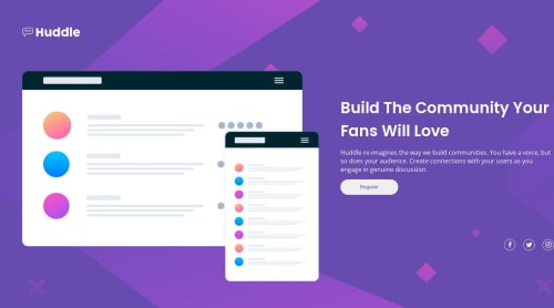
Submitted almost 2 years agoA solution to the Huddle landing page with a single introductory section challenge
Mobile first approach

P
@Abrham007
Code
Please log in to post a comment
Log in with GitHubCommunity feedback
- @mraditya1999
Nice job done, however there appears to be an issue with the layout when the screen size is above 600px. To ensure a seamless user experience across all devices, it is advisable to implement additional CSS adjustments within a media query targeting screen sizes between
576pxand992px. By addressing this concern, we can guarantee that the design maintains its responsiveness and professionalism across the entire range of devices and screen sizes.

Join our Discord community
Join thousands of Frontend Mentor community members taking the challenges, sharing resources, helping each other, and chatting about all things front-end!
Join our Discord