Skip to content
  • Unlock Pro
  • Log in with GitHub
Profile
OverviewSolutions
32
Comments
20

Aditya Yadav

@mraditya1999Prayagraj,Uttar Pradesh, India710 points

I am a web developer with a passion for creating things that live on the internet. I'm passionate about designing beautiful web Interfaces.. I'm self-taught developer trying to learn new technologies, frameworks and reading tech articles.

I’m currently learning...

NodeJs || MongoDB

Latest solutions

  • Social Links Profile


    Aditya Yadav•710
    Submitted about 1 year ago

    0 comments
  • Recipe Page


    Aditya Yadav•710
    Submitted about 1 year ago

    0 comments
  • Interactive Card Details Form


    Aditya Yadav•710
    Submitted almost 2 years ago

    0 comments
  • Pricing Component With Toggle


    Aditya Yadav•710
    Submitted almost 2 years ago

    0 comments
  • Calculator App


    Aditya Yadav•710
    Submitted almost 2 years ago

    0 comments
  • Notifications Page


    Aditya Yadav•710
    Submitted almost 2 years ago

    0 comments
View more solutions

Latest comments

  • TheCRIS•70
    @TheCRIS69
    Submitted almost 2 years ago

    3 Column Preview Cards!

    1
    Aditya Yadav•710
    @mraditya1999
    Posted almost 2 years ago

    Instead of employing the flex-wrap: wrap property, an alternative strategy has been implemented through the integration of a meticulously crafted media query, meticulously tailored to accommodate screen dimensions below 900 pixels. This meticulous approach ensures seamless presentation and functionality across an array of viewport sizes, thereby elevating the overall user experience with precision and foresight.

    Marked as helpful
  • MartinXCVI•150
    @MartinXCVI
    Submitted almost 2 years ago

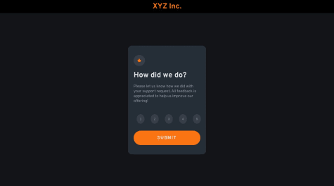
    MobileFirst -- Interactive Rating Component

    #accessibility
    2
    Aditya Yadav•710
    @mraditya1999
    Posted almost 2 years ago

    Within the context of the .numbers class, consider applying a refined approach by utilizing height and width properties in conjunction with display: flex, justify-content: center, and align-items: center. This strategic combination serves to precisely center the content both horizontally and vertically, culminating in a harmoniously balanced arrangement.

    Marked as helpful
  • Ralpmike•200
    @Ralpmike
    Submitted almost 2 years ago

    Html & Css

    1
    Aditya Yadav•710
    @mraditya1999
    Posted almost 2 years ago

    To enhance the visual appeal and user engagement of your interface, consider implementing hover effects using the transition property for both links and buttons. These effects introduce smooth and gradual changes in attributes like color, background, or borders when users hover their cursor over these elements. This subtle transformation adds an interactive and dynamic dimension to the interface, creating a more polished and captivating user experience. By skillfully synchronizing these effects with the transition property, you ensure that the interface changes in a gradual and pleasing manner, enhancing usability and aesthetics simultaneously. This design approach effectively communicates interactivity, guiding users intuitively and encouraging interaction.

    Marked as helpful
  • SooperChiller•60
    @SoopChiller
    Submitted almost 2 years ago

    BASE APPAREL (FLEXBOX + JAVASCRIPT)

    1
    Aditya Yadav•710
    @mraditya1999
    Posted almost 2 years ago

    for simpler solution to make it responsive and elegant design you can follow these steps:

    /* CSS code for the container and the two divs */
    .container {
      display: flex;
    }
    
    .left-section, .right-section {
      width: 50%;
      height: 100%;
    }
    
    .right-section {
      background-image: url("path/to/your/image.jpg"); /* Set background image for the right section */
      background-size: cover; /* Adjust the background image size to cover the container */
      background-position: center; /* Center the background image within the container */
    }
    
    /* Media query for screen sizes below 800px */
    @media (max-width: 800px) {
      .container {
        flex-direction: column; /* Display the divs vertically on smaller screens */
      }
    
      .left-section, .right-section {
        width: 100%; /* Make the divs occupy full width on smaller screens */
      }
    }
    

    With this CSS code, we create a container with flex display and two divs inside it, .left-section and .right-section. Both divs will have a width of 50% each, occupying half of the container's width. The .right-section will have the specified background image, which will cover the container and remain centered within it.

    For smaller screens below 800px, we use a media query to change the flex-direction to column, making the divs stack vertically. We also set both divs to occupy the full width, eliminating the repeating background image and ensuring a clean and professional design.

    Marked as helpful
  • TOCHUKWU UCHE•280
    @Toch007
    Submitted almost 2 years ago

    Base Apparel coming soon page solution

    1
    Aditya Yadav•710
    @mraditya1999
    Posted almost 2 years ago

    Nice job done🥳. However it looks like your "Huddle landing page with single introductory section solution" was mistakenly uploaded to the "Base Apparel coming soon page" challenge page.

    Additionally, I have noticed that the design background repeats below the screen size of 800px. To ensure a seamless and visually appealing user experience on all devices, you can promptly address this concern by making the necessary CSS adjustments within a media query targeting screen sizes below 800px. By doing so, you can ensure that the design background remains consistent and does not repeat, thereby maintaining a high level of professionalism and user satisfaction across various screen sizes.

    Marked as helpful
  • Dhabeehullah•110
    @Dhabeehullah
    Submitted almost 2 years ago

    stats-preview-card

    1
    Aditya Yadav•710
    @mraditya1999
    Posted almost 2 years ago

    Excellent work accomplished! Nevertheless, there seems to be an issue with the layout overflowing when the screen size is below 900px. To ensure an impeccably seamless user experience across all devices, it is highly advisable to implement additional CSS adjustments through a media query specifically targeting screen sizes ranging from 576px to 992px. By effectively addressing this concern, we can confidently guarantee that the design retains its remarkable responsiveness and exudes a level of professionalism that extends consistently across the entire spectrum of devices and screen sizes.

View more comments
Frontend Mentor logo

Stay up to datewith new challenges, featured solutions, selected articles, and our latest news

Frontend Mentor

  • Unlock Pro
  • Contact us
  • FAQs
  • Become a partner

Explore

  • Learning paths
  • Challenges
  • Solutions
  • Articles

Community

  • Discord
  • Guidelines

For companies

  • Hire developers
  • Train developers
© Frontend Mentor 2019 - 2025
  • Terms
  • Cookie Policy
  • Privacy Policy
  • License

Oops! 😬

You need to be logged in before you can do that.

Log in with GitHub

Oops! 😬

You need to be logged in before you can do that.

Log in with GitHub

Oops! 😬

You need to be logged in before you can do that.

Log in with GitHub

Oops! 😬

You need to be logged in before you can do that.

Log in with GitHub

Oops! 😬

You need to be logged in before you can do that.

Log in with GitHub

Oops! 😬

You need to be logged in before you can do that.

Log in with GitHub

Oops! 😬

You need to be logged in before you can do that.

Log in with GitHub

Oops! 😬

You need to be logged in before you can do that.

Log in with GitHub

Oops! 😬

You need to be logged in before you can do that.

Log in with GitHub

Oops! 😬

You need to be logged in before you can do that.

Log in with GitHub

Oops! 😬

You need to be logged in before you can do that.

Log in with GitHub

Oops! 😬

You need to be logged in before you can do that.

Log in with GitHub

Oops! 😬

You need to be logged in before you can do that.

Log in with GitHub

Oops! 😬

You need to be logged in before you can do that.

Log in with GitHub

Oops! 😬

You need to be logged in before you can do that.

Log in with GitHub

Oops! 😬

You need to be logged in before you can do that.

Log in with GitHub

Oops! 😬

You need to be logged in before you can do that.

Log in with GitHub

Oops! 😬

You need to be logged in before you can do that.

Log in with GitHub

Oops! 😬

You need to be logged in before you can do that.

Log in with GitHub

Oops! 😬

You need to be logged in before you can do that.

Log in with GitHub

Oops! 😬

You need to be logged in before you can do that.

Log in with GitHub

Oops! 😬

You need to be logged in before you can do that.

Log in with GitHub

Oops! 😬

You need to be logged in before you can do that.

Log in with GitHub

Oops! 😬

You need to be logged in before you can do that.

Log in with GitHub

Oops! 😬

You need to be logged in before you can do that.

Log in with GitHub

Oops! 😬

You need to be logged in before you can do that.

Log in with GitHub

Oops! 😬

You need to be logged in before you can do that.

Log in with GitHub

Oops! 😬

You need to be logged in before you can do that.

Log in with GitHub

Oops! 😬

You need to be logged in before you can do that.

Log in with GitHub

Oops! 😬

You need to be logged in before you can do that.

Log in with GitHub

Oops! 😬

You need to be logged in before you can do that.

Log in with GitHub