
@TheCRIS69

Aditya Yadav
@mraditya1999All comments
- @mraditya1999
Instead of employing the flex-wrap: wrap property, an alternative strategy has been implemented through the integration of a meticulously crafted media query, meticulously tailored to accommodate screen dimensions below 900 pixels. This meticulous approach ensures seamless presentation and functionality across an array of viewport sizes, thereby elevating the overall user experience with precision and foresight.
Marked as helpful - @MartinXCVI@mraditya1999
Within the context of the
.numbersclass, consider applying a refined approach by utilizing height and width properties in conjunction withdisplay: flex,justify-content: center, andalign-items: center. This strategic combination serves to precisely center the content both horizontally and vertically, culminating in a harmoniously balanced arrangement.Marked as helpful - @Ralpmike@mraditya1999
To enhance the visual appeal and user engagement of your interface, consider implementing hover effects using the
transitionproperty for both links and buttons. These effects introduce smooth and gradual changes in attributes like color, background, or borders when users hover their cursor over these elements. This subtle transformation adds an interactive and dynamic dimension to the interface, creating a more polished and captivating user experience. By skillfully synchronizing these effects with thetransitionproperty, you ensure that the interface changes in a gradual and pleasing manner, enhancing usability and aesthetics simultaneously. This design approach effectively communicates interactivity, guiding users intuitively and encouraging interaction.Marked as helpful - @SoopChiller@mraditya1999
for simpler solution to make it responsive and elegant design you can follow these steps:
/* CSS code for the container and the two divs */
.container {
  display: flex;
}

.left-section, .right-section {
  width: 50%;
  height: 100%;
}

.right-section {
  background-image: url("path/to/your/image.jpg"); /* Set background image for the right section */
  background-size: cover; /* Adjust the background image size to cover the container */
  background-position: center; /* Center the background image within the container */
}

/* Media query for screen sizes below 800px */
@media (max-width: 800px) {
  .container {
    flex-direction: column; /* Display the divs vertically on smaller screens */
  }

  .left-section, .right-section {
    width: 100%; /* Make the divs occupy full width on smaller screens */
  }
}
With this CSS code, we create a container with flex display and two divs inside it,
.left-sectionand.right-section. Both divs will have a width of 50% each, occupying half of the container's width. The.right-sectionwill have the specified background image, which will cover the container and remain centered within it.For smaller screens below 800px, we use a media query to change the flex-direction to column, making the divs stack vertically. We also set both divs to occupy the full width, eliminating the repeating background image and ensuring a clean and professional design.
Marked as helpful - @Toch007@mraditya1999
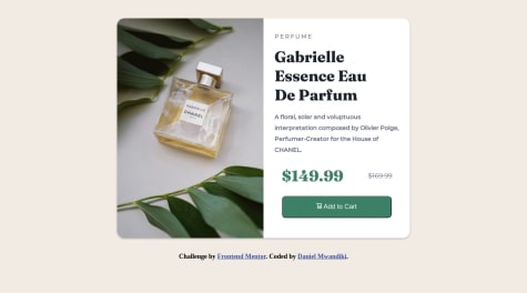
Nice job done🥳. However it looks like your "Huddle landing page with single introductory section solution" was mistakenly uploaded to the "Base Apparel coming soon page" challenge page.
Additionally, I have noticed that the design background repeats below the screen size of 800px. To ensure a seamless and visually appealing user experience on all devices, you can promptly address this concern by making the necessary CSS adjustments within a media query targeting screen sizes below 800px. By doing so, you can ensure that the design background remains consistent and does not repeat, thereby maintaining a high level of professionalism and user satisfaction across various screen sizes.
Marked as helpful - @Dhabeehullah@mraditya1999
Excellent work accomplished! Nevertheless, there seems to be an issue with the layout overflowing when the screen size is below 900px. To ensure an impeccably seamless user experience across all devices, it is highly advisable to implement additional CSS adjustments through a media query specifically targeting screen sizes ranging from
576pxto992px. By effectively addressing this concern, we can confidently guarantee that the design retains its remarkable responsiveness and exudes a level of professionalism that extends consistently across the entire spectrum of devices and screen sizes. - P@Abrham007@mraditya1999
Nice job done, however there appears to be an issue with the layout when the screen size is above 600px. To ensure a seamless user experience across all devices, it is advisable to implement additional CSS adjustments within a media query targeting screen sizes between
576pxand992px. By addressing this concern, we can guarantee that the design maintains its responsiveness and professionalism across the entire range of devices and screen sizes. - @younasBnHasainar@mraditya1999
To ensure responsiveness between screen sizes 576px to 768px, it is advisable to use media queries starting from 768px instead of 576px. This will help maintain a consistent layout across different devices.
Consider updating the CSS code as follows:
/* Responsive layout for screen sizes above 768px */
@media (min-width: 768px) {
  .testimonial-1, .testimonial-4 {
    width: 65%;
  }
}
By implementing this change, the design will adapt appropriately to screen sizes greater than or equal to 768px, promoting a more professional and consistent user experience.
Marked as helpful - @MonetCode88@mraditya1999
For enhanced responsiveness and simplified background image integration, consider removing the fixed width and height properties from the container. Instead, utilize a single div to enclose the image, and apply flex properties to the "card-info" and "card-img" elements with a value of "flex: 1". This approach allows the card to adapt fluidly to different screen sizes while maintaining its proportion and providing a more professional user experience.
HTML:
<!DOCTYPE html>
<html lang="en">
<head>
  <meta charset="UTF-8">
  <meta name="viewport" content="width=device-width, initial-scale=1.0">
  <title>Centered Card with Responsive Image</title>
  <link rel="stylesheet" href="styles.css">
</head>
<body>
  <main>
    <div class="card">
      <div class="card-img">
        <!-- Place your image here -->
        <img src="your-image.jpg" alt="Card Image">
      </div>
      <div class="card-info">
        <!-- Card content -->
      </div>
    </div>
  </main>
</body>
</html>
CSS (styles.css):
body {
  margin: 0;
  padding: 0;
}

main {
  min-height: 100vh;
  display: grid;
  place-items: center;
  /* Additional main container styles can be added if needed */
}

.card {
  display: flex;
  /* Add more card styles as per design requirements */
}

.card-img {
  flex: 1;
  /* Additional styles for the image container can be included here */
}

.card-info {
  flex: 1;
  /* Additional styles for the card information container can be added here */
}
With this implementation, the card will naturally adjust its size and proportion based on the content and the screen's dimensions, providing an improved user experience on various devices. The background image is replaced by a more structured approach using a separate div for the image and employing flex properties to make the card content more responsive and visually appealing.
Marked as helpful - @AhmadIkhdair@mraditya1999
For improved aesthetics and responsiveness, it is advisable to set the "max-width" property instead of a fixed width for the card element. By employing this single line of code, the card will adapt dynamically to various screen sizes, enhancing the overall visual appeal and ensuring a more responsive layout.
CSS:
.card {
  max-width: 250px;
  /* Additional card styles can be included as needed */
}
By setting the "max-width" property, the card will gracefully adjust its size up to the specified limit while retaining its original dimensions for smaller screens, ensuring an enhanced user experience across different devices and viewports.
- @Error-at-night@mraditya1999
An alternative approach to achieve centered card placement with a background image is by utilizing the "main" container with the following CSS properties: "min-height: 100vh", "display: grid", and "place-items: center". By adopting this technique, there is no need to create a separate div for the background image. Instead, the background image property can be applied directly to the "main" container. This method simplifies the structure while maintaining an elegant layout.
Here's the code representation of the described approach:
HTML:
<!DOCTYPE html>
<html lang="en">
<head>
  <meta charset="UTF-8">
  <meta name="viewport" content="width=device-width, initial-scale=1.0">
  <title>Centered Card with Background Image</title>
  <link rel="stylesheet" href="styles.css">
</head>
<body>
  <main>
    <!-- Your card content goes here -->
    <div class="card">
      <!-- Card content -->
    </div>
  </main>
</body>
</html>
CSS (styles.css):
body {
  margin: 0;
  padding: 0;
}

main {
  min-height: 100vh;
  display: grid;
  place-items: center;
  background-image: url("your-background-image.jpg");
  background-size: cover;
  /* Additional background properties can be added if needed */
}

.card {
  /* Define your card styles here */
  /* For example: */
  width: 300px;
  height: 200px;
  background-color: white;
  border-radius: 10px;
  box-shadow: 0 4px 8px rgba(0, 0, 0, 0.1);
  /* Add more styles based on your card design */
}
This code snippet efficiently centers the card inside the "main" container while simultaneously setting the desired background image for an aesthetically appealing result.
- @jonatasolmartins@mraditya1999
To create a more appealing and seamless user experience, it's essential to ensure that your design is responsive across various screen sizes. Consider removing the
max-widthproperty from the body element, allowing your design to adapt and scale smoothly for screens above 600 pixels.In addition to responsive design, incorporating the
transitionproperty on buttons can add an extra layer of visual appeal to your interactions. By specifying smooth transitions for background-color, text color, and box-shadow, you can make button effects, such as hover and click actions, more delightful for users.button { /* Other button styles */ transition: background-color 0.3s ease, color 0.3s ease, box-shadow 0.3s ease; /* Smooth transitions for enhanced user experience */ }By thoughtfully selecting the timing and easing functions for the transitions, you can ensure that button interactions feel natural and polished, contributing to an overall improved user experience.
Feel free to experiment with different transition properties and durations to fine-tune the button behavior according to your design preferences. Emphasizing responsive design and incorporating smooth button transitions can go a long way in creating a more engaging and user-friendly interface.
- @DanielMwandiki@mraditya1999
Enhance User Experience with Smooth Button Transitions:
To create a more appealing and seamless user experience, consider incorporating the
transitionproperty on buttons. By doing so, you can add smooth and visually engaging transitions, making interactions more delightful for your users.button { /* Other button styles */ transition: background-color 0.3s ease, color 0.3s ease, box-shadow 0.3s ease; /* Smooth transitions for background-color, text color, and box-shadow */ }By including the
transitionproperty with carefully chosen timing and easing functions, you can ensure that button interactions, such as hover effects and click actions, are visually satisfying and contribute to an overall enhanced user experience.Feel free to experiment with different transition properties and durations to fine-tune the button behavior according to your design preferences.
Marked as helpful - @JosueJMartinez@mraditya1999
To achieve a more appealing user experience and ensure responsiveness across a broader range of screen sizes, consider the following adjustments to the CSS code:
@media screen and (max-width: 1192px) {
  .container {
    flex-wrap: wrap;
    width: 90vw;
    max-width: 1000px; /* Adjusted max-width for improved responsiveness */
    margin: 0 auto; /* Center the container horizontally */
  }
}
With these modifications, your container element will now be responsive not only for screens up to 768px but also for screen sizes between 768px and 1192px. The changes aim to create a visually pleasing and user-friendly experience across various devices and display dimensions.
Feel free to further fine-tune the CSS values based on your specific design requirements to optimize the user experience.
- @kevankas@mraditya1999
To enhance the appeal and responsiveness of your design, consider adjusting the
max-widthproperty to 768px for wider screen compatibility. Incorporate the following CSS code within the appropriate@mediaquery:@media screen and (max-width: 768px) { .container { flex-wrap: wrap; margin-left: -90px; width: 90vw; margin-inline: auto; max-width: 350px; /* Adjusted max-width for better responsiveness */ } }By making these adjustments, your container element will adapt more effectively to different screen sizes, creating a more visually appealing and user-friendly experience.
- @imranhossainemi@mraditya1999
-
Enhance Attractiveness: Consider adding hover effects to buttons, which can make them more engaging and visually appealing.
-
Enhance Visual Design: Apply box shadows to cards for a more sophisticated and polished look, contributing to an improved overall visual design.
-
Optimize Readability: Utilize lighter background colors to enhance visibility, ensuring that content is easily readable and accessible for users.
-
- @sandrvvu@mraditya1999
- You might want to consider verifying the correctness of the image source (
src) by conducting if its path is valid or not.
- You might want to consider verifying the correctness of the image source (
- @julianlinaress@mraditya1999
To achieve vertical centering, an alternative approach can be employed by setting the
min-heightproperty of thebodyto100vh, along with applying thedisplay: gridandplace-items: centerCSS rules. This combination shall gracefully position the content at the center of the viewport, ensuring a professional and aesthetically pleasing layout.