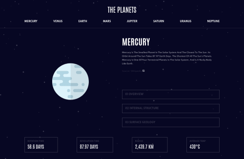
Planets Fact Site using HTML, SCSS, JS

Solution retrospective
Hello! I had very good moments and very hard times working at this project. I feel i got better at managing bigger projects but yet i need to think more carefully before writing code. There are things i would like to understand better so let's begin!
- The menu burger icon: I wanted to follow the design, when the icon is clicked there's no
X for closing it (that would have been easier), it changes color instead. I tried hard
but i couldn't change the color, so i found online this solution:
     filter: invert(14%) sepia(6%) saturate(7%) hue-rotate(31deg) brightness(94%)                            contrast(81%);
 }```
and a color generator website, i spent hours trying all color shades from black to gray, what you see is the best result! Any clue on how i could do it differently?
-
The aboveline! I got crazy because i want to put the focus on top the selected planet page but i can't!
-
Conclusion: I know it is not the best result but I'm quite happy anyway, it was very hard at times.
-
Edit: Thanks to Emmilie Estabillo the menu burger icon color is the same as the design now.
Feel free to leave a feedback. Thanks
Please log in to post a comment
Log in with GitHubCommunity feedback
No feedback yet. Be the first to give feedback on Davide's solution.
Join our Discord community
Join thousands of Frontend Mentor community members taking the challenges, sharing resources, helping each other, and chatting about all things front-end!
Join our Discord