
@VictorResines

David
@DavidMorgadeAll comments
- @DavidMorgade
Muy buenas Victor, enorabuena por terminar el challenge!!
Como ya dices en tus "next steps", como primero tomaría el hacerlo completamente responsive porque como ya sabes en la actualidad la mayoría de los usuarios navegan a traves de un dispositivo móvil, en mucha mayor medida que desde un PC, te recomiendo que pruebes el "Mobile first", que consiste en empezar la web desde el tamaño mobile y después ir adaptandola a tamaño de escritorio, aunque como ya la tienes montada así, puedes ir ahora adaptandola a tablet y después a móvil...
Sobre el tema del formulario, tendrás que crear un servidor de Backend que reciba la información, ya eso va a tu gusto, puedes hacerlo con múltiples lenguajes de programación (java, c#, PHP, python, Javascript, Typescript...) con alguno de sus frameworks/librerias enfocados para el Backend.
Te dejo el enlace a como enfoqué yo este proyecto por si te sirve de ayuda para inspirarte, el formulario lo hice con NodeJS y una librería que se llama nodemailer, te dejo el repositorio del servidor por si te interesa.
Cualquier duda que tengas pregunta, muy buen trabajo!
Marked as helpful - @estebanp2022@DavidMorgade
Hello man congrats on finishing the challenge!! great job, the accordition issue is just a bit of logic warm up that will come with time, don't worry much about that.
Here is my approach to solve the problem (for sure there is a better solution, but this should do the trick):
1 - Give each of your faq elements an unique
id(for example: faq1, faq2, faq3...)2 - Now that we have each faq element with an unique identifier, you can improve your
removeActiveClassesfunction so it identifies when the clicked faq is the same that is open:function removeActiveClasses(elementId) { faqs.forEach((faq) => { if (elementId === faq.id) return; faq.classList.remove('active'); }); }2.1 - The element Id is the id of the faq div that should be pass to the function, then it compares it to the
faq.idin your foreach loop and if its the same it will instantly return (cutting out the bad behaviour of not letting you close a faq by themself.3 - Last but not least you have to pass the current faq id from your event using some dom traversing or directly getting it from your forEach method:
faqs.forEach((faq) => {
  faq.addEventListener('click', (e) => {
    removeActiveClasses(faq.id);
    faq.classList.toggle('active');
  });
});
3.1 - You could also use dom traversing with the
eEvent but this would be overkill since you already have your html faq element from the forEach method, just use faq.id in your eventListener and it should workHope it helps, if you have any questions or need a pull request just ask!
Marked as helpful - @trevisandaniel@DavidMorgade
Hello Daniel, congrats on finishing the challenge!
You are doing good using
display: gridplace-items: centeron your parent component, the problem is that setting amax-width: 1440pxon your body will limit the width of the component, not getting centered, you should remove hardcode widths on your body.Apart from that you could also use
display: flexjustify-content: centeralign-items: centerto center your component from the parent element.Marked as helpful - @mikhaelholden001@DavidMorgade
Hello Mikhael, congrats on finishing the challenge ! you did a great job.
To answer you question, you can archieve this with different apporaches, you could add a div with position absolute that wraps the whole document and has shadowy background and some opacity (all of this should be added when the mobile menu is active)
Other thing that I noticed in your project is that the images are not loading correctly, this is because you are uploading your files to github with a different folder structure than your local project, you should either have the same structure as the live project has, or change the path of your img source atttribute
Apart from that, great job and keep it going, hope my feedback helped you!
Marked as helpful - @arkaroy135@DavidMorgade
Hello Roy! Great job finishing the challenge, for me it looks great on mobile and desktop sizes, nice.
To answer your question, you can easily archive the same result with grid, you won't need to use flex at mobile sizes, just grid at your 1280px media querie.
You can try it at your own doing this:
- In your
.container .cardremove thedisplay: flex. - In your 1280px mediaquery, add at your
.container .cardselector the propertydisplay: grid; - Also add to your
.container .cardgrid-template-columns: repeat(3, 1fr);
With these properties your layout at mobile sizes will stay the same (because those block elements stacks one on the other as they have
display: blockby default), and with thedisplay: gridat 1280px you will have 3 columns of the same size (grid-template-columns: repeat(3,1fr))Hope my answer helps you!
Marked as helpful - In your
- @Exiturn@DavidMorgade
Hey man great job with the project!
The project looks good both in Mobile and Desktop, there is no need to run the project locally to see the styles, you just need to link the relative path to your project like this:
<link rel="stylesheet" href="./output.css">Instead of:
<link rel="stylesheet" href="/public/output.css">This
./output.csswill work for you because your CSS file is in the same folder as the html file, then to refer to the same folder you just have to type./followed by the name of the file.Hope my feedback helps you!
Marked as helpful - @WorldWideWeb-er@DavidMorgade
Hello Nathan great job with the challenge! looks great for me
I will try to answer your questions:
I'm looking to improve my Bootstrap & CSS skills, what would be some key topics to work on?
- Well, depends a lot in wich starting point you are in CSS, but in my opinion this should be the most important topics that anyone starting out in CSS:
-
Box model, learn how it works, how you can benefit from this for your layout and components.
-
Selector specifity, it's important to learn how your selectors effects on your components / layout, learn the hierarchy in CSS, it will improve a lot the way you apply styles in your projects.
-
Learn how to positiong things, there are two important things that you have to master: flexbox and CSS Grid, if you learn this two you will have a solution for every type of layout that you face, also important to learn how to use
position, but this is a more secondary topic that you can learn later.
This for me are the basic topics for CSS, for Bootstrap, just read the docs and practice a lot, the more important thing to learn in bootstrap is how to use the bootstrap grid and responsive layouts, you can get decent knowledge just by reading the docs.
What are the benefits of working with frameworks vs. Bootstrap?
I think that in this question you meant to ask CSS vs. Bootstrap, Bootstrap is the easy way to get your job done, but as I always recommend to everyone, learn CSS first, not only the basic but make a few projects using only CSS, using Bootstrap from the start can lead you to not understanding how the things you are doing works, and also CSS is something that will be there, frameworks are just in the top and then they loose popularity (for example, in the past year Tailwind has win over Bootstrap in popularity), learning ol' good CSS will make your transition to any framework a lot easier that just learning a framework.
Hope my answers helps you!
Marked as helpful - @StalinAM@DavidMorgade
Hello Stalin, congrats on finishing the challenge, amazing job!
Let me try to answer your questions as much as I can.
For the submenus, you could have used
height: 0as default and then increase the height with a CSS class added on click and animate it withtransition: height 0.5s linear, butdisplay: nonealso does the job!In the case of the arrow image, you don't even need to use another image, you can create a CSS class with
transformand add it dinamically with JS, something like this:CSS:
.rotate {
     transform: rotate(180deg);
     transition: transform 0.5s linear;
}
JS:
const openSubMenu = (submenu) => {
   submenu.addEventListener('click', () => {
           iconchange.classList.toggle('rotate');
    })
}
openSubMenu(openCompany)
Hope my feedback helps you, if you have any question, don't hesitate to ask!
Marked as helpful - @jlmunozfdev@DavidMorgade
Muy buenas Jorge, excelente trabajo, se va notando todo lo que estás mejorando respecto a tus anterior proyectos, sigue así!
Si no te importa me gustaría darte algo de feedback:
- Lo primero y más importante, deberías de subir el valor de tus media queries, ya que si usas
@media(min-width: 375px), tus estilos para mobile solo se estarían aplicando de 0 a 375px (y así no englobas apenas tamaños de telefonos), además si te fijas bien el layout se rompe desde los 375px hasta lost 700~, prueba subiendo tus media queries hasta al menos@media(min-width: 768px)que es el tamaño máximo para telefonos.
Por lo demás muy bien, buen trabajo con el Grid, y muy buen trabajo usando
align-selfpara alinear cada elemento por separado!Espero que mi feedback te sea de ayuda, si tienes alguna pregunta no dudes en preguntar! Un saludo
Marked as helpful - Lo primero y más importante, deberías de subir el valor de tus media queries, ya que si usas
- @vazdiego@DavidMorgade
Hello Diego, congrats on finishing the challenge! your card looks awesome and its almost the same as the solution!
The only thing you are missing is the background-image, this is easy to add, try adding this to your body:
body {
  background-color: hsl(225, 100%, 94%);
  background-image: url(../images/pattern-background-desktop.svg);
  background-size: cover;
  background-repeat: no-repeat;
}
Let me explain what I did here: ->
background-imagegets the background image displayed on the body ->background-sizemeans how much size should your bg image have, in this case is covering ->background-repeatsetting it to no repeat, means that the image does not repeat!With this you will have your image for desktop sizes, I recommend you to try adding your self also the pattern for mobile screen sizes playing with those properties!
Hope my feedback helps you, if you have any questions don't hesitate to ask!
Marked as helpful - @Demyttenaere@DavidMorgade
Hello Demy, great job with the challenge
The solution looks fantastic but is only working for desktop :(!, you should try to adapt it for tablet / mobile devices using
@mediamedia queries, if you want to adapt it from your desktop point of view, I would recommend you using@media(max-width)and playing with diferent sizes until it fits for every type of screen!But my real recommendation is to start building your future projects from a mobile size, and then start adapting it to tablet / desktop using
@media(min-width), you will see that is not that hard, and you will get used to it in no time!Hope my feedback helps you, if you have any questions don't hesitate to ask!
Marked as helpful - @tiago-jv0@DavidMorgade
Hello Tiago, congrats on finishing the challenge! good job with the layout and the responsiveness of your page, it looks great
Regarding your question, just don't use the
<strong>tag, use a<span></span>with afont-weight: 700and it will get the job done, you can even use thefont-weight: 700in your current strong tag and it will also work.<strong>is supported on firefox, but there is something in your code thats clashing with it and its not letting the strong tag to work as it shouldHope my answer helps you, if you have any questions don't hesitate to ask!
Edit:
Okay I found the problem, your
<strong>is inheriting thefont-weight: 300from your<h1>, the best way to fix it is like I pointed you on the initial answer! - @lulublake@DavidMorgade
Hello Oluchi, congrats on finishing the challenge! great job in my opinion
You should try for desktop size using
brackground-size: containand remove thebackground-positionit will get your BG image on the middle for 1400px+.Also would like to recommend you using flex to center the component instead of just margins on your
<div>you can get it easily with this on your body (remember to remove the margins):body { display: flex; flex-direction: column; justify-content: center; align-items: center; min-height: 100vh; }With
min-height: 100vhyour body will wrap the whole screen, and then flex-box will center the children wich in this case is the whole card.Hope my feedback helps you, if you have any questions don't hesitate to ask, great job
- @Jetyun@DavidMorgade
**Hello Jetyun, congrats on finishing the challenge I'm glad that you found out how to change the color for svg, good job with the layout and the responsiveness, it looks great! **
Let me try to answer your question:
- First of all, consider moving to a preprocessor like SASS / LESS to have a more readable / mantainable code, you will have everything separated, mixins, variables, indentation, functions... impossible to make a more mantinable code as making CSS almost like a programing language.
Apart from that point of view, if you don't want to go for SASS, there are a lot of tricks that you can do in your CSS to make it more readable and easyt to change, let me try to resume them:
-
Use a naming convention such as BEM, it will give your classes more sense, they will be easier to understand and you will also never run about ideas for selectors or classnames.
-
Try giving the default styles of different elements right on the start of your CSS file, for example the sizes of headings, size of paragraph, colors, for example:
h1 { font-size: 3rem; font-weight: 700; line-height: 2.2; color: #fff; } h2, h3, h4 { font-size: 1.8rem; font-weight: 400; line-height: 3; }-
Create utility classes like
containers,marginsetc... Why someone would writemargin-top; 4remfor every section? just add the classmargin-topthat you created to stop repeating margin-top! (I saw that you used this trick in your solution). -
Don't use pixels, try to use always relative units such as
emsandrems, pixels just for special cases.
Hope my feedback helps you, great work with the solution, if you have any questions, don't hesitate to ask!
Marked as helpful - @Mateusz-wink@DavidMorgade
Hello Mateusz, welcome to the community and congrats on getting the first challenge done!
Let me try to answer the questions the best I can:
: -Will my project show up in center of page in both mobiles and PCs?
Working on desktop but failing in mobile, this is caused by the way you centered it, try not to use
positionto center the main elements from your layout, instead of that you could have use flexbox on the body, you just need to set themin-height: 100vhof the body, so it takes the whole browser screen, then with flexbox center your component.If you want to get this done in your project, first of all remove position, top, left, margins, height and widths from your body, also the
marginfrom your<div class='container'>.Then use flexbox in the body like this:
body {
    font-family: "Outfit", sans-serif;
    background-color: hsl(212, 45%, 89%);

    display: flex;
    justify-content: center;
    align-items: center;
    min-height: 100vh;
}
With this it will get centered in the screen for any type of syze!
What should I focus on, when starting such project?
Since you are starting out in CSS, just do it the way you are doing, create your html skeleton and then start adding styles trough classes, in the future you will find out that having some starting values as CSS variables for colors, sizes, weights will save you a lot of time, also having default values for your headings, paragraph, container... those are just utility class that you will just write on start because you are 100% sure that you are going to use them.
Hope my feedback helps you, if you have any questions don't hesitate to ask!
Marked as helpful - @thaiscode@DavidMorgade
Hello Thais, congrats on finishing the challenge! your FAQ accordion looks great and its working perfectly, good job using the
<summary>html tag to do the job for you!I think that your arrow is behaving that way because in your Javascript you are attaching the
addEventListenerto your arrow image instead to the whole<details>dropdown, you should attach your event listener to your details and then change the arrows on clicking them instead of just selecting the arrows.Hope my feedback helps you, if you have any questions about how can this get done, don't hesitate to ask I will try to help you with a pull request if needed!
Marked as helpful - @alvyynm@DavidMorgade
Hello Alvin, great job with the solution it looks responsive and the layout is great, congratulations!
If you don't mind, I would like to give you some suggestions.
-
I think that using an html is a better approach, for accesibility and for semantic purpouse, use background image when they really are background images. If you are struggling getting the effect with an html image, just think on wrapping it on a
<div>and use that background color on the div to get the desired effect. -
You should try getting your solution centered without using
height: 120vhis moving your section to the bottom, instead of that, remove it and just use flexbox on the body to get everything center like this:
{
  display: flex;
  flex-direction: column;
  justify-content: center;
  align-items: center;
  min-height: 100vh;
}
Setting the body to a
min-height: 100vhis the best way to get the desired effect on this type of challenges!Hope my feedback helps you, if you have any questions don't hesitate to ask, great work!
Marked as helpful -
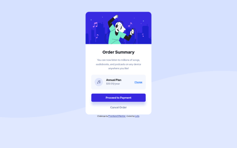
- @osamanazakat@DavidMorgade
Hello Osama, congrats on finishing the challenge! the card looks pretty good IMO, I would add some things to it, if you don't mind I would like to give you some advices
-
First of all, I saw that you were trying to center it using flexbox nice job! but you need to set the body's height to wrapp all of the browser screen, you can do this by setting your
<body>min-height: 100vh, with this the body will wrap the fully screen and your card will be centered. -
Your background is covering the whole screen until it reach some point that in larger screens it gets cutoff, try setting
background-size: containfor desktop sizes so it gets container in the background and fully displayed. -
Regarding the html, remember that every document should have one
<h1>to improve the accesibility and rank better on search engines, just use your 'Order Summary' as an<h1>to pass this validation and you are good to go!
Hope my feedback helps you, if you have any questions, don't hesitate to ask, great job with the solution
Marked as helpful -